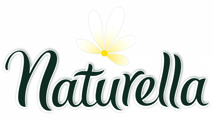
When you look at the Naturella logo, you can smell the fragrance of daisies. The symbols of the emblem promise cleanliness and excellent absorbency. They hint at natural impregnations used in products. Their presence sets the brand apart from similar products.
Naturella: Brand overview
| Founder: | Procter & Gamble Company |
| Headquarters: | Cincinnati, Ohio, U.S. |
Meaning and History
The designers presented the logo as soon as the brand emerged when the product entered the market. They took the concept of naturalness reflected in the name as a basis and the addition of chamomile extract. The developers also tried to get away from such products’ standard ideas, usually dominated by pink or red tones with a feminine theme. As a result, the brand name turned out to be very successful and has not changed during the line’s existence.
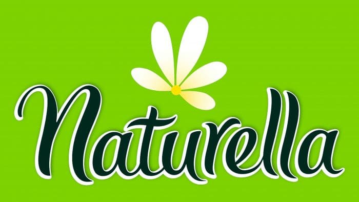
The distinctive symbol of the brand is the classic chamomile. It is presented segmentally, only in half of the inflorescence, and is located above the brand name, exactly in the center – near the letters “u” and “r.” The flower is traditionally depicted with a yellow center and white oval petals. They have a slight shading towards the base. The word “Naturella” is placed horizontally but tilted slightly diagonally upward.
What is Naturella?
Naturella is a brand under which women’s pads of all types are produced. Their base consists of natural materials – cotton fibers impregnated with extracts of medicinal plants. The brand originated in Mexico and was later sold to the international company Procter & Gamble, which owns it.
Naturella: Interesting Facts
Naturella is a well-known women’s hygiene brand that is loved for its variety of feminine pads. These pads are made with women’s needs and comfort in mind.
- Natural Ingredients: Naturella uses ingredients like chamomile in its products, which are gentle on the skin. This is great for those who prefer skin-friendly options.
- Wide Product Range: Whether you need ultra-thin, regular, maxi, or night pads, Naturella has something for everyone.
- Skin Safety: Their pads are dermatologically tested to avoid skin irritation, focusing on comfort and health.
- Smart Packaging: Naturella’s packaging is nice and practical, keeping the pads clean and easy to carry around.
- Educating People: The brand works to educate people about menstrual health and break the stigma around menstruation. It runs campaigns and forms partnerships to spread knowledge.
- Understanding Different Cultures: As a global brand, Naturella ensures its products and marketing speak to women’s unique cultures and preferences everywhere.
- Online Community: Naturella has created an online space where women can discuss menstrual health and hygiene, share stories, and support each other.
Naturella is dedicated to providing quality, comfort, and care to women everywhere, making it a trusted name in feminine hygiene.
Font and Colors
The inscription is made in a calligraphic script without italics. Instead of the capital “n,” there is a lowercase, the “t” has a wavy crossbar, and the letters “ll” have a curved shape. The logo’s palette consists of yellow, white, and green in two shades: dark for text and light for the background.
Naturella color codes
| Golden Yellow | Hex color: | #fee104 |
|---|---|---|
| RGB: | 254 225 4 | |
| CMYK: | 0 11 98 0 | |
| Pantone: | PMS 108 C |
| Medium Jungle Green | Hex color: | #102c22 |
|---|---|---|
| RGB: | 16 44 34 | |
| CMYK: | 64 0 23 83 | |
| Pantone: | PMS 627 C |


