


![]() NCT Logo PNG
NCT Logo PNG
In the elongated characters, several separate divisions of the group and their multilingualism are encrypted. The NCT logo demonstrates the presence of fans of all ages and reflects the songs’ length and harmonious sound. The ability of soloists to hit a wide range of notes.
NCT began in late 2013, when SM Entertainment launched SM Rookies, a training system for future performers in vocals, dance, acting, and foreign languages. On January 28, 2016, founder Lee Soo-man presented “SMTown: Neo Culture Technology 2016” in Seoul. The concept was unusual for K-pop: NCT would have no fixed member limit, with separate units built for different markets and musical directions.
The first unit, NCT U, debuted on April 9, 2016, with “The 7th Sense” and “Without You.” Its lineup changed by release, depending on the song. NCT 127 followed on July 7, with “127” referring to Seoul’s longitude, while NCT Dream debuted on August 24 with “Chewing Gum” as a younger unit.
In 2018, the units joined for the full-group album Empathy. On January 17, 2019, WayV debuted under Label V for Chinese-language audiences with The Vision. That same year, NCT 127 signed with Capitol Music Group and performed at the MTV Europe Music Awards in Seville, giving the project a clearer global profile.
The 2020 album Resonance sold over 2.6 million copies in two months and became SM Entertainment’s strongest physical seller at the time. Universe followed in 2021 with over 1.7 million preorders. NCT 127’s Sticker reached No. 3 on the Billboard 200, and Sticker with Favorite passed 3.58 million copies. The Golden Age arrived in 2023, NCT Wish debuted in Japan in February 2024, and by June 2024, total NCT sales in South Korea exceeded 45 million.
Meaning and History
![]()
The first trainees were introduced much earlier, in 2013, the year the project was founded. That’s when a training team called SM Rookies emerged. At first, five guys got into it by casting. They were repeatedly auditioned and selected. Then the number of potential participants increased to 16 – that’s how many they were in the winter of 2016. The rest joined the group through S.M. Entertainment shows and personal recommendations.
The main work began in 2016 with an unusual idea of the producer. He presented his concept “SMTOWN: New Culture Technology 2016” at the SM Coex Artium. Lee Soo-man wanted to start a new-format teenage music group according to the idea. The number of its members should be unlimited, and the boy band can open at any time, depending on how many people are recruited. If a boy is not in one unit, he must go to the second. And the name was taken from the presentation and shortened to three letters.
The main unit is NCT U. It began its career with two singles: “Without You” and “The 7th Sense”. The second came to the NCT 127 lineup, which debuted with a mini-album of the same name. Other performers joined to form the group NCT Dream, which released the song “Chewing Gum”. The next project is WayV, which debuted with the collection “The Vision.” They sing in Korean, Japanese, Chinese, and English. At the same time, they have one owner, one manager, and one logo. The identity reflects the essence of the compositions: unity.
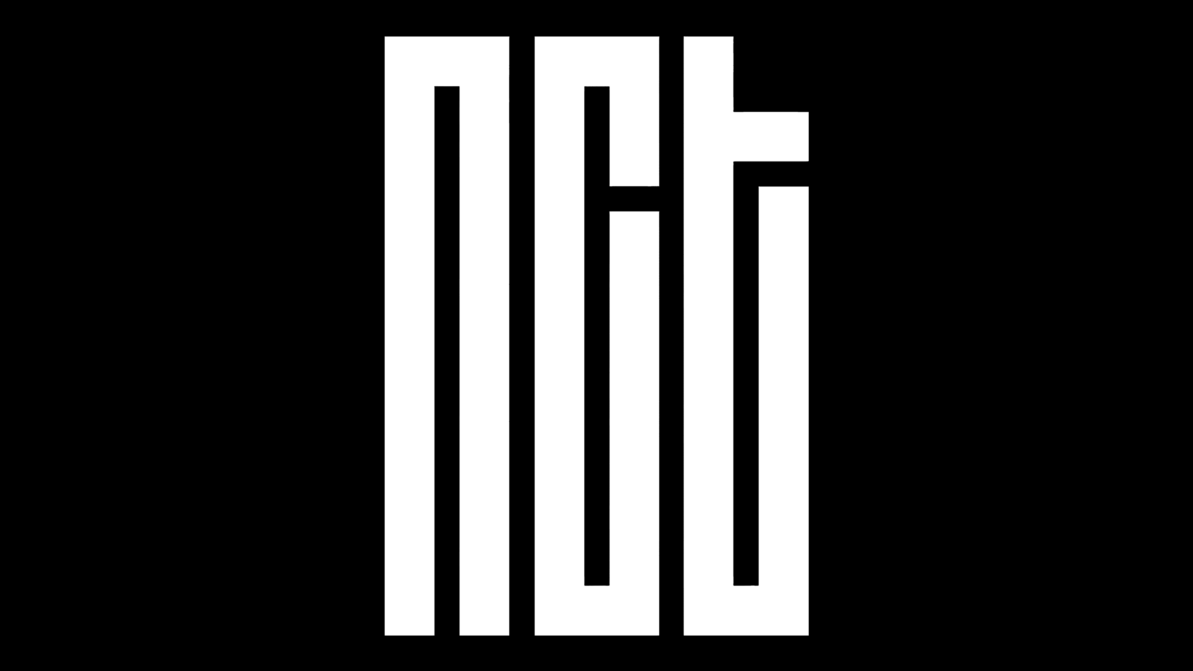
The logo, like the project, is innovative. It concentrates on opposing tendencies. For example, it is simultaneously stylish and unusual for the music sphere, austere and innovative. We feel the drive toward classicism, while technology and pixel graphics are present, with miniature elements combined into something bigger. In this case, the geometric shapes look like parts composed of pixelation. In addition, they resemble fragments of popular first-generation video games in which the main characters advanced through labyrinths and received rewards.
But in fact, the letters are stylized as hieroglyphs. This is evidenced by the “construction” of the “t” sign, which does not look like an English-language character. It has an overly elongated right-hand side that does not appear in the original writing. The presence of the labyrinth is also indicated by the half bar overlapping the inner space. The additional element of the last letter makes it identical to the “n.” Overall, the abbreviation is set in lowercase because the similarity between the characters is more clearly visible that way.
Font and Colors
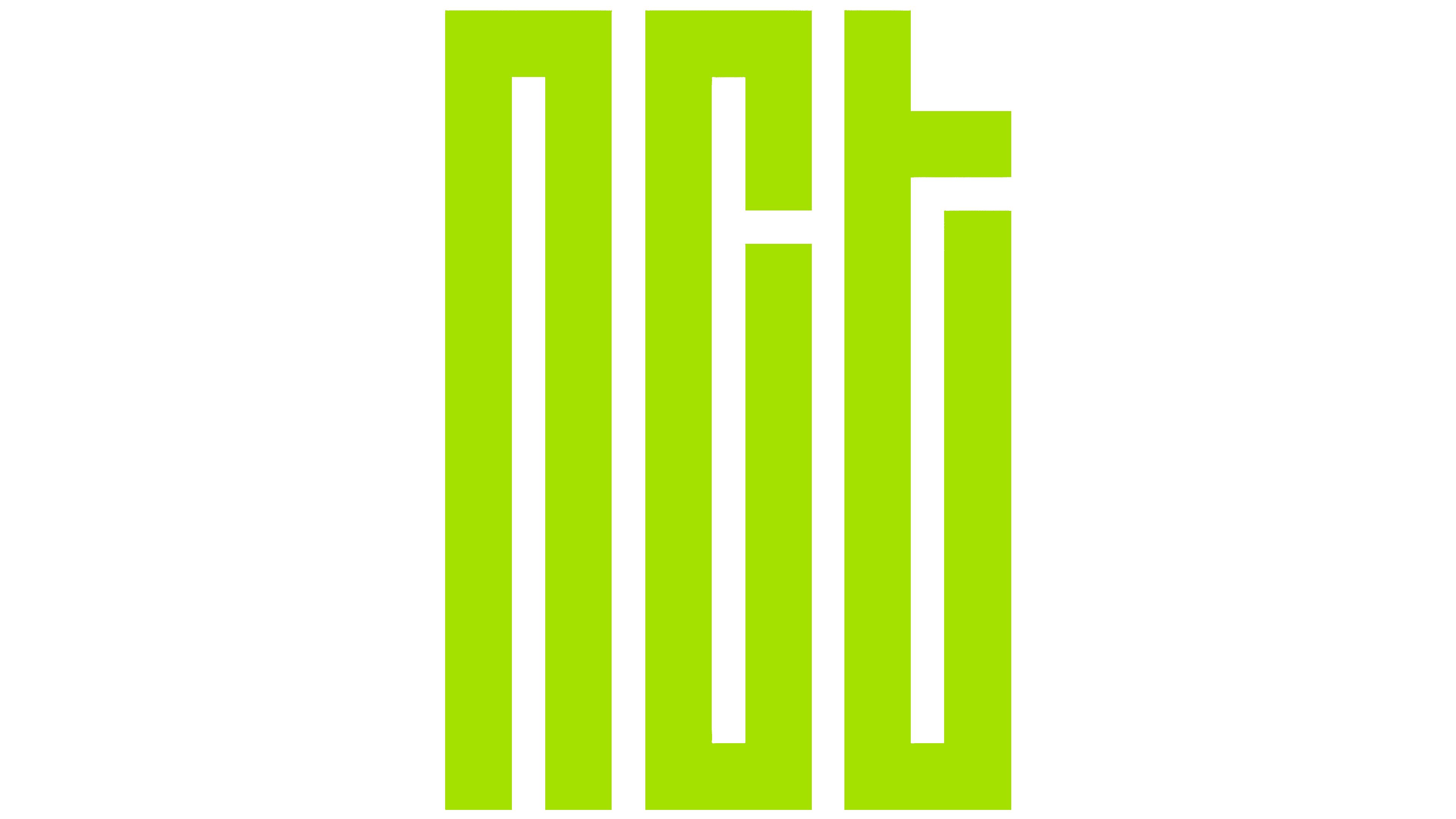
The typeface used to denote the NCT group is as close as possible to Hauptbahnhof and Severe. She got manufacturability and perfect evenness; from the other, a roll call in the oriental script. But the color scheme is the same. It is monochrome, consisting of a black background and white lettering. There are also mirror-opposite options.