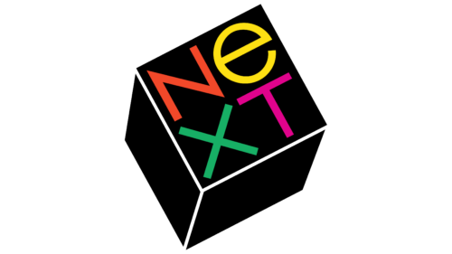
The NeXT logo is playful, diverse, and dynamic. The symbol seems to invite someone to start typing. The emblem conveys the exciting learning process through a computer station, a blend of accurate data and engaging facts.
NeXT: Brand overview
| Founded: | 1985 – 1996 |
| Founder: | Steve Jobs |
| Headquarters: | Redwood City, California, U.S. |
Established in 1985 by Steve Jobs following his exit from Apple, NeXT Inc. set up its headquarters in Redwood City, California. The firm targeted the premium segments of the higher education and corporate markets to deliver top-tier computers and software. In 1988, NeXT launched its debut machine three years into its journey, distinguished by its avant-garde magnesium casing and the revolutionary NeXTSTEP operating system. Nevertheless, the company struggled to gain market traction, primarily due to the steep pricing of its products.
Acknowledging the uphill battle in the hardware sector, NeXT shifted its focus entirely to software in 1993. It began marketing its NeXTSTEP operating system and WebObjects, a server-side web application framework. The company found a niche among large financial establishments and corporations, where its software became popular for crafting customized applications.
In a twist of fate, Apple acquired NeXT in 1996 for $429 million. This marked Steve Jobs’ comeback to Apple and facilitated a technological infusion into the struggling company. NeXTSTEP was the architectural bedrock for developing Apple’s new operating system, Mac OS X.
Although NeXT didn’t become a commercial blockbuster, its contributions were instrumental in Apple’s revival during the late ’90s. NeXT played a crucial role in Apple’s transformative leap to OS X by offering an operating system and a development environment.
Meaning and History
Steve Jobs was keen for his company’s logo to be designed by Paul Rand, one of the best graphic designers in the U.S., known for his Swiss style. Yet the guru was already contractually bound to IBM. This did not deter the businessman. Jobs called the CEO of his competitor and the Vice President and was so persistent that IBM eventually “loaned” Paul Rand for the project. Rand met with Jobs, listened to his wishes, and promised to create a single logo option. The customer could use it or not but had to pay either way. This single design amounted to $100,000, including a 20-page brochure describing the logo and the sketch itself.
What is NeXT?
An American company founded by Steve Jobs after he departed from Apple. NeXT ceased to exist after being absorbed and the founder’s return to the primary company. The company produced specialized, powerful computers running on the NeXTSTEP OS like the NeXT Computer, NeXTcube, and NeXTstation.
1985 – 1996
The logo is a cube, tilted at a 28-degree angle to the viewer. The face of the cube displays the four letters of the company name in various colors.
Reasons for choosing a cube for the logo:
- Jobs designed the computer to be cubic, believing the shape to be simple, harmonious, and perfect. Hartmut Esslinger of the German design agency Frog Design developed the design. The sides of the device measured 30 cm.
- Cubes are associated with development and education. They serve as the first building materials for children, helping them learn the laws of geometry.
- The shape is associated with the Rubik’s Cube, a complicated puzzle that is an analogy for NeXT’s complex educational software.
The design balances thanks to the sharp edges of the letters, symbolizing sharpness of thought, originality, informality, and friendliness.
The logo resembles a dice thrown in a game, momentarily paused to reveal specific information. The spinning process is associated with information retrieval and application loading.
Straight angles and flat faces emit authority. These elements highlight logical reasoning and stringent technical applications.
The four letters precisely occupy the square space of the face, implying computational processes. The inscription symbolizes order and rule adherence.
The logo remained used until Apple purchased the company and its products in 1996.
Font and Colors
The color palette was based on contrasts to depict the process of cognition and exploration of various perspectives. The black base directed the viewer toward the theme of classroom chalkboards and black fonts on monitors. White faces rendered the image stylish and neat, resembling chalk sketches or axes of coordinates. The four multicolored letters emphasized diversity: exploring sociology, mathematics, biology, and other important subjects.
- Orange – a friendly, warm color, conveying user-friendly OS and ease for students.
- Yellow – signifies the joy of learning. Rand and Jobs disagreed about this color, but Jobs conceded to the designer’s authority. The bright yellow letter evoked positive emotions transferred to the company’s product and learning process.
- Green – the color of growth, development, and professional advancement.
- Magenta – symbolizes the pursuit of knowledge and breakthroughs in education.
The font of the inscription is simple and smooth, without serifs or standout elements. It helps focus on the material content rather than the style of the inscription. The lowercase ‘e’ in the name is emphasized to draw attention to concepts like education and excellence.
For those involved in science, the lowercase ‘e’ is associated with Einstein’s equation: e=mc2.
NeXT color codes
| Neon Scarlet | Hex color: | #f14829 |
|---|---|---|
| RGB: | 241 72 41 | |
| CMYK: | 0 70 83 5 | |
| Pantone: | PMS 172 C |
| Golden Yellow | Hex color: | #fde013 |
|---|---|---|
| RGB: | 253 224 19 | |
| CMYK: | 0 11 92 1 | |
| Pantone: | PMS 108 C |
| Medium Sea Green | Hex color: | #17af65 |
|---|---|---|
| RGB: | 28 175 101 | |
| CMYK: | 87 0 42 31 | |
| Pantone: | PMS 3405 C |
| Vivid Cerise | Hex color: | #e0038c |
|---|---|---|
| RGB: | 224 3 140 | |
| CMYK: | 0 99 37 12 | |
| Pantone: | PMS 806 C |
| Black | Hex color: | #000000 |
|---|---|---|
| RGB: | 0 0 0 | |
| CMYK: | 0 0 0 100 | |
| Pantone: | PMS Process Black C |
