![]() Nielsen Logo PNG
Nielsen Logo PNG
From the very beginning, the Nielsen logo was businesslike and professional, accurately reflecting the company’s mission to research the media market, study consumer demand, and analyze audience preferences. Several simple elements harmoniously convey these and other goals of the analytics company.
Nielsen began in August 1923, when 26-year-old electrical engineer Arthur C. Nielsen Sr., a University of Wisconsin graduate, borrowed $45,000 from fraternity brothers and founded A.C. Nielsen Company in Chicago. Its first work had no link to media. The firm tested conveyor belts and turbine generators for industrial manufacturers.
After two near-failures, Nielsen moved into retail sales analysis. In 1932 and 1933, his staff tracked goods through drugstores and grocery stores, creating the Nielsen Drug Index and Retail Index Services. The method helped define market share as a measurable business concept.
In 1936, Nielsen bought rights to the Audimeter, a device attached to radio sets to record when they were on and which station was selected. Nielsen Radio Index followed in 1942, with early ratings released in December 1947. In March 1950, Nielsen bought C.E. Hooper’s national radio and TV ratings service and then launched the Nielsen Television Index with its “black box.”
Arthur Nielsen Jr. joined in 1945 and later backed data processing with Univac I. Nielsen Station Index Service appeared in 1953; daily TV ratings began after the 1971 Storage Instantaneous Audimeter; Scantrack arrived in 1979; Dun & Bradstreet bought the company in 1984; and People Meter followed in 1987. VNU later bought Nielsen Media Research and ACNielsen, forming Nielsen Company in 2007. After its 2011 IPO, Nielsen split in 2021, with NielsenIQ sold to Advent International, then went private in 2022 through Elliott Investment Management and Brookfield Business Partners.
Meaning and History
![]()
An independent company based in the Netherlands, focused on gathering information about rapidly developing consumer goods, gained international recognition and became recognizable among clients worldwide within a few years of its existence. Due to its strong prospects and good performance in the market, it has become a widely sought-after source of information. Therefore, in 2006, it was purchased by a consortium of private investment firms from the USA. This led to a redesign of the logo, which was maximally updated to match modern trends.
What is Nielsen?
Nielsen is an American company engaged in analytics and data analysis to inform future media development strategies. Founded in 1923, the agency identifies audience preferences and provides clients with reliable information collected across all channels and platforms. It stimulates actions and anticipates events to develop the correct marketing strategy. The company’s founder is Arthur C. Nielsen, Sr.
1923 – 1989
![]()
The debut Nielsen logo features a square with inwardly curved corners. A long rectangle runs through its center, dividing the figure into two halves. On top, on a yellow background, is the word “Nielsen,” and at the bottom is the second part of the name “Service.” Both inscriptions are made with a thin uppercase font. Because the emblem’s corners are narrower than its middle, the outer letters are slightly distorted: some of them are cut off, and others are bent. The word “Marketing” is set horizontally, using bold sans-serif glyphs. A yellow frame and a yellow square, by a black one, complement the black rectangle.
1989 – 2007
![]()
The modernization of visual identity brought positive results: the logo became much more contemporary. Moreover, designers transformed the first letter of the name into a stylish graphic sign. They split it into two fragments, resembling the Roman numeral “V.” The developers placed them mirror-like to create the desired glyph. The rest of the inscription shifted to lowercase and received smooth, rounded edges. Needle-like serifs appeared everywhere.
2007 – 2021
![]()
Retaining the same font, designers made it more refined by narrowing some lines. They achieved an airy effect with incomplete forms: several letters have strokes that do not reach the opposite sides, creating tiny gaps. There are no more uppercase glyphs; they are all lowercase. However, there are many dots at the bottom, which in size and shape repeat the upper dot on the ‘i.’ To highlight the first ‘n,’ developers colored it light blue, while the rest of the characters are gray. The miniature sharp serifs remained in place.
2021 – today
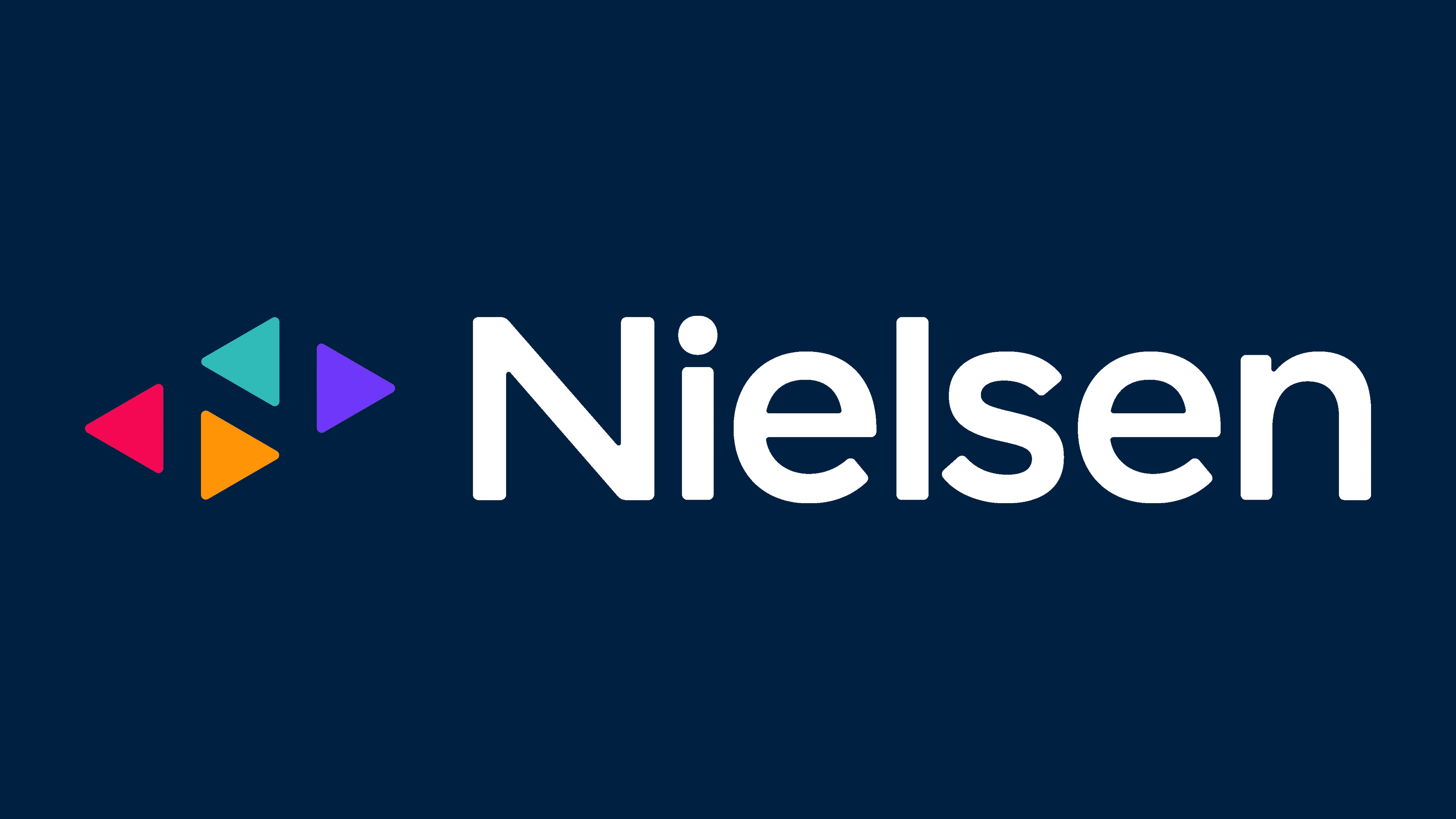
![]()
This Nielsen logo features a graphic symbol placed separately from the main inscription. It is located before the analytics company’s name and appears very bright. It includes four different colored triangles: purple, turquoise, orange, and raspberry. The geometric figures are miniature in size and freely positioned, as they are separate from each other, representing playback buttons. In the negative space, they form the letter ‘N.’ The right side of the emblem is occupied by an inscription, primarily in lowercase, except for the first glyph, which developers converted to uppercase. All symbols are grotesque, rounded, and semi-bold.
Font and Colors
Fonts reminiscent of Thames Serial Regular by SoftMaker, Big Caslon Regular by Matthew Carter, and Core Sans AR 55 Medium by S-Core have been used in logos from different periods. The first two have serifs, while the third does not.
Great attention is paid to the palette, as each color, according to Nielsen’s concept, serves a specific function. For example, green signifies upward movement (growth), orange conveys a striving for brightness, purple balances the surroundings, and red represents content that viewers “haven’t seen or heard.” Together with black, blue, and white, they reflect the diversity of mass media and the changing dynamics of opinion about them.