The Nikon logo is bright and soaring, like a bird in flight high above. The emblem conveys the idea of a brilliant flash that captures moments important and dear to the heart. The symbol represents technologies that connect the present and the future.
Nikon: Brand overview
| Founded: | July 25, 1917 |
| Founder: | Koyata Iwasaki |
| Headquarters: | Minato, Tokyo, Japan |
| Website: | nikon.com |
Born on July 25, 1917, under the original name Nippon Kogaku Kogyo Kabushikigaisha, or Japan Optical Industries Corporation, Nikon was the brainchild of Koyata Iwasaki. Initially, the enterprise concentrated on crafting optical lenses and related apparatus for cameras and instruments like binoculars, microscopes, and specialized inspection gear.
1946 marked a milestone for the company when it ventured into the camera market by introducing its camera, stamped with the Nikon brand name. A turning point came in the late 1950s and early 1960s when Nikon captured the public’s attention with its Nikon F line of single-lens reflex cameras, launched in 1959. These quickly became a hit and contributed to the company’s rising fame.
Reflecting its evolving identity, the company underwent a name change in 1988, rebranding itself as Nikon Corporation in homage to its successful camera line. Since then, Nikon has expanded its horizons considerably, diversifying into a broad range of technological products. These include systems for semiconductor and Flat Panel Display (FPD) lithography, specialized microscopes for biological research, instruments for industrial measurements, and equipment for X-ray and CT inspections.
In today’s landscape, Nikon stands as a titanic figure in the domains of optical and imaging technologies. Its products and services have impacted many sectors, such as manufacturing automation, energy solutions, healthcare technologies, and consumer entertainment.
Meaning and History
From the beginning, the company had a well-thought-out and stylish logo design that narrated the company’s focus and origins. Over time, a transformation was observed from a Japanese brand style to a European one. The stylish yet simple font of the English name became the brand’s hallmark for many years. The company also established signature colors, which make the brand recognizable.
What is Nikon?
A major conglomerate producing products for photography and cinematography. It is comprised of three divisions: Precision Equipment (medical equipment), Instruments (microscopes, telescopes, binoculars), and Imaging (cameras, camcorders). All these companies are unified under the Nikon Group. The corporate headquarters is based in Tokyo.
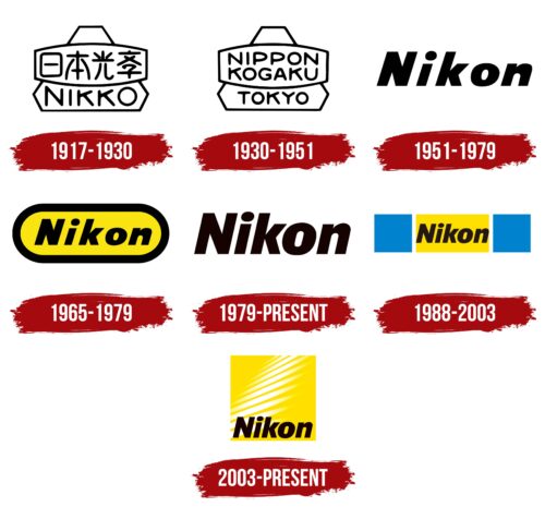
1917 – 1930
In 1917, the company was called Nippon KōGaku KōGyō Kabushikigaisha, translated into English as Japan Optical Industries Corporation.
The first emblem consisted of a triangle with truncated corners, resembling Mount Fuji. The country’s highest peak is 90 km from Tokyo, where the company was founded. The peak has always been closely associated with Japan, making the logo look patriotic.
Another reason for using the mountain was that Nippon was formed by merging two optical manufacturers, including Iwaki Glass. Its leading brand, Fujii, was named after Mount Fuji.
A rectangle with oval protruding sides was situated on top of the triangle, likely representing the emblem of the second company from the merger – Tokyo Keiki Company. The shape could signify navigational instruments, which the company also produced.
The faceted corners and convex elements of the emblem also indicated light refraction, lenses, and optics—the main products of the corporation. The rectangle’s shape resembled a biconvex lens from the side.
The company was informally called Nikko, taking the first syllable from Nippon, the letter “k” from KōGaku, and “ko” from KōGyō. This short name was written at the bottom of the logo in English and the center in Japanese.
1930 – 1951

Nippon KōGaku achieved high-quality glass that matched European competitors and began actively exporting optical products. That’s why the brand Nikkor was registered for camera lenses in the early 1930s.
The logo update marked this significant historical milestone. The symbol’s shape remained unchanged, but the emblem’s inscriptions were replaced with English words, understandable to Europeans.
At the center of the logo, inside the rim of a convex lens, instead of Japanese characters, was the phrase Nippon KōGaku. Below it was the name of Tokyo, where the company’s headquarters were located.
1951 – 1979
The emblem of the ’50s featured the word Nikon, printed in black font with a slight tilt. The name first appeared in 1946 and was coined as the brand name for compact cameras.
The name originated from Nikkō, a shortened name of the company and also the name of a well-known city in Onsen Town games. The literal translation of the name is sunlight. The company used this name as a brand for lenses. Written in a Western-style, the name became Nikkor. By changing the “r” to “n,” a new brand was formed. In ’46, it was spelled with two “k”s—Nikkon. Eventually, the name became the moniker for the entire camera line, and the double “k” was dropped.
Black matched the primary color of the camera bodies. The confident, slanted font indicated the product’s popularity and the range of models. The symbol, while simple and memorable, appeared as if viewed through the lens of a camera and signified the brand’s potential.
1965 – 1979
Famed Japanese designer Yūsaku Kamekura worked on the new visual identity. The 1965 logo design combined the shape of a lens and a camera. The symbol also resembled a caterpillar track, earning it Track Nikon.
A bold black oval outline enclosed the word Nikon on a yellow background. New portable cameras appeared as rectangles with rounded corners, which formed an oval when photographed from above.
The bold line indicates the durability and reliability of the products. It emphasized the need to protect the camera’s internal contents from light. The yellow color hinted at the flash and the pleasant memories captured by the camera.
A simple, concise inscription emphasized the compactness and ease of use of the new type of portable cameras.
1979 – today
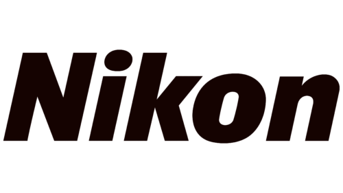
The new emblem is simply the brand name in black letters.
The symbol reflected the brand’s grandeur and role in the photo industry’s history. Nikon cameras have proven to be extremely lightweight, reliable, and durable. Over the past decade, they have been in space and on the Moon with Apollo 15, followed by the Mercury and Skylab programs. They have visited the North Pole. Merely uttering the name Nikon made it clear that top-of-the-line professional cameras were being discussed.
Thus, a simple inscription was sufficient to evoke the necessary associations. The emblem featured the familiar brand font with taller and closely spaced characters to demonstrate the company’s growing significance. The absence of graphical elements completely focused attention on the letters, making them easily memorable.
1988 – 2003
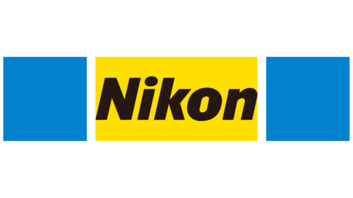
In 1988, the company changed its name to Nikon Corporation, following its famous brand. The updated logo design displayed the scale of the corporation. The traditional black lettering on a yellow background was given a blue frame to signify expansion and the name’s company-wide application. The color blue is associated with the vast ocean and endless sky. The design evokes a sense of space and projects an image of a large corporation with branches worldwide.
Side blue rectangles focus on the center, where the yellow figure with the lettering captivates. The composition showcased the auto-focus feature in action, hinting at the release of Nikon F4 cameras with autofocus.
2003 – today
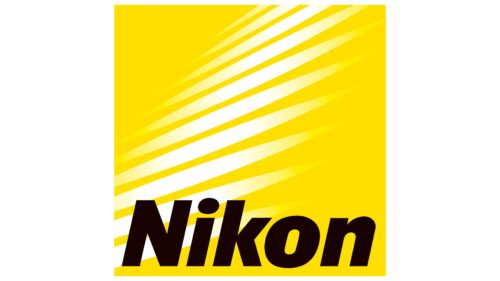
The modern emblem combines the brand’s signature colors. On a square yellow background, white glares are visible, soaring upwards like the flap of wings. The customary black name, present in logos since the brand’s inception, is placed at the bottom of the square.
White glares are flashes of light that carry the brand into the future, showing its commitment to constant improvement and adopting new technologies. The name serves as a solid foundation, indicating product reliability and quality.
In the logo, future possibilities merge with reliability, giving birth to new products that will delight the company’s clients.
Font and Colors
Black and yellow entered the brand’s history in 1965 and have been featured in the logos ever since. Black symbolizes product reliability and quality, creating a sense of precise accuracy. Yellow represents enthusiasm and the ability to capture the brightest and most pleasant moments of life for future generations. These are particles of happy memories that customers share with the brand. White glares emphasize the brand’s continual line-up refreshment.
The font of the lettering is straightforward and distinct: Syke Black Italic.
Nikon color codes
| Golden Yellow | Hex color: | #ffdf00 |
|---|---|---|
| RGB: | 255 223 0 | |
| CMYK: | 0 13 100 0 | |
| Pantone: | PMS 108 C |
| Licorice | Hex color: | #160200 |
|---|---|---|
| RGB: | 22 2 0 | |
| CMYK: | 0 91 100 91 | |
| Pantone: | PMS Neutral Black C |
