


![]() Nioxin Logo PNG
Nioxin Logo PNG
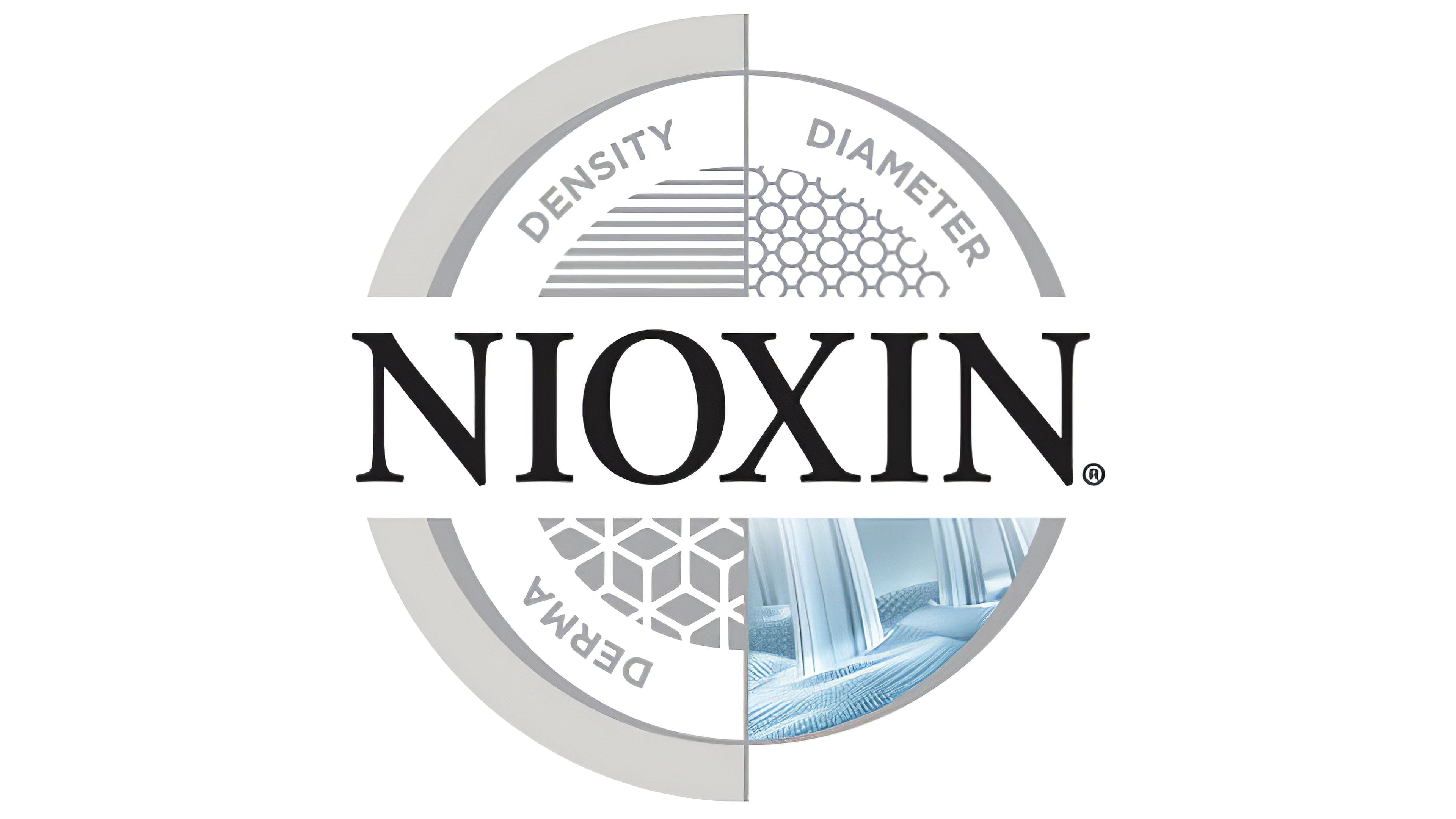
“Thinning hair will become strong,” the Nioxin logo promises. The emblem is a prototype of strong, elastic, and long hair. Brand products will provide their growth and protection. And buyers can only use and enjoy the effect.
Nioxin began in 1987 in Georgia, when Eva Graham faced post-pregnancy hair thinning. Existing products focused on shine and volume, while scalp care was absent as a category. She started experiments in a garage in Lithia Springs.
The concept treated the scalp as a separate biological system. Hair condition was linked to the follicle environment, shifting attention from styling to dermatological care. This approach shaped the Nioxin name and its core logic.
From the start, distribution was handled by professional salons. Graham personally worked with stylists, explained the method, and trained them. Adoption spread through salon networks rather than retail promotion.
In the late 1990s and early 2000s, her son Brian Graham became CEO. The company expanded beyond the US into Europe, Latin America, and the Asia-Pacific region. Before the sale, Nioxin products were present in over 40 countries and more than 85,000 US salons.
The brand built an education system focused on scalp diagnostics and protocols for thinning hair caused by genetics or medical treatments, including chemotherapy. This formed a professional niche within salon services.
At that time, competitors like Frédéric Fekkai under P&G and René Furterer under Pierre Fabre offered separate product lines. At the same time, Nioxin developed a full line focused on one problem. The company later estimated its share in the segment at about 75 percent.
In September 2008, Procter & Gamble acquired Nioxin Research Laboratories for about $300 million. The move complemented brands like Clairol and Wella, and aligned with the scalp-focused model used in Head & Shoulders.
Meaning and History
Since the grooming series is named after the drug, its name served as the basis for the emblem. It contains only one word, “Nioxin,” which has never changed since the line’s appearance.
The logo contains the brand name. It is written in large, uniform letters so that it immediately catches customers’ attention, is easy to read, and is quickly remembered. All signs are geometrically precise with sharp corners. Only the letter “O” has smooth lines, and the rest of the symbols have straight strokes. The word “Nioxin” covers the entire area.
What is Nioxin?
Nioxin is a brand of hair and scalp care products. It was founded in 1987 by Eva Graham and has since offered products designed to effectively restore, nourish, and strengthen hair. Special emphasis is placed on problematic hair: thinning hair. To address these issues, the company develops comprehensive lines of branded products.
Font and Colors
The inscription on the emblem is in capital letters. The typeface is classic, with distinct serifs and thickening of the central elements: “N” has both thin legs, “X” has the left one. The color scheme is black and white: dark letters on a light background. There are also options in light silver and dark gray palettes.