The company logo symbolizes renewal. Products cleanse the skin and help it shine with purity and health. The Nu Skin logo exemplifies the rebirth and rejuvenation that results from using the brand’s products.
Nu Skin: Brand overview
| Founded: | 1984 |
| Founder: | Blake Roney, Steven J. Lund, Sandie Tillotson, Nedra Roney |
| Headquarters: | Provo, Utah, United States |
| Website: | nuskin.com |
Meaning and History
It was important for Nu Skin to show its uniqueness as a manufacturer of innovative products for face, body, and hair care. Its range of products is not limited to cosmetics – it includes a variety of beauty and health products that allow you to arrange a spa at home. The main concept of the brand is to prolong youth, which is reflected in its visual identity. After all, the artists who created the emblem did not just draw gracefully curved lines – they presented their own interpretation of the so-called fountain of youth. It is believed that this legendary spring prolongs the life of all who drink from it. Moreover, he does not just return the lost years but makes all people beautiful. That is, Nu Skin positions itself as a magical source of attractiveness that can stop the aging process.
What is Nu Skin?
Nu Skin is one of the two main brands of Nu Skin Enterprises, an American company that operates on the principle of multi-level marketing. It recruits distributors to sell personal care and nutritional supplements in 54 markets. The full lineup includes color cosmetics, dietary supplements, skincare, haircare, and oral care products.
1984 – 2008
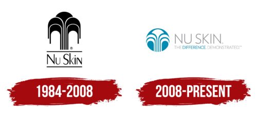
The global beauty company used to be a small limited edition company with a black and white logo. It appeared in 1984 and, from the first days, offered a little more than ten products that were wildly popular. Nu Skin evolved gradually, but its logo did not change until 2008.
The manufacturer made a huge leap when he bought Pharmanex and was able to take care not only of the beauty of customers but also of their health. This was consistent with his concept because, as already mentioned, the miraculous fountain was depicted on the Nu Skin logo – a source of youth and strength. It consisted of five elements, four of which looked like stylized arches and were mirrored. Another fragment was in the center and resembled the silhouette of a flower on a long stem. And the brand’s name was at the bottom, between two horizontal lines. The designers used a contrasting sans-serif font for it. Remarkably, the lowercase “n” looked almost like a capital “N” but was not angular.
2008 – today
The trademark logo consists of two parts: text and graphic. It was approved in the year the brand was launched and is still relevant today.
A circle lined with smooth lines is used on the brand name. The resulting image can be interpreted differently: it can be a fountain or a mirrored gate. Moreover, there is not a single straight line in the image – all are semicircular and streamlined.
The verbal part consists of two lines. The upper one is the brand name written in large capital letters. The lower one is the motto of THE DIFFERENCE. DEMONSTRATED. “, Executed in small uppercase characters.
Nu Skin: Interesting Facts
Nu Skin is a company that sells personal care items and dietary supplements, starting in 1984 in Provo, Utah.
- Beginnings: Founded by Blake Roney, Sandie Tillotson, and Steve Lund, Nu Skin wanted to make skin care products that were both innovative and natural. Now, it operates in over 50 countries.
- Innovation: Nu Skin is known for creating unique products, especially the ageLOC line, designed to make aging less noticeable.
- ageLOC Technology: This technology focuses on the causes of aging and is used in various products to help people look younger.
- Giving Back: The Nu Skin Force for Good Foundation helps children worldwide live better by supporting health, education, and economic projects.
- Direct Selling: Nu Skin sells its products through independent distributors, which allows people to start their businesses.
- Global and Culturally Aware: As it expanded, Nu Skin adapted its products and marketing to fit the tastes and needs of customers in different countries.
- Expert Guidance: A Scientific Advisory Board of renowned scientists guides Nu Skin in product development, ensuring it is scientifically sound.
- Awards: The company has received numerous awards for its products and social responsibility efforts.
- Quality Focus: Nu Skin is serious about the quality and safety of its products, following strict standards and testing thoroughly.
Nu Skin stands out for its commitment to innovation, quality, and making a positive difference in personal care and dietary supplements.
Font and Colors
The parent company chose three types of typefaces, which they use to design the logo, depending on the situation: Verlag – for the corporate version, Proxima Nova – for the web version, Freeland – for visual accent. The original palette includes blue (circle and one word), light gray (lettering), white (fountain).
FAQ
What is the tagline of Nu Skin?
Nu Skin’s tagline is “Discover the Best You®.” It shows their commitment to helping customers achieve their best selves with high-quality skincare and wellness products.
The tagline suggests a journey of self-improvement and empowerment. It emphasizes that everyone can unlock their potential and enhance their well-being with the right products and support.
Who owns Nu Skin?
Blake Roney, Sandie Tillotson, and Steve Lund founded the company. They aimed to create a company offering innovative personal care products with a philosophy of “all of the good, none of the bad.” They wanted to provide a generous business opportunity to attract top salespeople.
Blake Roney shaped the company’s vision, Sandie Tillotson contributed her product development and marketing expertise, and Steve Lund focused on business operations. Together, they built a global leader in personal care and wellness.
Today, the company is publicly traded, with ownership shared among individual and institutional shareholders who hold its stock. The founders’ vision continues to guide the company’s operations and product development.
What does Nu Skin do?
Nu Skin is a global beauty and wellness company that helps people look, feel, and live their best. They offer products that combine science, technology, and nature, including an award-winning line of beauty device systems.
The company focuses on innovative skincare and wellness products. It uses advanced scientific research to create formulas that promote healthy, youthful skin. Its beauty devices enhance the effectiveness of its skincare products, giving users professional-level results at home.
In addition to skincare, the brand offers health and wellness products, including supplements and nutrition programs. These products support overall well-being and help people achieve a balanced and healthy lifestyle.
What does the Nu Skin logo mean?
The logo has a deep meaning and can be interpreted in many ways. Officially, it symbolizes the fountain of youth, a source of healing water that prolongs beauty and vitality. This aligns with the brand’s mission to help people look and feel their best through innovative skincare and wellness products.
Some see the logo as a mirror gate, suggesting a gateway to self-discovery and improvement. This interpretation reflects the brand’s commitment to personal growth and transformation.
Both interpretations highlight key aspects of the brand’s philosophy: promoting beauty, health, and a journey toward becoming the best version of oneself.
What is the font of the Nu Skin logo?
The logo uses a thin geometric font from the Proxima Nova family, based on Proxima Sans. Designed by Mark Simonson, this font is a mix of classic grotesque typefaces and Futura.
Proxima Nova gives the logo a modern and clean look. Its geometric shapes and balanced proportions create a sense of professionalism and simplicity. This font choice aligns with Nu Skin’s values of innovation and quality and focuses on enhancing beauty and wellness. The font’s clean lines and contemporary style convey the brand’s commitment to providing advanced and effective products.
