


![]() Obama Logo PNG
Obama Logo PNG
Each Obama logo looked bright and spectacular. There were only two of them. The first was created before the first presidential term, and the second, respectively, before the second term. They differed significantly from each other, but the central element was always the same. This is a symbol of the rising sun, set against the backdrop of a small hill. At different times, it was supplemented with original inscriptions, but the main one is the fragment with the sun.
Barack Obama’s political brand began before the presidency. Born in Honolulu on August 4, 1961, he grew up between Hawaii and Indonesia, then studied at Columbia University and Harvard Law School. In 1990, he became the first Black president of the Harvard Law Review. This role brought his name into the national media.
Obama entered politics in Illinois, serving in the state senate from 1997 to 2004. His national breakthrough came at the 2004 Democratic National Convention, where his keynote speech turned him into a rising figure in the party. That same year, he won a U.S. Senate seat from Illinois with 70% of the vote against Republican Alan Keyes.
In February 2007, Obama launched his presidential campaign against Hillary Clinton, then seen as the Democratic favorite. His team relied on small online donations, digital communication, and a visual identity built around the “O” logo by Sol Sender. In 2008, Shepard Fairey’s “Hope” poster and slogans such as “Yes We Can” and “Change We Can Believe In” helped turn the campaign into a national political phenomenon.
On November 4, 2008, Obama defeated John McCain with 365 electoral votes, becoming the 44th U.S. president and the first Black president in American history. In 2010, his administration passed the Affordable Care Act, known as “Obamacare.” In 2012, he defeated Mitt Romney with 332 electoral votes. After leaving office in January 2017, Barack and Michelle Obama founded Higher Ground Productions. They later signed a major content deal with Netflix.
Meaning and History
![]()
During his election campaigns, designers created incredibly stylish and patriotic logos that reflected his aspirations and political direction. They reflected the hope for a new life, a course towards liberalization, and new, effective solutions. Outstanding colors also complemented symbolic signs. They included colors similar to those used on the American flag.
What is Obama?
Barack Obama is a cult figure who has made a huge contribution to the development of the United States of America. The politician became the first African-American President of America and held this post for two presidential terms (from 2009 to 2017). During his reign, he adopted several important laws that helped the country recover from the crisis, contributed to the development of the automotive industry, and improved the healthcare system. In addition, he implemented many other important reforms that improved the state of affairs in the United States.
2007 – 2008
![]()
In 2007, Barack Obama officially submitted his candidacy for the presidency of the United States. It was then that the first election campaign started, during which the first logo was created. The badge’s creation was entrusted to the well-known design company Sender LLC. The firm’s creative director led the project. Saul Sander started the project at the end of the previous year and already presented the finished picture in 2007.
The designers’ idea was based on a stylized letter O. It was not only associated directly with Barack Obama but also carried additional semantic weight. It was shaped like a rising sun, set against a light blue background reminiscent of the sky. Below was a mound in striped form, reminiscent of the colors of the American flag. Under the picture were two inscriptions: “Barack Obama ’08” and the website address.
The chosen stylization meant hope, enlightenment, and positive change. That was the basis of the politician’s election campaign. The color scheme included blue, red, white, and a light shade of blue, which are directly associated with state paraphernalia. So the future President demonstrated his strong patriotism.
2011 – 2012
![]()
In April 2011, the President announced his intentions to run for a second presidential term. After that, a new election campaign was launched, held under the updated logo. It still had a picture of the rising sun as a sign of an unchanged political course. But the President’s aspirations have taken on a new character, as reflected in the emergence of new details.
The updated logo was a rectangle with a large inscription reading “2012” inside. It was the year when the presidential elections were held directly. The figures had a massive, confident shape and occupied most of the space. Inside 0 was the traditional symbol of a politician – a round frame with a rising sun inside. This approach emphasized the politician’s stability and unchanging values in the struggle to improve the country’s situation.
Complementing the visual concept are well-chosen colors. For the background, a light blue was used, which symbolizes trust, reliability, and security. The numbers were painted white, symbolizing another important quality of the future President: honesty and openness. Within the rising-sun symbol, red was also observed, denoting vigor. By tradition, the icon was supplemented with a miniature inscription in the form of the address on Barack Obama’s website.
2012 – today
![]()
Despite the different designs of the election campaign logos, they were united by one small but expressive detail: a symbol in the form of the letter O with an image of the rising sun. It is considered the main logo of a famous person and is now recognized by many people. The stylized drawing features a rounded frame, inside which a white circle rises against a striped background.
In this case, the white circle symbolizes the sun, which rises against a clear blue sky and a small hill. All elements are harmoniously combined into a single whole, reflecting the main principles of the policy of the 44th American President. The logo demonstrates patriotism, faith, a bright future, a course toward improving the country’s situation, and honest fulfillment of the assigned obligations.
Font and Colors
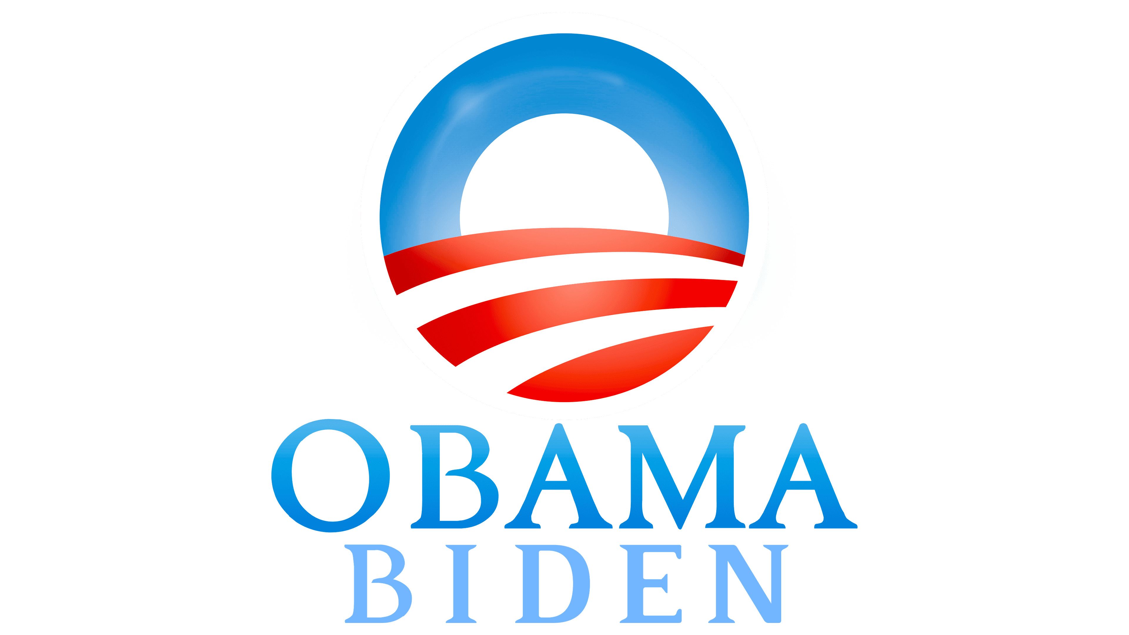
The main logo of the legendary President Barack Obama is a bright, expressive image that combines several symbolic elements. The base is a neat, even circle denoting the letter O. It is a direct reference to the personality of a well-known politician, and additional elements demonstrate his aspirations and principles of activity. A small white circle, located inside the frame, evokes associations with the rising sun.
It shows several important aspects of the political course: honesty, hope, perspective, and revival. In addition, white symbolizes honesty, which is very important for a presidential candidate. The picture is complemented by a blue background resembling the sky. The semantic load of this detail is trust, reliability, and authority. The hill-like part is done in white and red. The latter is a symbol of energy and vitality, both of which characterize a politician’s personality.

If we consider the color scheme in Unity, it repeats the colors used in the American flag. This is another important feature that demonstrates a strong sense of patriotism and a desire to significantly improve the country’s state of affairs. This is exactly what the 44th President of the United States put into practice. During his reign, he boosted the economy, improved infrastructure, and supported important industries.