


![]() Olmeca Tequila Logo PNG
Olmeca Tequila Logo PNG
The Olmeca Tequila logo tells the story of tequila’s ancient roots. A deep reverence for the civilization that gave rise to the alcoholic beverage is evident in the sign’s symbols. In the shades of the emblem, there is a hint of the color of the agave from which the distillate is made.
Olmeca Tequila traces its background to 1873, when the Colonial distillery began operating in Arandas, Jalisco. The official brand story starts in 1967 with the registration of the Olmeca trademark. Its name refers to the Olmec civilization of Mesoamerica. At the same time, the logo uses a stylized stone head inspired by Olmec sculpture.
Seagram’s entered tequila in 1967 by buying a distillery in Tequila. In the 1990s, it signed a distribution deal with Patrón. It financed the new Colonial de Jalisco distillery in Arandas to support Patrón’s growth. The plant opened in October 1997, but four months later, Patrón’s owner, St. Martin’s Spirits, ended the deal. Seagram’s redirected the site to its own tequila brands, Olmeca and Mariachi.
In the late 1990s, Seagram’s shifted toward media, acquiring Universal Pictures and PolyGram Records in 1998. After its 2001 merger with Vivendi, the drinks portfolio was sold and split between Pernod Ricard and Diageo. Olmeca and the Arandas production site were acquired by Pernod Ricard, which provided the brand with dedicated management and stronger global promotion. Sales then grew by 20 to 30 percent annually, and in 2003, Olmeca received international awards as a leading tequila.
In 2009, Olmeca Altos was developed with British bartenders Henry Besant and Dre Masso, along with master distiller Jesús Hernández. The 100% blue agave line used the tahona method for bar-focused tequila. In 2014, Pernod Ricard updated the brand with a Chris Mitchell logo and darker bottle colors. Olmeca later became the top-selling tequila in EMEA and stayed in the global top 5 outside the United States and Mexico.
Meaning and History
![]()
Under the Olmeca brand, the drink has been produced since 1967. Tequila is named after the first ancient civilization (2nd-1st century B.C.) that existed in the middle of the American continent (in the south and center of today’s Mexico). The Olmecs were the ancestors of the country’s cultural features. They were the first to prepare alcohol from agave. The drinks of the modern brand are made according to ancient recipes. Therefore, an authentic name was chosen for the product. Colonial, which opened in 1873, is responsible for the production. Part of the pinyas is processed using an ancient tahona wheel, and the resulting liquid is added to all brand varieties in varying proportions.
During its existence, the tequila logo has changed three times, and only in the last six years, after Pernod Ricard’s purchase in 2001. Before that, for almost 50 years, the drink had a permanent logo. Modern changes were not cardinal either and didn’t touch the brand’s main visual symbol, an unusual head at the center of the composition.
What is Olmeca Tequila?
This is a premium Mexican tequila brand produced in the heart of Jalisco, where tequila holds a protected designation of origin. The production uses ripe blue agave grown in highland regions, where the plant reaches its highest concentrations of sugars and aromatic compounds due to unique climatic conditions. The brand offers various types of tequila, including the ultra-premium Altos line, developed in collaboration with renowned bartenders, the aged Gold (Reposado), and the classic Silver (Plata). The uniqueness of the production process lies in combining traditional methods, such as roasting agave in brick ovens and distilling in copper stills, with modern quality control systems, creating a tequila with bright citrus notes and a rich agave flavor.
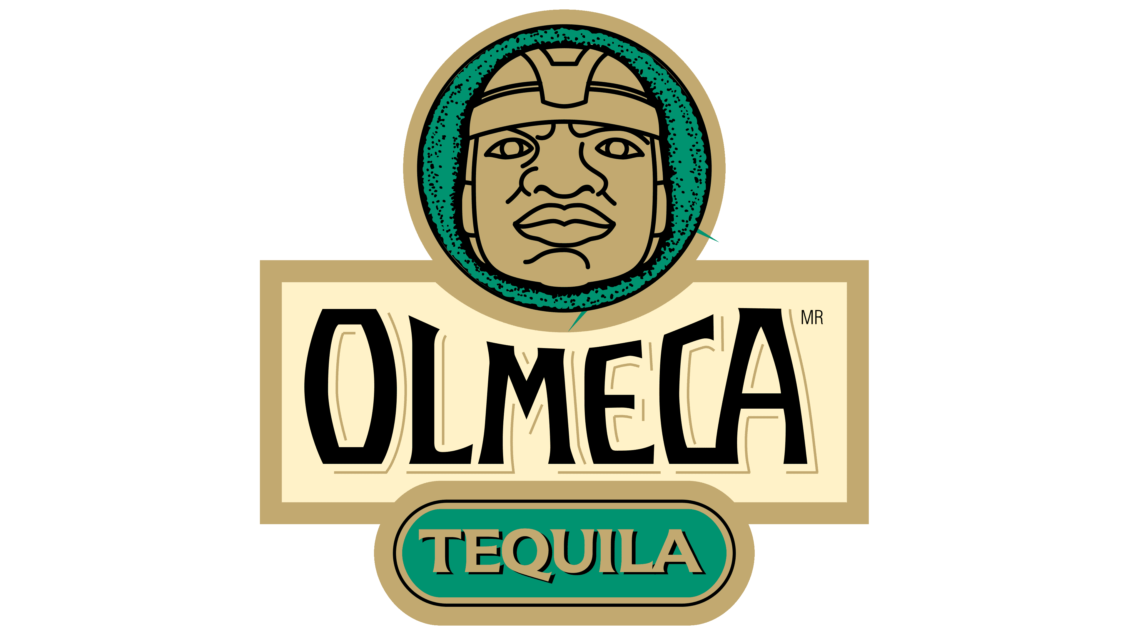
1967 – 2014
![]()
Preserved artifacts of ancient civilization were used as visual brand symbols on every bottle, including ancient writings. And on the logo, a stone portrait of the ruler of the Olmec civilization. It is copied from one of the unusual sculptures found by archaeologists in the coastal lands of Mexico. The Olmecs carved the head from volcanic rock. Probably the same rock used to make the first tachones for tequila production. The sculptures represent the history and roots of the Mexican land and express the culture of ancient peoples. That is why the image was chosen as the drink’s main sign. According to ancient beliefs, the head contains a person’s soul and experience. And in every bottle of tequila is the experience and soul of its producers and the Mexican land.
The brand’s name is written on a rectangular plate, similar to the signature under a museum exhibit. The letters are chosen ancient as if carved from stone, which corresponds to the spirit of the drink. The first and last characters are larger than the central part of the inscription. They show that tequila has retained its unique taste from its inception to today; below the brand name, the inscription “tequila,” which indicates the original drink, can be produced only in five regions worldwide.
All logo elements are done in gold to present Olmeca Tequila as an ancient and valuable product.
2014 – 2018
![]()
In 2014, the tequila owner restructured the company. As a result, promotion and branding options were also updated. A new logo has been developed for Olmeca by designer Chris Mitchell. It emphasized the brand’s features and was realistic.
The head and trim of the plaque were done in a color that matched the actual sculpture. The logo’s background received color. This changed depending on the tequila, from deep red (the most common) to chocolate. Red was associated with the inner fire that fuels tequila, the red volcanic soils of tequila agave, and the brick ovens for its roasting.
The font and spelling features of the brand name have not changed. And the inscription color changed to white. To reveal all the flavors of the drink, it is served chilled. During production, standards are observed to ensure environmental safety, and only natural ingredients are used. Therefore, the color indicated the naturalness, purity, and coolness that distinguishes Olmeca.
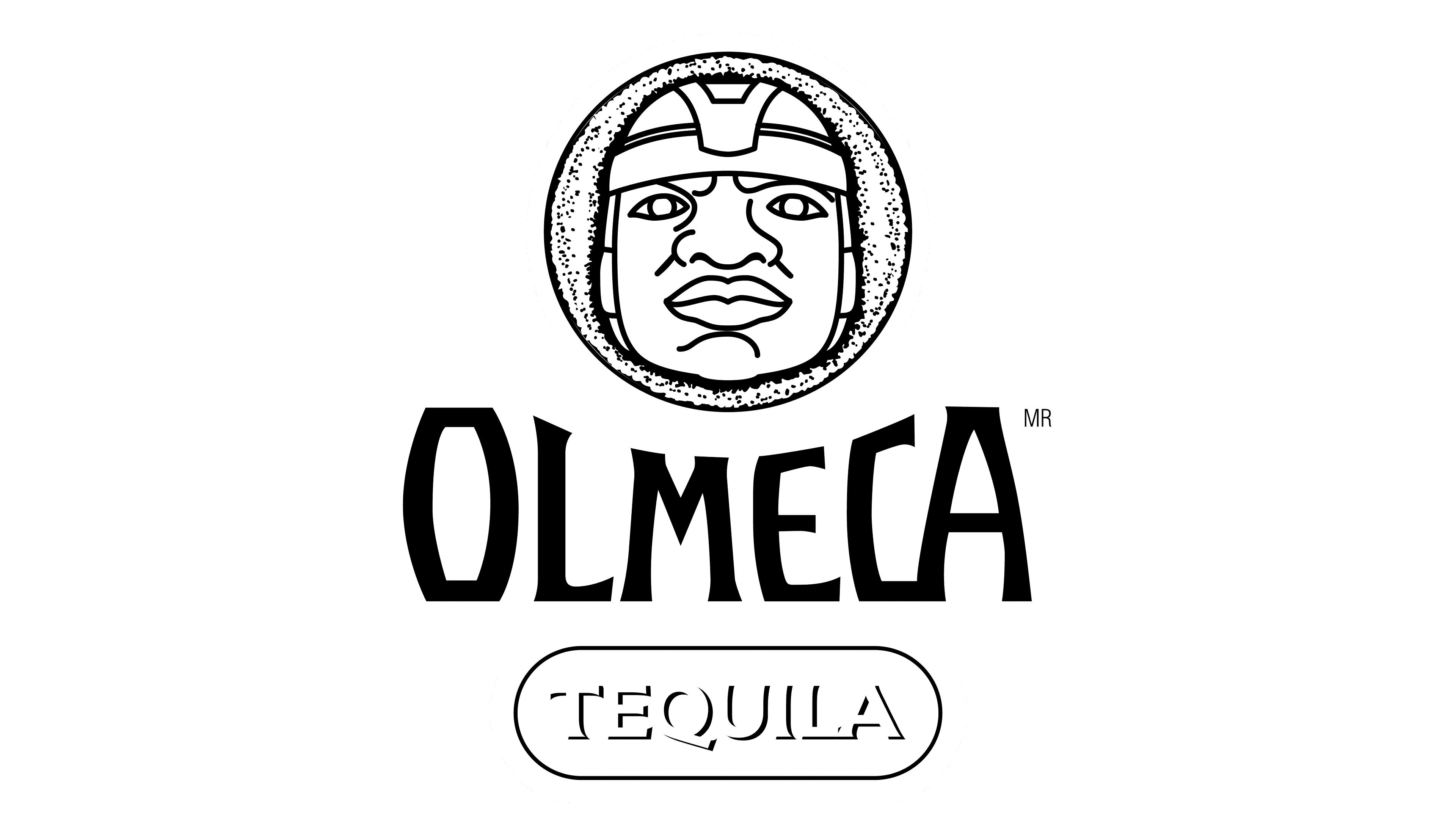
2018 – today
![]()
In 2018, Elliott Management Corporation became a partial owner of Pernod Ricard, which affected the business policy. A new stage of development for the brand “Olmeca Tequila” included a more modern market presence. The renowned French creative studio Yorgo & Co. has created the new visual identity for Olmeca. The studio made the image more stylish. All lines of the emblem are thin and clear. The head looks stricter and does not resemble a stone head. However, Mexican features are preserved and visible in the emblem. The inscription “tequila” is made in the same font as the main brand name.
Font and Colors
A feature of tequila logos is the use of a single color throughout the image. The last shade of the emblem is moray. It is a mixture of blue and green with a slight gray undertone. The color is deep and noble. It corresponds to the agave leaves from which tequila is made.
The logo’s font does not match the exact look, but it has features of Lentz’s Bold and Los Lana Niu Pro Black.