



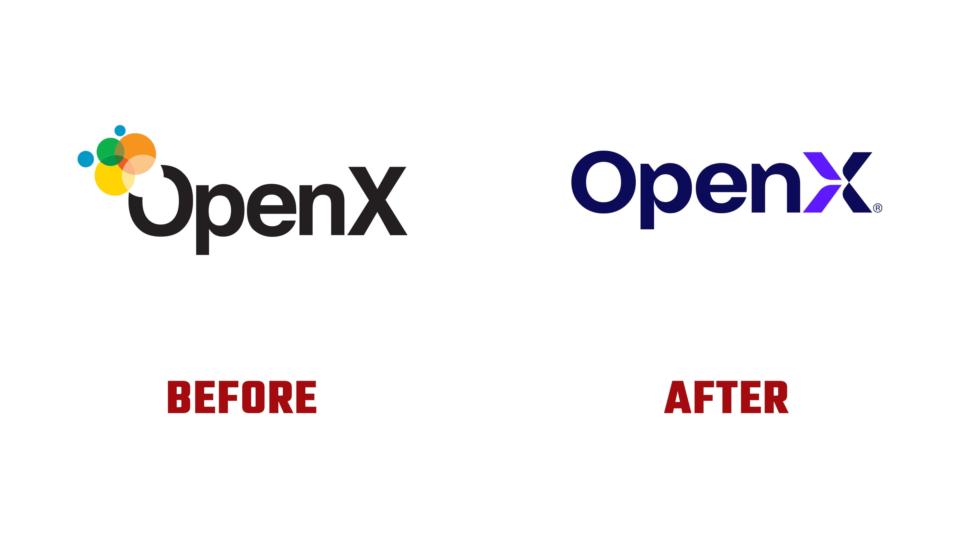
OpenX has introduced a new logo and positioning as “The Intelligent SSP.” Announced on April 13, 2026, the update accompanies changes to how the company presents its products and the launch of a new website. A wordmark with a purple accent in the “X” replaces the multicolored circle emblem introduced in 2008.
The company is developing a supply-side platform to automate the sale of advertising inventory on websites, in apps, and on connected TV. OpenX attributes the update to the growing complexity of advertising technology and the increasing use of artificial intelligence. Long chains of intermediaries make it difficult to assess inventory quality and understand costs. The company aims to shorten the path between ad buyers and publishers, provide verifiable data, and make products easier to compare.
The OpenX name remains. In a launch announcement, Amanda Forrester connected it to the company’s history, its support for quality media, and the principles guiding its work on advertising infrastructure. “The Intelligent SSP” brings together three areas of focus: data, automation, and AI use on the publisher side of the advertising market.
The previous logo expressed openness through a gap in the upper-left section of the “O.” Following the announcement, Scott Switzer, who had helped select the name and develop the emblem, explained the original idea. Multicolored circles symbolically entered the letter through the gap, representing ideas flowing into the company and its community. Light blue, green, yellow, and orange circles varied in size, partially overlapped the “O,” and created additional colors where they intersected.

The logo now consists of a wordmark alone. The “O” has been closed, and a dark, indigo-like blue replaces black. The OpenX capitalization remains, with uppercase “O” and “X” surrounding lowercase “pen.” The letters are still bold and sans-serif, with rounded counters. The color accent has moved from the beginning of the name to its final letter.
The “X” is built from four diagonal segments. The two on the left are bright purple, while the two on the right match Open’s color. Their outer ends are flat, while the strokes curve and taper as they approach the center. White gaps separate the pieces, leaving their meeting point open. Four distinct sections replace the intersection of two continuous diagonals.

OpenX’s marketing and technical teams worked on the project. Amanda Forrester credited Creative Director John Nguyen, along with Sydney Held, Narender Kumar, Krzysztof Szczygieł, Zoey Larsen, Tiffany Tai, Nick Van Amburg, Ryan Christopher, Jen Eaton, and James Lee. Sydney Held and Narender Kumar contributed to the new website.
The company also organized its product offering under four names. OpenXSelect helps users choose advertising placements, OpenXBuild provides development infrastructure, OpenXControl manages monetization, and OpenXExchange identifies the ad exchange. The shared prefix links the tools to OpenX, while the suffixes indicate their functions. The website update includes a series of educational videos on advertising technology and AI.