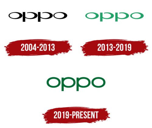
The Oppo logo is a model of simplicity and elegance. The emblem represents modern products that meet the needs of consumers here and now. The symbol is part of the company’s brand style, which grows and changes with customers.
Oppo: Brand overview
| Founded: | 10 October 2004 |
| Founder: | Tony Chen |
| Headquarters: | Dongguan, Guangdong, China |
| Website: | oppo.com |
Originating in Dongguan, China, in 2004, Oppo was the brainchild of Tony Chen and initially delved into the production of MP3 and Blu-ray players. The company forayed into the realm of mobile phones in 2008 with a device whimsically dubbed the “Smiley Face” phone. However, it wasn’t until 2011 that Oppo marked its entry into the smartphone market.
By 2016, Oppo had captured the Chinese smartphone arena, boasting over 200,000 retail locations and introducing innovative features like rotatable cameras. It wasn’t long before the company set its sights on global expansion, making its mark in European and Indian markets and forging partnerships with carriers to establish itself in locales like Australia.
The year 2019 was pivotal for Oppo for multiple reasons. The company secured sponsorship deals with high-profile tennis competitions like Wimbledon and Roland Garros and committed to investing $7 billion over three years in research and development. This investment aims to push the envelope in 5G technology, the Internet of Things (IoT), and Artificial Intelligence (AI).
Today, Oppo stands as one of the leading smartphone manufacturers worldwide. It has garnered acclaim primarily for its cutting-edge camera functionalities and rapid charging technologies, with notable models including the Find X and Reno series. The brand operates under the umbrella of its parent entity, BBK Electronics, which also owns other prominent smartphone labels like Vivo, Realme, and OnePlus.
From its humble beginnings crafting media players to its contemporary status as a global smartphone juggernaut, Oppo has carved out a reputation for being at the forefront of camera and charging innovations. It continues to concentrate on developing groundbreaking technologies.
Meaning and History
The brand emerged in 2001 as part of the large corporation BBK Electronics but became fully operational and launched its first MP3 player product in 2004. That’s when the first logo appeared. Each rebranding marked new milestones in the company’s development and an expansion of its product line. The gradual transformation of symbols indicated the brand’s growth and maturation.
What is Oppo?
A Chinese brand that produces headphones, players, and mobile phones in series A, N, R, K, Find, Reno. The company employs 1,400 engineers, ranking fifth worldwide within 15 years. The smartphones from the company are the thinnest in the world. Since 2019, they come with a hybrid optical zoom with 10x magnification, earning them the nickname “selfie expert.”
2004 – 2013
The Oppo logo consists of the name written in lowercase black letters. The brand name originates from the English word “opportunity” to convey the new features available to customers with the company’s phones.
The rounded characters resemble the strokes of an experienced artist, symbolizing harmony and beauty. They represent the smooth lines of the new gadgets’ design.
Each letter of the word includes an ellipse. This shape conveys themes of completeness, perfection, and eternity. Earth revolves around the Sun in an elliptical orbit, the Moon around the Earth, and the Solar System is located within a spiral elliptical galaxy. This analogy indicates that:
- Brand products are natural and organic. They integrate into reality as an integral part.
- The brand is constantly moving and evolving in tandem with life on Earth.
- The company has a grand future and plans to exist indefinitely.
In the letter O, open glyphs convey a readiness to adopt modern developments, accept new things, and transform.
2013 – 2019
In 2011, the company released its first smartphone, and in 2013, it entered the global smartphone market, marked by a logo update.
The main change in visual identity was the color palette shifting from black to green.
The light lettuce color reflected the brand’s novelty to the global community and conveyed the ultra-thin design of the phones. Like young green grass, Oppo emerged among renowned competitors and plans to grow and earn a worthy place in the phone Olympus.
2019 – today
In 2019, the company introduced a revised logo. Eddie Opara, a well-known English designer and a partner of the New York design agency Pentagram, worked on its development for two years.
The emblem remained textual but underwent a font and color change. The deep green shade of the inscription indicates:
- Growing influence of the company in the market,
- Constant growth and development.
The color presents the brand as alive and prepared to meet customer needs.
Font and Colors
For different company products, Green is used in several shades, from dark to light. In digital printing, the color retains its saturation. The shade resonates with life and development, promising a wealth of features and long-lasting use.
The font of the inscription was specially created for the emblem and is called OPPO Sans. It combines classic and Gothic elements, considering the brand’s unique features, style, and spirit. Straight, perfectly crafted letters are harmonious and embody the craftsmanship and quality of the brand’s products.
Oppo color codes
| Cadmium Green | Hex color: | #006b34 |
|---|---|---|
| RGB: | 0 107 52 | |
| CMYK: | 100 0 51 58 | |
| Pantone: | PMS 348 C |


