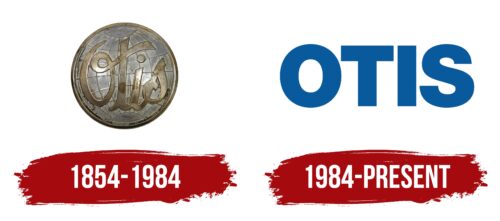
Although the Otis logo looks powerful and stylish, it is designed in a minimalist style. Designers used only one element – the name of the company itself. But, they chose a special format that fully reveals the brand’s main message. It lies in the fact that the company offers customers high-tech, reliable, safe products that show excellent results in practice. These advantages are manifested in the basic colors and incredibly massive forms.
Otis: Brand overview
| Founded: | 20 September 1853 |
| Founder: | Elisha Otis |
| Headquarters: | Farmington, Connecticut, U.S. |
| Website: | otis.com |
Meaning and History
Otis is one of the most famous lifting equipment manufacturers in the world. He began his work more than 100 years ago, and during this time, he was able to bring this technique to perfection. Today, this company’s moving mechanisms are valued worldwide and are considered a real mark of quality in this segment. Such success was achieved by increasing the production base and applying innovative solutions in production.
In addition, the company’s founder was the first in the world to create safe elevator technology. Despite the impressive facts and features of the manufacturer, its visual identity is rather strict and restrained. Over the entire period, Otis management only rebranded once. As a result of the decision made, the current logo was created. It demonstrates the main principles of activity – quality, reliability, and durability.
What is Otis?
Otis is one of the best companies in the lift industry. The brand is of American origin, but its products are highly valued far beyond the country’s borders. Otis lifts are used in many places of worship, including the Petronas Towers, the Eiffel Tower, and the Empire State Building. All of them are created according to the principle of a safe elevator, which was developed directly by the company’s founder.
1854 – 1984
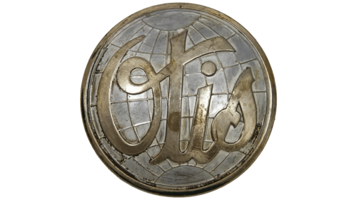
Elisha Graves Otis founded Otis in 1854. An experienced inventor has greatly contributed to developing the production of moving lifting units at the world level. Striving for this in the early stages of the company, he instructed the designers to create an appropriate logo. As a result, the basis of its first version was a stylized sign of the globe, complemented by an expressive brand name.
The graphic element was simple and minimalistic. It consisted of flat thin contours connected at the top and bottom of the circle. The use of this figure meant the global nature of the enterprise. The founder planned to manufacture the best moving equipment in the world and organize deliveries to the foreign market. In addition to the symbolic element, the logo also includes the brand name. The inscription was located inside the globe.
An elegant font was used for the design, which resembled a handwritten style with original curves. It symbolizes the creative approach, the uniqueness of the brand, as well as its desire for beauty. In practice, this meant that Otis produced not only high-quality but also stylish equipment. Additional characteristics of the brand are also emphasized by the strict achromatic color scheme, consisting of white and black colors. A dark shade demonstrates solid status and authority, while white is a symbol of responsibility.
1984 – today
In 1984, the old laconic badge was replaced with a modern version of the logo. It is fundamentally different from the previous version. It does not have a figure of the globe and elegant lines. Designers have simplified the design as much as possible by choosing only the company’s name without any decorations. Now all attention has shifted directly to the name of the manufacturer.
The reason for this decision was the incredible success of the company. Otis has not only entered the international market but has become one of the world’s best brands. This explains the absence of unnecessary elements and frames. The manufacturer declares itself as a leader in its segment. This is also emphasized at the level of font selection and coloring. The letters of the inscription are quite massive, and the color scheme consists of basic soft shades.
Font and Colors
The current Otis logo is an example of a brand design that is timeless. It combines a modern roman typeface with a versatile colorway that stands for timeless values. The uniqueness of such a logo is also in the fact that the designers were able to convey the whole meaning through just one inscription. Part of the information lies in the particularly massive letters used to decorate the name.
Large shapes, which are distinguished by straight cuts and straight lines, symbolize confidence, calmness, and security. In addition, the chosen coloring also has a semantic load. The rich blue color of the inscription means trust, reliability, and strength. This is the basis of the palette. The standard white color was chosen as the background, denoting conscientiousness and honesty. Guided by these principles, the brand was able to create high-quality designs that were appreciated by hundreds of buyers.
Otis color codes
| Lapis Lazuli | Hex color: | #065a9d |
|---|---|---|
| RGB: | 6 90 157 | |
| CMYK: | 96 43 0 38 | |
| Pantone: | PMS 2945 C |


