


 Outback Steakhouse Logo PNG
The Outback Steakhouse logo conveys the spirit of a place where dishes turn dinner into a journey inspired by Australia’s atmosphere. The establishment was created to combine hospitality, culinary traditions, and a relaxed setting, making exquisite meat dishes accessible and inviting.
Trudy Cooper, Tim Gannon, Robert Basham, and Chris Sullivan founded Outback Steakhouse in Tampa, Florida, in 1988. None of the founders had visited Australia before opening the first restaurant. Still, they used an Australian theme to separate it from conventional American steakhouses. Expansion began in 1989, and Gannon’s Bloomin’ Onion became one of the chain’s best-known items.
By 1993, Outback operated 49 restaurants across several US states. That year, Bloomin’ Brands was created to manage the growing restaurant group, and the company went public in 1994. International expansion followed, with the first Canadian location opening in 1996 and the first South Korean restaurant in 1997.
A revised menu introduced in 2001 kept steaks at the center while adding seafood and vegetarian dishes. In 2007, an investment group led by Bain Capital Partners and Catterton Partners acquired the business for $3.2 billion. From 2010 to 2012, restaurants received updated interiors, service systems, menus, and customer technology. Bloomin’ Brands returned to the public market through an IPO in 2012.
From 2015 to 2017, the company invested in renovations, delivery, equipment, and digital ordering. The chain marked its 30th anniversary in 2018 with menu changes, returning dishes, and a loyalty program. Mobile ordering and reservation tools expanded from 2020 to 2022. By 2023, Outback had grown from one Florida restaurant into a franchise with more than 1,000 locations in 23 countries.
Meaning and History
What is Outback Steakhouse?
This restaurant combines the traditions of steakhouses with an Australian atmosphere, offering guests delicious dishes and a cozy environment. It serves juicy steaks, seafood, chicken dishes, and unique appetizers like crispy bloomin’ onions. The diverse menu ensures everyone can find something they enjoy: premium grilled dishes, freshly baked bread, or signature cocktails. The relaxed, casual atmosphere, accented by décor inspired by the faraway land of Australia, makes dining especially enjoyable. This restaurant is perfect for those seeking hearty portions, bold flavors, and friendly service.
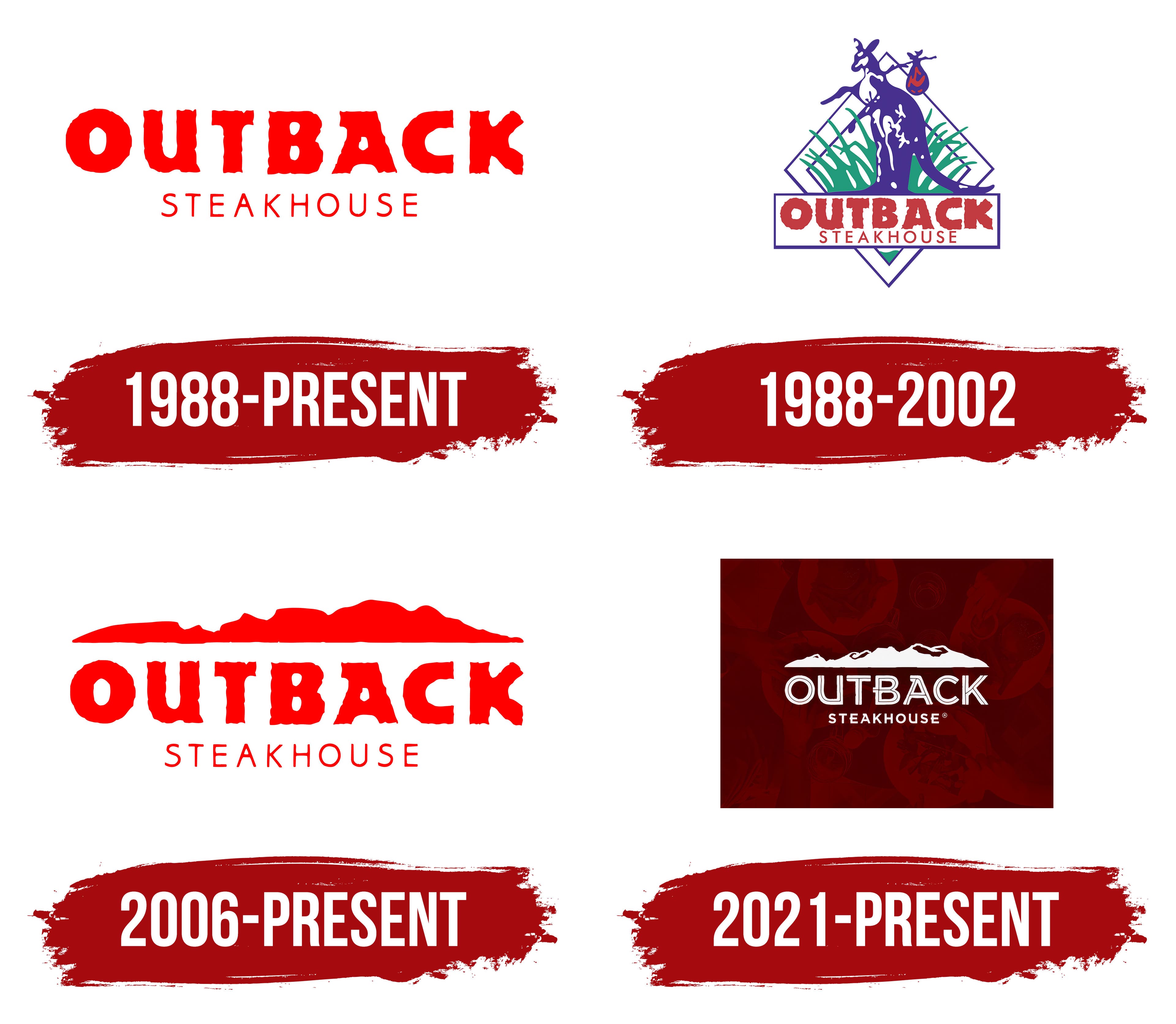
1988 – today
The logo consists of a two-level inscription in bright red tones. At the top level is the brand name “OUTBACK,” set in a large, bold font with characteristic jagged edges. This font creates an impression of informality and emphasizes the connection with the natural theme and atmosphere of the Australian outback. The irregularities in the lines add a sense of “handmade” work, evoking the Australian bush and its natural, unspoiled character. The font adds visual dynamics by avoiding clear, aligned lines.
The lower level features the word “STEAKHOUSE” in a thin, small-cap font, which balances the massive top text. The contrast between the two levels focuses on the main title.
The rich red color palette symbolizes passion, energy, and warmth. The absence of additional decorative details emphasizes the name’s significance.
“Outback” refers to Australia’s remote and wild territories, signifying simplicity, adventure, and authenticity. “Steakhouse” specifies the restaurant’s specialization, emphasizing the focus on quality steaks and meat dishes.
1988 – 2002
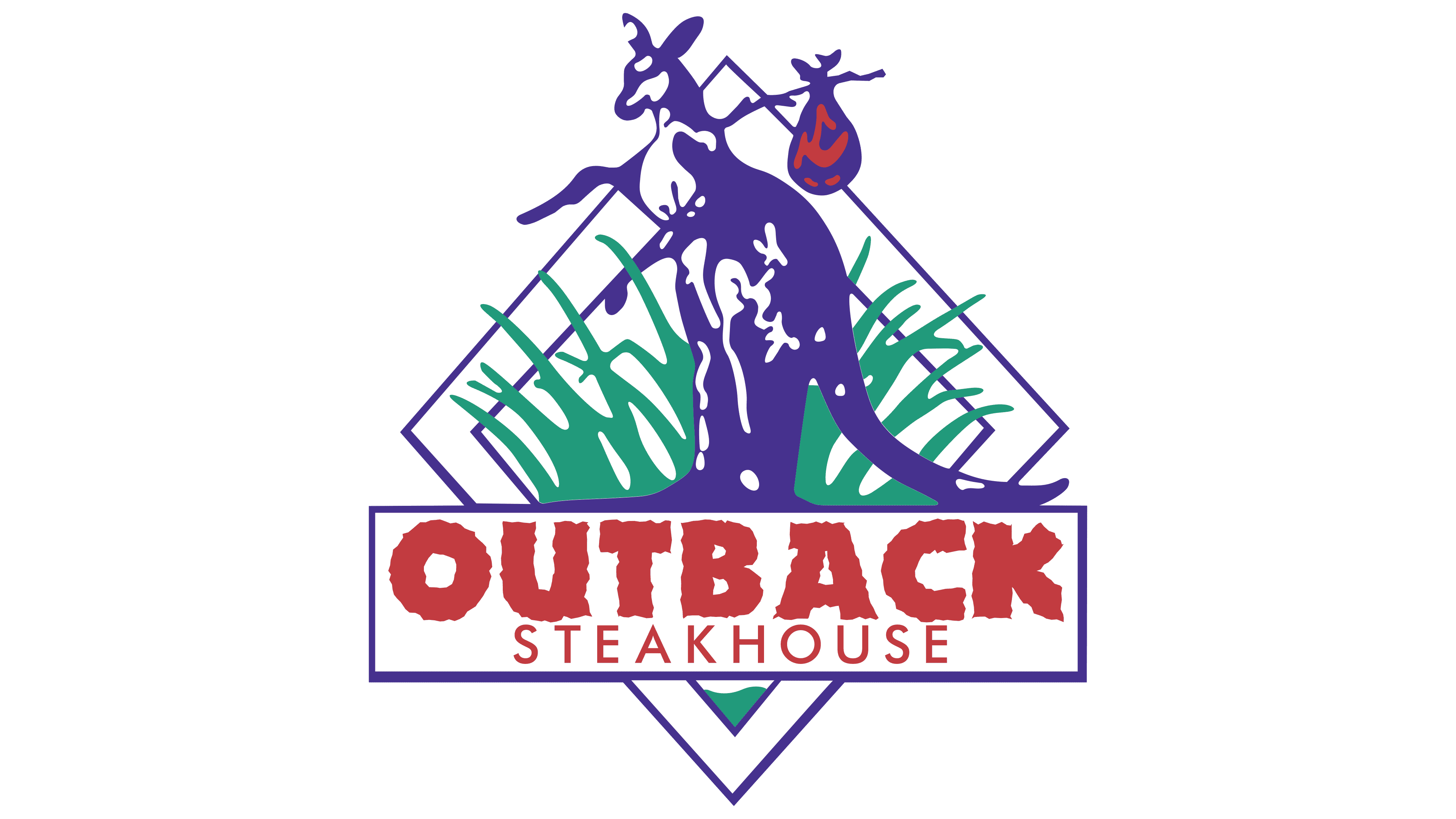
Along with the logo, another version featured higher visual saturation and graphic symbols that emphasized the brand’s connection to the Australian theme. The central place is occupied by a lilac kangaroo image, set within a diamond-shaped frame of the same shade. The animal is one of Australia’s most popular symbols. The kangaroo is depicted in motion, with a bag tied to a stick over his shoulder, emphasizing the dynamism and spirit of travel and hinting at the freedom and adventure inherent in the restaurant’s concept.
The background inside the rhombus is filled with green grass, giving the logo a sense of nature and harmony. At the bottom, a rectangular plate complements the graphic composition, where the restaurant’s name is located. The word “OUTBACK” is in bold font with jagged edges painted bright red. Under the main title is the word “STEAKHOUSE,” printed in a thin font with small capital letters, creating a visual contrast and completing the composition.
Lilac, green, and red create a bright palette. A lilac accent adds eccentricity and uniqueness, while green and red balance natural and energetic shades.
The brand’s visual appearance was important for associating it with Australian culture. It focused on its symbols, such as kangaroos and natural motifs. Using graphic fragments and bright colors helped create a signature image of the restaurant focused on quality and a unique atmosphere.
2006 – today
Updates in 2006 added additional visual accents, emphasizing the emblem’s connection with the brand’s concept. The emblem is based on two bright red inscriptions: “OUTBACK” and “STEAKHOUSE.” However, the main innovation of this version is the abstract outline depicted above the text. This symbol is a stylized image of a mountain range or plateau, reminiscent of the landscape of remote areas of Australia.
The landscape contour is rendered in a rich red, like the text, creating visual integrity and harmony. The jagged edges of the font continue the tradition of emphasizing natural themes. The red has darkened, making the logo even more expressive and emphasizing energy and appeal.
The symbolism of the landscape is closely related to the brand’s name, as “Outback” in Australian culture denotes remote, sparsely populated areas. Such places are associated with openness, adventure, and natural beauty, reflecting a restaurant chain that creates a unique atmosphere and offers dishes inspired by these themes.
2021 – today
The visual style, introduced in 2021, offers an updated approach to corporate identity. In the center of the composition is a snow-white line reminiscent of a mountain range or plateau. Thanks to neat cutouts in the silhouette, the symbol looks fresh and dynamic, creating a textural effect and associations with natural landscapes.
The brand name is set in a modern sans-serif font: smooth letters convey simplicity and conciseness. The new interpretation emphasizes modern trends without forgetting the brand’s roots, which are associated with nature, the Australian outback, and Outback Steakhouse’s unique atmosphere.