


![]() Parker Logo PNG
Parker Logo PNG
The Parker logo appears dynamic only at first glance. Its clear framework limits movement. The emblem symbolizes precision, which is very important when using writing instruments. Its style suggests that the pen can be an elite luxury item.
Parker Pen Company began in Janesville, Wisconsin, after George Safford Parker grew tired of repairing faulty pens he had sold while working for John Holland Gold Pen Company. In 1888, he founded Parker Pen Company, received his first patent in 1889, and formally incorporated the business in 1892 after W.F. Palmer invested $1,000.
The first breakthrough came in 1894 with the Lucky Curve feed, which used capillary action to return excess ink to the reservoir and reduce leaking. The system helped Parker compete with Waterman, another brand built around ink-flow reliability. In 1921, Parker introduced the Duofold, a large orange hard-rubber pen priced at $7 and backed by a 25-year guarantee.
During the 1920s and 1930s, Parker expanded its materials and engineering capabilities. Duofold later used durable “Permanite” plastic, while public durability tests supported its reputation. In 1931, Parker launched Quink, a fast-drying ink, and in 1933 introduced the Vacumatic and the arrow-shaped clip designed by Joseph Platt.
After George Parker died in 1937, his son Kenneth led the company. The Parker 51, developed from 1939 to 1941, became one of the brand’s defining models, and Parker pens were used to sign the German and Japanese surrender documents in 1945. Parker entered ballpoints with the Jotter in 1954 and became the world’s largest writing-instrument maker by 1956. Gillette bought Parker in 1993, and in 2000, it moved with Waterman and Paper Mate to Sanford, which later became part of Newell Brands.
Meaning and History
![]()
The company logo changed three times with changes in ownership, but the idea of a flying arrow proved so successful that it appears in all variations of the emblem.
What is Parker?
Parker is an exquisite brand of writing instruments with a 130-year history. Founded in America by George Safford Parker in 1888. In the company’s history, about 20 successful pen models have been sold worldwide and delivered to the White House.
1888 – 1993
![]()
The first image on Parker’s pens was simple and built on associations. The sharp nib at the end of a fountain pen evoked an analogy with an arrowhead. The thin, elongated shape further enhanced the similarity. Therefore, the logo depicted the company’s product as an arrow flying upward, piercing the target right at the top. After all, a “perfect” pen is a hit in the bull’s eye. The reversal of the composition directly into the sky demonstrated a powerful impetus for development.
The logo predicted leadership positions and product popularity. Kennedy and the Queen of England signed documents with Parker’s pen for the first century, and Puccini and Conan Doyle worked with her. Even after Germany surrendered and the agreements at the end of the Vietnam War were signed, they continued to use Parker models.
The arrow-and-oval design also represented the idea of suction, for which Parker’s Lucky Curve was famous. When the wearer stopped writing, the remaining ink flowed back into the reservoir, making the writing less easily soiled and free of smudges and drips. In the logo, the upward arrow symbolizes reverse flow, and the empty oval outline symbolizes the absence of leakage.
1993 – 2016
![]()
In the nineties, Gillette set its sights on the writing instrument sector. She already owned the best-selling disposable pen brand, Paper Mate. In 1993, they decided to add another well-known option: a Parker pen.
The new owner has worked on the company’s style, which has not changed for the past 100 years. Thanks to Gillett, the brand logo has acquired elegance and modern design.
The emblem now depicts a flying arrow, the trace of which spells out the initial letter of the company’s name, a large capital R. The tip still rushes up, but with a slight forward inclination. The logo symbolizes leadership, ambition, and big claims. The shade of the emblem has also changed. The light gray color reflects stability, business qualities, and rigor.
Everything from the color to the curves of the lines spoke of impeccable style.
2016 – today
![]()
The logo change did not occur immediately after Newell Rubbermaid’s purchase in 2000. In recent years, Parker products have become less popular than they once were. The office goods sector has been replaced by simpler, cheaper, and more convenient writing instruments. The new owners thought long and hard about a suitable strategy. And we decided to leave Parker pens only in the luxurious, elite options niche. Several factories and retail outlets have been closed. Subsequently, a major rebranding began in 2016 and lasted two years, ending in 2018.
We focused on the brand’s long history and colossal experience to do this. The logo reverted to its original first version: an arrow rushing through an oval. But they added more sophistication and gold-thin lines, expanding outward on the sides to refine and volumize the oval figure. The arrow’s body has acquired smooth, streamlined curves that gradually expand downwards. All logo details seem to be forged from metal and are very durable.
In the modern image, the elements are perpendicular to each other. The arrow pierces the sky vertically, symbolizing a horizontally oriented oval. The clear upward direction of the point demonstrates the intention to reach the highest heights, the cosmos. This idea is complemented by the silhouette of an arrow, reminiscent of a rocket taking off. In this case, no competitor equals the company, since it is impossible to rise above it.
The logo’s central core resembles an arrow. It also references the Eiffel Tower, France’s symbol, and the fact that the brand has been headquartered in Nantes since 2011.
Below the image is a caption that complements the icon. The letters of the name are large, and their elements vary in thickness, creating the impression of volume. Even lower, the company’s founding date is indicated in thin type, emphasizing its venerable age and hinting at the antique value of items from the Parker line.
Font and Colors
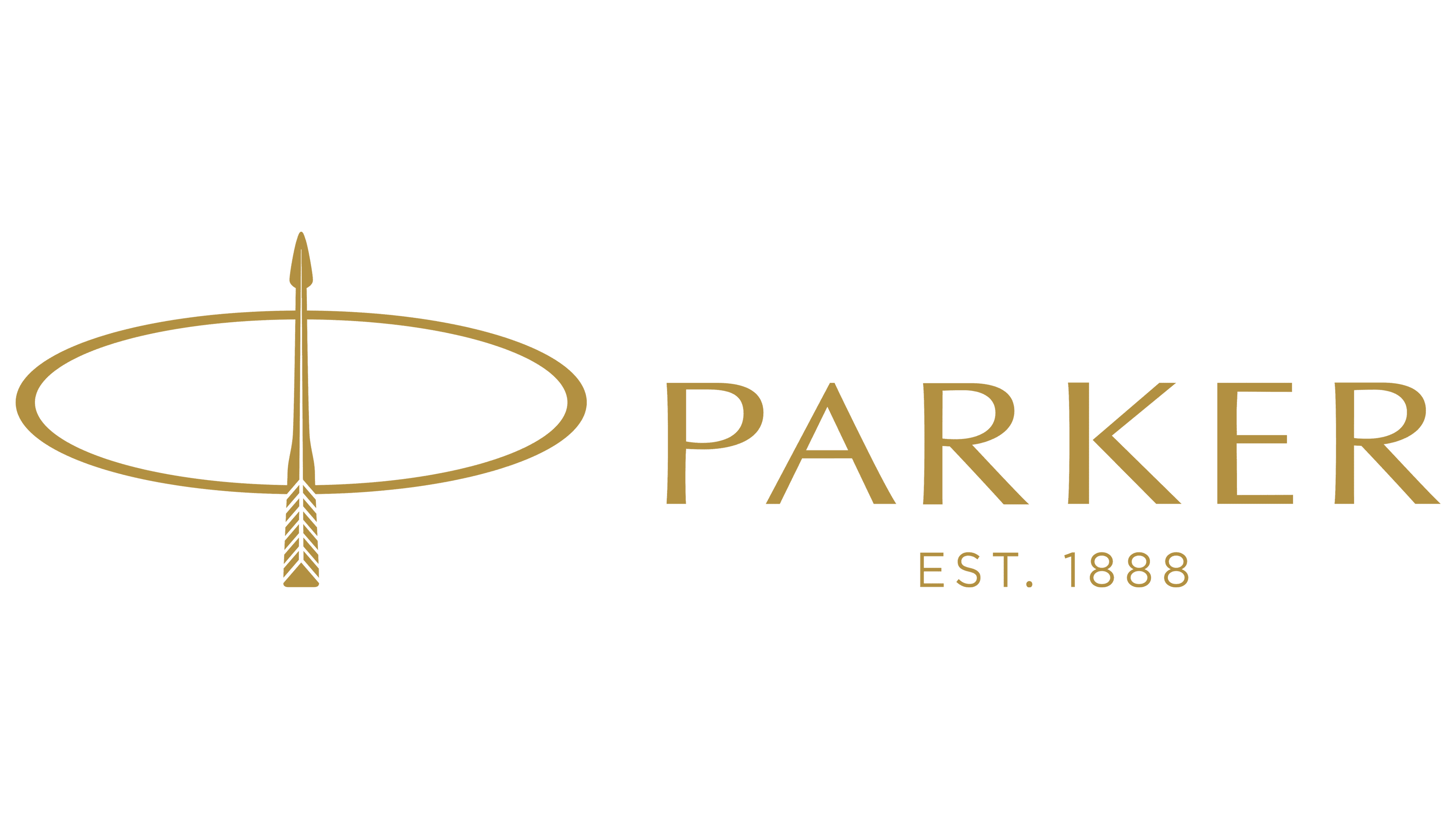
The logo’s main colors are black, gray, and gold, and are also used for product packaging.
- The sign was initially black, which hinted at the ink used by Parker’s pens. Gamma demonstrated market dominance and superiority over competitors.
- The light gray color is businesslike yet discreet and calm. It showed that the pen is an addition. The most important things are the owner and the text that will be put on paper. The color also shifted the focus away from ink as the firm’s product line expanded.
- Gold is a hint of value. The color demonstrates status, excellent quality, and the highest position in the market.
For the inscription, an elegant Optima Pro Roman font is used.