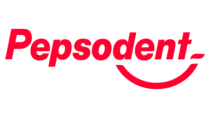
“If you use the brand’s toothpaste, the smile will not leave your face,” the Pepsodent logo promises. A small amount is enough daily, and the effect is not long in coming. The emblem indicates the presence of a cosmetic and a therapeutic effect.
Pepsodent: Brand overview
| Founded: | 1915 |
| Founder: | Church & Dwight, Unilever |
| Headquarters: | United States |
| Website: | pepsodent.com |
Meaning and History
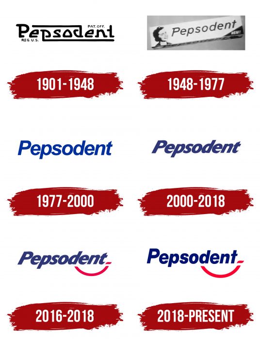
The brand name is shown on the corporate logo. Moreover, the word “Pepsodent” is used in all variations of the logo. It is a key element formed from two bases – “pepsin” + “dent.” During the entire existence of the trademark, it had six basic emblems and several additional versions.
What is Pepsodent?
Pepsodent is a line of toothpaste that appeared in 1915. It is owned by Church & Dwight, except in Canada and the United States, where the brand belongs to Unilever. A distinctive feature of this product is the presence of sassafras extract, giving it a strong minty taste.
1901 – 1948
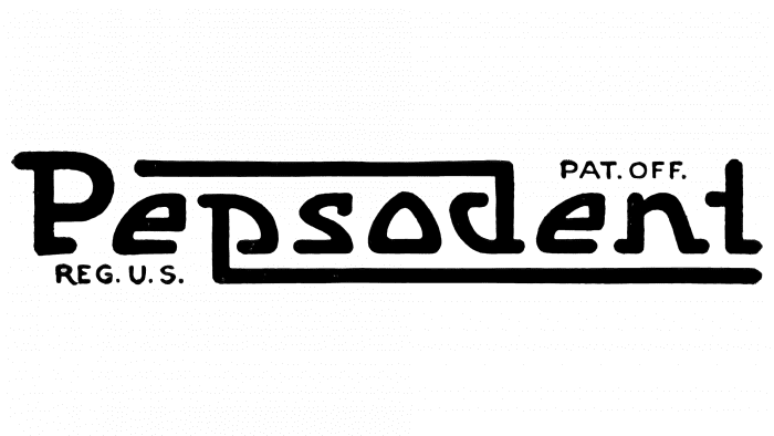
The debut version was the most creative. The letters “p” and “d” have elongated legs, which is an original way to go beyond the borders of the inscription “Pepsodent,” surrounding it from above and below.
1948 – 1977
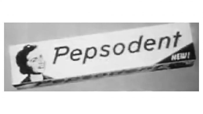
The serifs are removed in this logo. The emphasis is on the “t” without the bottom, so the letter looks like a straight stick with a top bar.
1977 – 2000
The designers offered a standard version of the lettering, where there are no additional elements – only the brand name. The letters are classic, with a capital “P.”
2000 – 2018
During this period, the word “Pepsodent” became dark blue and tilted to the right.
2016 – 2018
The management approved a new emblem – complemented by a graphic sign in the form of a welcoming smile. It’s an inverted arch with a miniature stroke on the right.
2018 – today
The developers removed the italics and replaced the standard letter “t” with the original character in the 1948 version.
Pepsodent: Interesting Facts
Pepsodent, a famous toothpaste brand, has been around since 1915 and is known for its minty flavor and whitening properties.
- Start: Launched in 1915, Pepsodent quickly stood out for its taste and ability to whiten teeth, gaining popularity fast.
- Unique Ingredient: Pepsodent uses “Irium,” or sodium lauryl sulfate, to help clean teeth better. Though “Irium” was mainly a marketing term, it highlighted the toothpaste’s cleaning power.
- Memorable Ads: Famous for catchy slogans like “You’ll wonder where the yellow went when you brush your teeth with Pepsodent,” its advertising campaigns played a big role in making Pepsodent well-known.
- Worldwide Popularity: Starting in the U.S., Pepsodent is now loved globally, especially in parts of Asia and Africa, where Unilever markets it.
- Oral Care Innovations: Pepsodent has developed various formulas targeting cavities, gum care, and sensitivity, showing its dedication to enhancing oral health.
- Dental Endorsements: Early ads claimed dental professionals recommended Pepsodent, helping build trust and highlighting its benefits for dental care.
- Promoting Toothbrushing: The brand significantly influenced the habit of regular toothbrushing, educating people on the importance of caring for their teeth.
- Joining Unilever: In 1944, Unilever acquired Pepsodent, broadening its reach. Under Unilever, the brand has continued to evolve and cater to consumer needs.
- Social Initiatives: Along with Unilever, Pepsodent has supported global programs to improve oral health care, focusing on teaching kids about brushing.
- Lasting Presence: Despite tough competition, Pepsodent has remained a favorite for over a century, thanks to effective marketing, ongoing innovation, and a strong focus on oral health.
Pepsodent’s story, from its beginnings to becoming a global oral care leader, showcases its enduring impact on dental hygiene and its ability to meet changing consumer needs.
Font and Colors
Each logo option contains a product name in a recognizable style. The corporate version is a strict inscription with smooth symbols. Recently, it has been supplemented with a curved line in the form of a smiling emoticon.
If in the early emblems, the typeface had serifs, now they are not. The font is grotesque, with evenly spaced characters. The first letter is uppercase; the rest are lowercase. The palette consists of several shades of white, red, and blue.
Pepsodent color codes
| Midnight Blue | Hex color: | #001273 |
|---|---|---|
| RGB: | 0 18 115 | |
| CMYK: | 100 84 0 55 | |
| Pantone: | PMS 2745 C |
| Torch Red | Hex color: | #ff002f |
|---|---|---|
| RGB: | 255 0 47 | |
| CMYK: | 0 100 82 0 | |
| Pantone: | PMS Bright Red C |
