


![]() Pernod Ricard Logo PNG
Pernod Ricard Logo PNG
Development and prosperity are the main messages of the emblem. The Pernod Ricard logo conveys a company with clear values and a strong sense of team spirit. All giants’ divisions are responsible for producing the highest-quality alcohol of various strengths.
Pernod Ricard grew out of two French family businesses centered on anise-based drinks. In 1805, Swiss distiller Henri-Louis Pernod founded Maison Pernod Fils in Pontarlier and developed industrial absinthe production. After absinthe was banned in 1915, the company moved into anise drinks without wormwood.
In 1932, Paul Ricard founded Ricard in Marseille and created his own pastis recipe. The brand tied the drink to southern France, cafés, sun, and Mediterranean leisure. Pastis was banned by the Vichy regime in 1940, then returned in 1944 and became one of France’s best-known aperitifs.
Pernod and Ricard spent decades competing in the same market before merging on July 1, 1975. Paul Ricard and Jean Hémard founded Pernod Ricard, which was later listed on the Paris Stock Exchange. In 1978, Patrick Ricard became CEO and pushed the company abroad. Deals followed with Austin Nichols and Wild Turkey in 1980, Ramazzotti in 1985, Pernod Ricard Japan in 1986, Irish Distillers and Jameson in 1988, and Havana Club through Cuba Ron in 1993.
The group expanded sharply in the 2000s. In 2001, it bought about 40% of Seagram’s assets, adding Chivas Regal, The Glenlivet, Royal Salute, and Martell. In 2005, Allied Domecq added Ballantine’s, Malibu, Beefeater, Mumm, and Perrier-Jouët. In 2008, Pernod Ricard bought Vin & Sprit, owner of Absolut Vodka, for €5.63 billion. Alexandre Ricard became CEO in 2015, and in 2016, the group acquired a controlling stake in Monkey 47.
Meaning and History
![]()
The corporation emerged from the 1975 merger of two family-owned companies, Ricard of Marseilles, which produced anise tincture, and Pernod of Savoy, which sold absinthe. Over the next 50 years, Tantz has achieved extraordinary results, increasing its sales 25-fold to 9 billion euros. The corporation owes this promotion to Patrick Ricard, the son of one of the founders. Pernod Ricard’s portfolio includes brands of whiskey, tequila, gin, cognac, and champagne. At the same time, the company continues to produce anise tincture (pastis), which is popular in France.
The company’s visual mark has not changed since its inception. This is because a single owner always owns the company.
What is Pernod Ricard?
This is a major French alcohol company offering an impressive range of premium spirits worldwide. Its portfolio includes legendary brands such as Absolut vodka, Jameson Irish whiskey, Chivas Regal and The Glenlivet whiskies, Martell cognac, Havana Club rum, Beefeater gin, and many other well-known labels. The company is a guardian of centuries-old traditions in producing spirits from various cultures and nations, preserving the authenticity and origin of each product. Whether in distilleries in Sweden, whisky distilleries in Scotland, or cognac cellars in Cognac, attention to every detail is given to maintain the unique character of each drink.
The visual mark is simple and modern. However, this minimalism contains a lot of meaning and hides the entire history of the concern.
At the base of the emblem is the company name. It is written in a round, thin, serif typeface. Each word starts with a capital letter, indicating the two names at the origin. Pernod is first because it’s 130 years older than Paul Ricard, founded in 1932.

At the head of the logo is a schematic flower. This choice is connected to the fact that the anise blossom, a symbol of Ricard and its pastis, is the sign. And as Ricard and his descendants ruled the company, the logo inherited its traditions.
The flower consists of individual petal stripes that resemble excise stamps. The bottom two petals merged into one stripe, which holds the entire subsequent composition. It symbolizes the merger of two companies, which laid the foundation of the concern.
The 10 petals above are arranged in a circle, symbolizing the new companies acquired throughout the company’s history. Five years after its formation, the company absorbed its first acquisition, American Austin Nichols. And it didn’t stop again, buying ten liquor producers around the world. The largest purchase was $9 billion.
All the firms are now documented and grouped around a single goal: preserving the premium taste and creating a festive mood for customers. And for holidays and celebrations, they always choose flowers and the best alcohol. That’s why the company’s assets include only valuable brands.
The flower’s petals point in different directions as new companies join the concern from around the world. Just as the flower opens up in all directions, Pernod Ricard distributes its products everywhere (in 160 countries).
Font and Colors
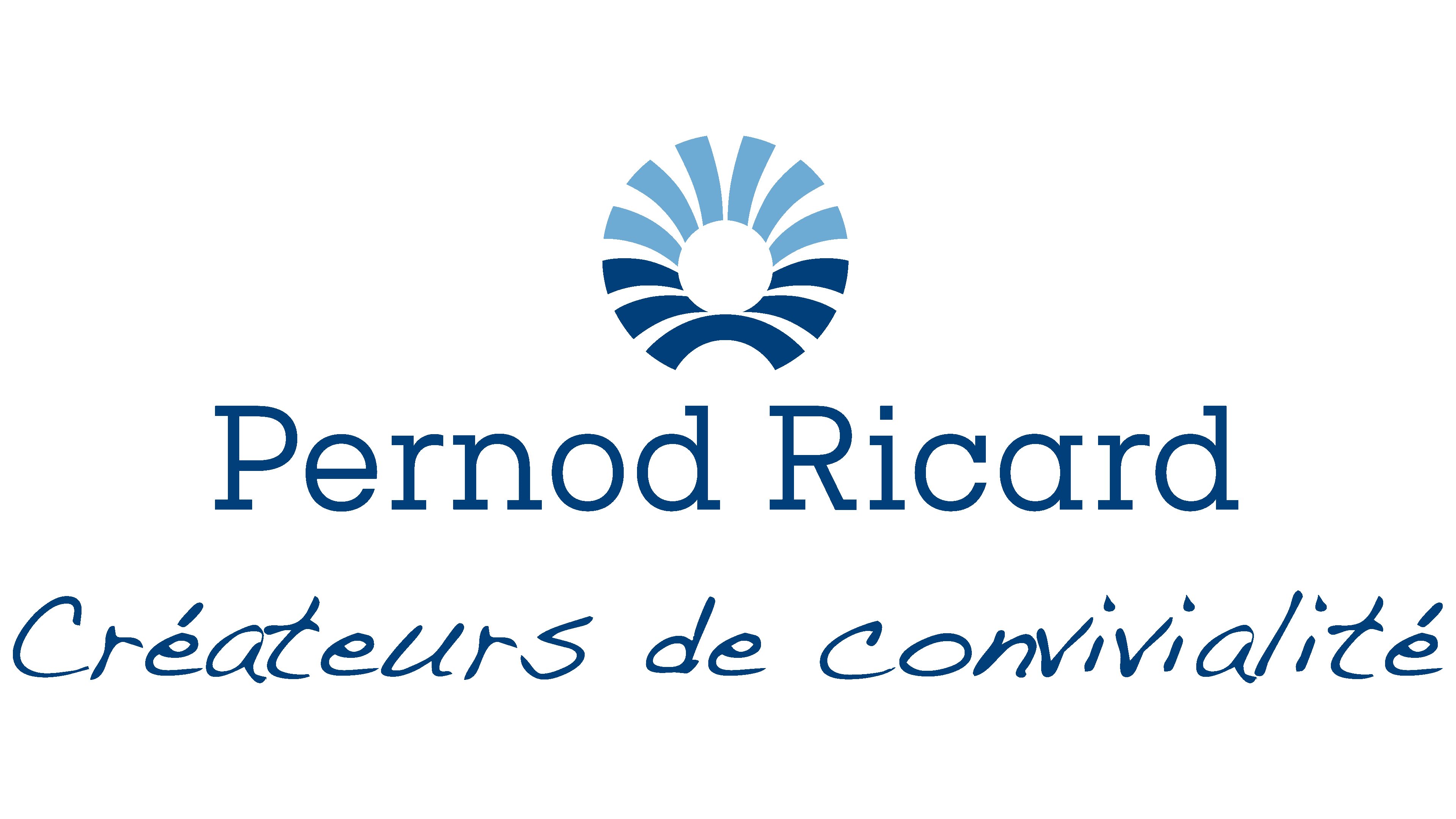
The logo uses a blue gradient from dark to light. This color symbolizes history, heritage, experience, and smart, thoughtful management that has made the company rise to the top.
The name of the concern and the bottom petals are in deep blue as a sign of the beginning, the foundation, and the base. The dark petals symbolize the six companies that Pernod Ricard acquired in the 20th century. The others, 21st-century acquisitions, are colored in lighter blue tones.
The change in gradient from bottom to top and from dark to light also signifies the company’s gradual transformation towards a better, brighter future. The concern has been reforming to reduce waste and protect the environment, improve working conditions for its employees, and modernize management to operate even more efficiently.
Publica Slab Light lettering font.