The symbols of the Peugeot logo show strength and regal posture. The concern’s cars attract the attention of confident and wealthy customers. The body’s brilliance and the ideal silent operation of the engine allow the car to glide along the road like a stalking predatory animal.
Peugeot: Brand overview
| Founded: | 26 September 1810 |
| Founder: | Armand Peugeot |
| Headquarters: | France |
| Website: | peugeot.com |
Peugeot is a French automotive giant that is part of the Stellantis group and manufactures several types of transport equipment. It is the country’s oldest enterprise and is still active. The company was founded in 1810 by Armand Peugeot. The head office with legal and administrative bodies is in Paris, building on the Ave de la Grande Armée. Production sites are concentrated in the city of Sochaux (France).
The founder of the famous brand was a private manufactory organized at the beginning of the 19th century by the Peugeot family from the Valentigny commune of the Montbéliard district (Franche-Comté region). She made saws and quickly developed into a steel mill. Then half of the company went into bicycles and motorcycles, and the other half went into cars.
In 1896, the company split into two parts, one of which was the Société des Automobiles Peugeot. 1920, it merged again with the bicycle and motorcycle company Cycles Peugeot. The trademark was officially registered in November 1858 at the initiative of Emile Peugeot (the founder’s son). Moreover, the logo rarely changed, except for design edits.
Meaning and History
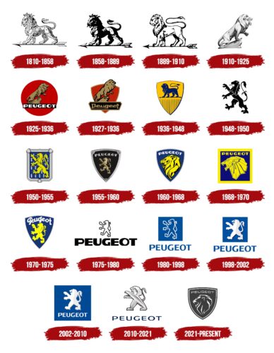
Historical roots, high prestige, and boundless power – that’s what Peugeot wants to show. His line of cars is decorated with a logo that fully meets these criteria because it represents the king of animals – the lion. Moreover, it is not easy, but it is heraldic. He is depicted from different angles: on four and two legs, sitting on a rock, and walking. There is also a variant with a maned head without a body. The designers’ styles were also different – from realism to empire.
1810 – 1858
The lion was originally on the emblem:
- It marks where the steel plant appeared because it is on the coat of arms of the commune of Valentigney.
- It symbolizes the power and strength of the saws that the company produced.
- The boom-walking predator is a testament to the Peugeot saw blades’ speed, stability, and flexibility.
The artist drew protruding muscles on the animal, especially for this. The logo is black and white.
1858 – 1889
The designer made the image of a lion more embossed and formidable by adding shadows. The color palette is still monochrome. One important clarification: during this period, the Peugeot family officially registered the lion as its trademark, which personified the speed and power of bicycles and motorcycles. This happened in 1858.
1889 – 1910
During this period, the company released its first car and redesigned the emblem. The authors corrected the lion: they removed the aggressive expression and muscles, added realism to the features, lengthened the tail, and painted the arrowhead black.
1910 – 1925
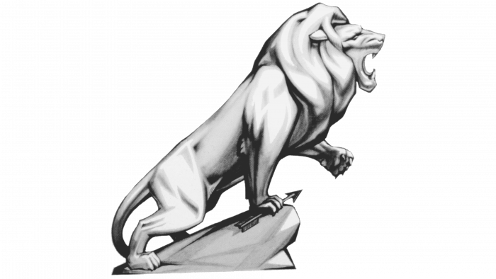
An image of a roaring lion was presented as a 3D figurine. The predator has become voluminous due to correctly distributed shadows and highlights on the body. The animal looks to the right and growls menacingly, releasing its claws on its left front paw, and presses the arrow against the stone with its right.
1925 – 1936
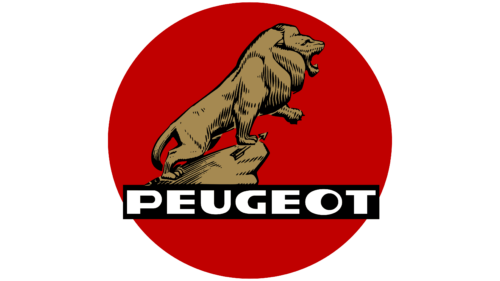
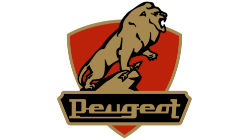
During this period, the company used the previous version but not 3D. The emblem is now flat for easy printing. A black rectangle with the brand name covers the boulder and one hind leg. The word “Peugeot” is printed in strict chopped uppercase. The letters are wide and powerful, echoing the image of a lion. Depressions “U” and “G” look like the open mouth of a predator.
1927 – 1936
During this period, a logo was used similar to the outline of the previous one. But it has less detail; the lion is depicted in general terms, without small artistic nuances. The king of beasts is massive, formidable, and impressive. He stands on a rock with his left paw raised. Under his right is an arrow. The designers turned the red disk into a shield with a gold border, and the name of the automobile company was placed in a black trapezoid with a figure cut around the edges.
1936 – 1948
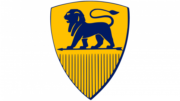
This period is the legendary beginning of the colored Peugeot emblems. The lion, reminiscent of earlier versions, is again depicted facing left and standing on a narrow arrow. The animal’s tail is taken from the 1889 logo; the rest is a symbiosis of the first brand names. The classic shield with a frame and dark stripes at the bottom is the only difference. The background is painted yellow, and the strokes, the lion, and the surrounding details are painted dark blue.
1948 – 1950
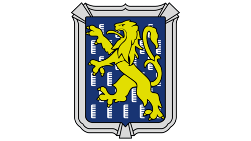
The artists “put” the animal on its hind legs. The front lion pulled forward and released its claws. The mouth is open, and a long tongue sticks out of it. The background is a heraldic symbol (presumably a vertical banner) with a black background and gray combs.
1950 – 1955
After the redesign, the Peugeot logo has become much more colorful and interesting: it has a color and internal dynamics. It was created thanks to the thin contours with which the figure is drawn. At the same time, the black lines effectively contrast and perfectly highlight the yellow color of the lion. The artists redrew the picture but retained the animal’s position: a formidable predator walks on two legs to the left, with its front paws stretched forward and its tongue hanging out. Moreover, the king of animals is turned into a heraldic sign because the armorial shield with a double wide frame serves as a background.
1955 – 1960
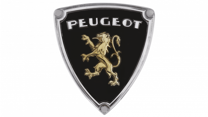
At the same time, another version was used – a triangular shield with painted corners. In this version, the lion is not massive but graceful, with thin paws and extended claws. The tail, as before, is figuratively raised and curved, resembling a flower with a bud and leaves – a heraldic lily. Above the animal is written the word “Peugeot” with a shortened ladder of the letter “E.”
1960 – 1968
The designers focused on the lion’s head to highlight its power, strength, and endurance. To this end, they drew the animal in profile from the side. This angle allows you to portray his emotions more accurately. A wide-open mouth, grasping fangs, a frown, a large ear, and a chic mane on a large neck conveys equanimity, confidence, brutality, and charisma. Moreover, the hanging strands are located at an angle for a harmonious combination with a shield circled in a gray stripe. At the top is the brand name in a classic design.
1968 – 1970
In 1968, the company dramatically changed the logo style: now, it is dominated by hard strokes, precise lines, and sharp angles. The triangular background was replaced by a square one, and the lion looks like an Egyptian deity with rectangular ears and trapezoidal strands of mane. The predator growls and displays formidable fangs.
1970 – 1975
Good-natured, safe, and attractive – that’s what we can say about the logo Peugeot of this period. The yellow lion is no longer as formidable as before: it has many curves, smooth lines, and few sharp corners and small details. Therefore, the image turned out to be cute and soft. The same fate befell the automobile manufacturer’s name: it received a rounded font with lowercase letters as if written by hand. Only the corners of the shield remained sharp.
1975 – 1980
The logo concept was again subjected to major changes: the proportions of the lion and the lettering were reversed. Above appeared a tiny lion standing on its hind legs, and below—the huge word “Peugeot.” The monochrome palette has been preserved.
1980 – 1998
The lion, repeating the outlines from the previous emblem, received a white outline and a blue background. Below the square is the name of the car brand. It is set in block type and reduced in size so that the eye clings first to the royal animal and then to the text.
1998 – 2002
The designers took up the idea reflected in the previous logo. But this time, they made the lion bigger, balancing it with the bottom caption so the predator and the text look harmonious. In addition, a blue square has appeared to replace the background.
2002 – 2010
The developers have combined the heraldic lion and the brand name, placing them in one square. The right side of the animal is slightly shaded.
2010 – 2021
Now, the emblem is used, stylized as a metal figurine of an animal. Although the pose of the lion has not changed, it has acquired anthropomorphic features. The emblem’s color is light and consists of a combination of white, gray, and blue.
2021 – today
In 2018, designers began adapting the 1960 Peugeot e-Legend symbol. It is supposed to come to replace the current logo. The image on the emblem is not much different from the earlier version – only in the font with which the word “Peugeot” is written above the lion’s head.
From the beginning, the automotive company’s identity was associated with the image of a powerful, confident, and strong lion. The lion never disappeared from the logo but only changed based on the concept. It is a show of respect for the area in which the legendary brand originated and a demonstration of the superiority of the products produced under this brand.
Peugeot: Interesting Facts
Peugeot was founded in 1810 in Sochaux, France, and made coffee mills and bicycles before becoming a famous car maker.
- Beginnings: It all began in 1810 when the Peugeot family started their company in France, making coffee mills and bicycles.
- First Car: Peugeot’s first car, a steam-powered three-wheeler by French engineer Léon Serpollet, was released in 1889. This was how Peugeot got into cars.
- Lion Logo: The lion logo, representing strength and speed, was first used on saw blades in 1858 before it was used on cars. It’s been updated over time but always includes a lion.
- Racing Wins: Peugeot has been successful in car racing, winning the French Grand Prix in 1912 and several Dakar Rallies, proving the quality of its cars.
- Peugeot 205 GTI: This car, launched in the ’80s, was a big hit and is known for its great performance.
- Diesel Tech: Peugeot was ahead of its time with diesel technology, introducing the first diesel passenger car in 1959 and continuing to improve it.
- World Records: In 2015, they set a fuel efficiency record with a Peugeot 208 that got 141.2 mpg over 1,337 miles.
- E-LEGEND Concept: In 2018, Peugeot unveiled the E-LEGEND, an electric car inspired by the Peugeot 504 Coupé that combines old design with new tech.
- Coming Back to North America: After being away, Peugeot plans to return to North America in 2023, looking to expand globally with Stellantis after its parent company merged with Fiat Chrysler in 2021.
Peugeot’s story is about innovation, high performance, and unique design, which has made it loved by car fans worldwide. Their dedication to excellence is clear from their simple beginnings to their current position as a global car leader.
Font and Colors
In 1998, the logo featured the Castle T Bold typeface designed by Steve Jackaman and published by the URW Type Foundry. The author of another of the fonts is graphic artist Christophe Badani.
The logo’s color has always been restrained, black and white. If colorfulness did appear, it was only in limited quantities, such as a combination of yellow and blue or white and blue. There are also different shades of gray, from graphite to silver-metallic.
