


 Stellantis Logo PNG
The Stellantis logo appears simple and modest at first glance, but it encompasses the entire automotive world because the brand it represents offers a wide range of specialized work. The minimalist emblem perfectly reflects this practical approach to business.
Stellantis grew out of merger talks announced in October 2019 between FCA and PSA Group. The deal was intended to create a large global automaker able to compete with Toyota, Volkswagen and General Motors. FCA had been formed in 2014 from the union of Italian and American operations, while the French group added a strong European production base and extensive dealer network.
A binding 50-50 agreement was signed on December 18, 2019. Regulators reviewed the transaction for more than a year, and shareholders approved it on January 4, 2021. The merger closed on January 16, creating Stellantis, a name derived from the Latin verb “stello,” meaning “to brighten with stars.” John Elkann became chairman, and Carlos Tavares took the chief executive role.
The company united 14 marques, including Fiat, Chrysler, Jeep, Dodge, Ram, Alfa Romeo, Peugeot, Citroën, DS, Opel, Vauxhall, Abarth, Lancia and Maserati. Early integration focused on research centers, factories, purchasing, vehicle platforms and management systems. The combined business soon ranked as the world’s fourth-largest automaker by sales.
During 2021 and 2022, investment shifted toward electric-vehicle architectures, software and autonomous-driving systems. Partnerships with technology companies supported those programs. In 2023, several electric models reached the market, while management expanded work in China and North America and continued combining engineering, production and distribution across the former businesses.
Meaning and History
What is Stellantis?
Fiat Chrysler Automobiles and PSA Group merged to create a global automotive giant featuring many well-known car brands. This international company’s remarkable lineup includes Jeep, Dodge, Ram, Fiat, Peugeot, Citroën, and Maserati. The brand develops advanced automotive technologies and designs, leveraging its extensive resources and combined expertise to meet the diverse needs of customers in various global markets. The organizational structure enables sharing platforms and technologies while preserving each brand’s heritage and identity. It competes across different types and price ranges of vehicles, from rugged SUVs and luxury sports cars to small, affordable cars.
2020 Pre-launch

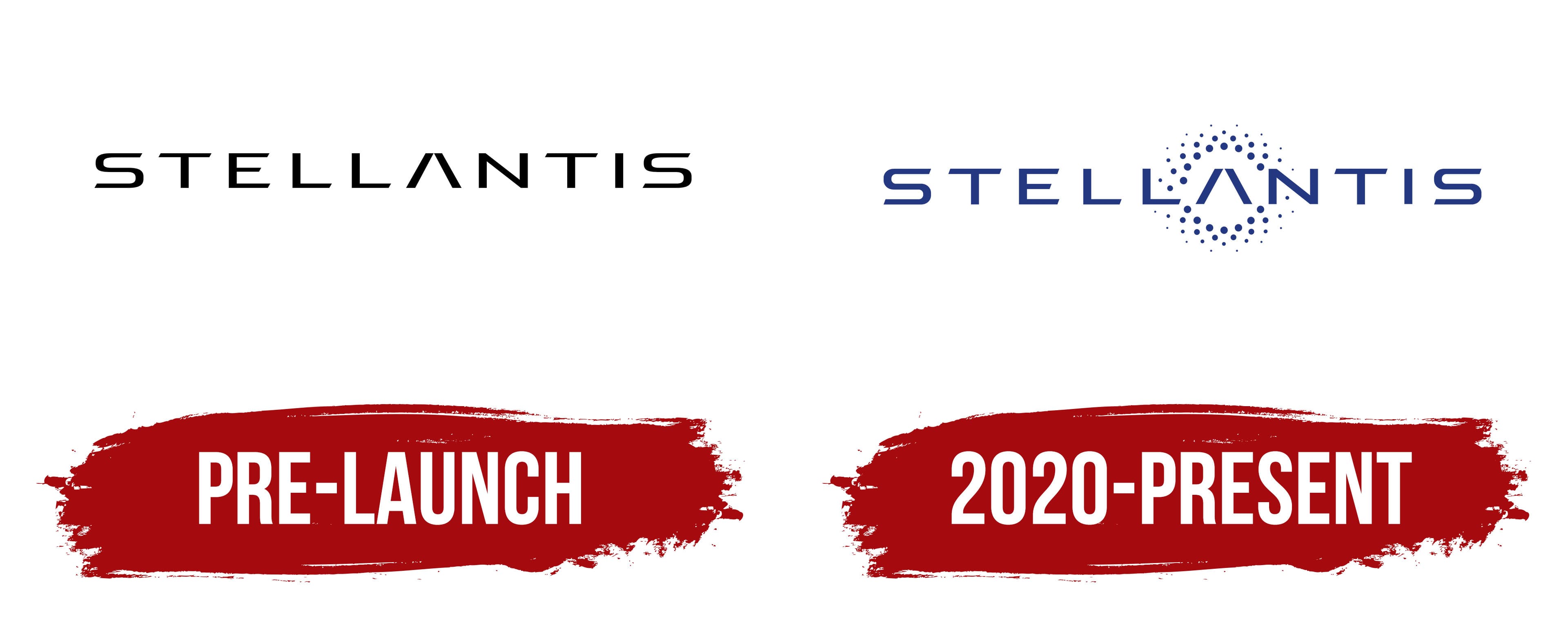
The beta version of the Stellantis logo was so successful that it later became the basis for the official emblem. Its conciseness helped it hit the mark and capture the desired style. The badge is nothing extraordinary or creative; it simply represents the name of the automotive corporation. But what a way it does! Its visual identity aligns with the latest branding trends.
A progressive font with extended contours was chosen for the text, perfectly fitting the concept of uniting independent, globally renowned manufacturers. The logo represents a group of companies brought together under the Stellantis banner. To emphasize their exclusivity, rich experience, professionalism, and success, the new structure received a “star” name, which was chosen because “stella” translates from Latin as “star.”
- The first distinctive feature is the excessive width of the letters, making them appear flattened.
- The second creative aspect highlights the “S”s similarity to a belt or a worm, as seen in NASA’s emblem.
- The third feature is the absence of a crossbar in the “A,” which makes it look like two domino pieces stacked in a “house” shape.
- The fourth characteristic showcases the glyphs’ uniqueness through angled cuts at the ends.
Together, they form a grand constellation of numerous bright stars. The spacing between the symbols is sufficient to maintain each member’s individuality and properly display them within an equal setting.
The Stellantis emblem’s color palette is simple: it is mainly black because dark letters on a light background remain a timeless classic. A black font on a white background creates a businesslike atmosphere, demonstrates the corporation’s practicality, and underscores the rigor of its business principles.
2020 – today
The designers slightly adjusted the letters by keeping the original diagonal cuts. They refined them to be neater, more even, and tighter, though, at first glance, it seems like everything remains the same. However, there are no narrow sections now; all strokes have a uniform width. Previously, these variations were noticeable, especially in letters like “T,” “E,” and “L.” Additionally, the “S” no longer has a slight curve. All the glyphs now have the same boldness.
However, the Stellantis logo’s writing style remains unchanged: extravagant, elegant, and even slightly futuristic. The brand name is still low and wide, giving it a flattened appearance. The glyphs now feature another characteristic that’s not immediately noticeable because of the graphic elements. The gap between the overlapping parallelograms in the “A” is larger than in the beta version. This change makes the letter more unique, giving it a symbolic peak: in the narrow area, the sides don’t touch each other and don’t form a sharp angle.
The company moved away from black and settled on a rich blue, a cold, fresh shade associated with professionalism, stability, and perfection. This color suits the brand’s visual identity better, as its name is linked to stars. The designers added a circular cluster of improvised “stars” to the emblem to emphasize the group’s connection to the companies within it.
Solid blue dots surround the central letter, a stylized “A.” They vary in diameter, making some bolder than others. The largest elements are closer to the glyph, while the smaller ones are further away. The alternating pattern creates an intriguing ornament that enhances the Stellantis logo. The pattern of numerous dots fits seamlessly into the brand’s concept, creating a relaxed atmosphere.