Brand products are created on a grand scale. The emblem shows the large size of the car and the rich interior design. The Chrysler logo is an ode to respectability and comfort. Everyone gives way to the driver in such a car, and competitors remain far behind.
Chrysler: Brand overview
Chrysler is the smallest of the Big Three that control the US auto market. It is 100% owned by the Italian concern Fiat. The deal was completed in 2014; the firm was renamed Fiat Chrysler Automobiles. The change in ownership and name did not affect the automaker’s major brands, including Jeep, Dodge, RAM, and subsidiary Chrysler.
Walter Chrysler was a great entrepreneur. He knew how to create a promising car company and quickly took it to the top. The secret to his success is simple: some of the greatest engineers, big start-up capital, and a promising business idea. Having assembled the dream team, Walter took action. He founded Chrysler in 1925, and the first car of this brand entered the market even earlier—in 1924. The debut vehicle was released at the Maxwell Motor Company plant.
Meaning and History
New cars compete with Lincoln Ford and Cadillac GM – the best models in the luxury class. The manufacturer’s concept was to make inexpensive yet luxurious and innovative cars. At the same time, he needed his symbol, which could be associated with a high-end brand. The old Chrysler identity has not been forgotten, even though this company has long been part of Fiat and is called FCA. Most past logos have been iconic, especially the famous Pentastar pentagon.
In the late 1990s, brand names were frequently updated, sometimes due to reorganization (expansion and change of ownership) and sometimes for marketing purposes. The automaker found its lettering style and began to stick with it, experimenting with only minor details and graphic elements.
What is Chrysler?
This is the representative of the Big Three of the US automakers. Its full name is Stellantis, North America. There is also the Chrysler trademark, under which minivans and cars are produced.
1925 – 1930
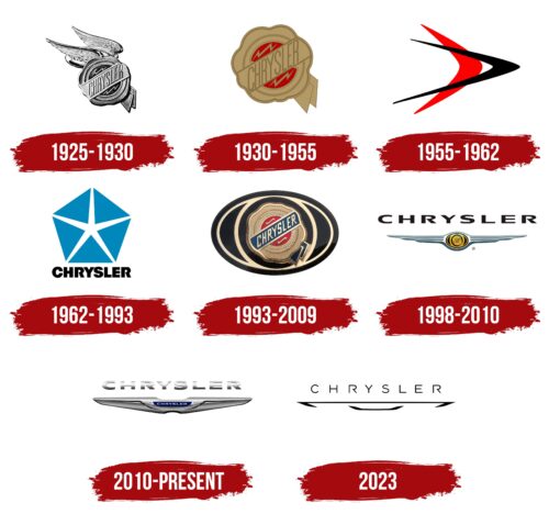
The impromptu wax seal became Chrysler’s logo for a long time. It was a flower composition with semicircular elements protruding along the edges. In the middle was a diagonal inscription with the name of the car brand. The background was a wide ribbon, the ends of which went sideways. There were also two zippers of the brand’s design: they were horizontal and looked like double “Z.” Above was a bird with large raised wings – it seemed to be rapidly flying forward. The silver color made the emblem very refined.
1930 – 1955
When Walter Chrysler founded the car company, he asked one of the engineers to help him design the logo. Oliver Clark knew how to draw and was knowledgeable about design, so he enthusiastically took on the task. He created one of Chrysler’s most iconic marks, a wax seal depicting the brand’s name across the transverse stripe.
The blue rectangle that contained the inscription was stylized as a ribbon. It wrapped around a golden circle, and its ends peeped from the lower right corner. There were two lightning bolts at the top and bottom of the diagonal strip, one on each side. Few people know, but these zigzags were stylized “Z” letters. They represented the Zeder model car. Its prototype was expected to be the first Chrysler car, but the company was forced to sell its development due to unforeseen circumstances. According to another version, lightning personified the power of engines.
The logo mimicked a real wax seal used as an award at government fairs. It symbolizes the manufacturer’s reliability and honesty and confirms the quality of his vehicles. The original symbol fell out of use in 1954 and was forgotten for several decades until the company decided to return to its origins.
1955 – 1962
An emblem appeared in the middle of the 20th century: two “boomerangs” in red and black. They had different proportions: one was wider and shorter, and the other was narrower and longer. Judging by the intersections, the black “boomerang” was on top of the red one. The Dodge brand used the same logo.
1962 – 1993
In 1962, marketing firm Lippincott & Margulies designed the famous Pentastar symbol for Chrysler. It is known to have been a corporate logo and, on rare occasions, adorned the hoods of cars. It has never been used on radiator grilles. This emblem was chosen from 800 others. Robert Stanley, a supporter of classics and stability, invented it. He wanted to make a sign combining simplicity, style, and dynamics.
All his ideas were embodied in a blue pentagon with a graceful star inside. The rays divided the large geometric figure into five small triangles towards the center’s top corners. Many people mistakenly believe the Pentastar facets represent specific brands: Dodge Trucks, Dodge, Plymouth, Imperial, and Chrysler. This is not the case—the star was added to create the visual illusion of movement and dilute the strict shape of the polygon. The company had many more brands.
Such misconceptions are associated with Bob Hope’s corporate logo in his popular show, placing the name of a car brand in front of each beam. This program came out in 1962, shortly after the emergence of Pentastar and its publication in promotional materials. The official version of the emblem was complemented only by the black “CHRYSLER” lettering at the bottom.
1993 – 2009
The original logo disappeared in 1955 and returned triumphantly in the early 1990s. The company again began to use a wax seal with tape to confirm the high reliability and quality of the machines.
1998 – 2010
At the end of 1998, the famous seal was placed inside the long wings containing three “feathers,” each on the right and left. They have been outlined with a gray line. The word “CHRYSLER” was at the top. The developers changed the shape of the letters, making them look like the lettering font under Pentastar.
2010 – today
The next redesign occurred when the Italian concern Fiat bought out part of Chrysler’s shares. The logo lost its traditional wax seal – it was replaced by the company name, written inside the blue nameplate. It has been integrated into the center of the sleeker fenders with a metallic gradient. The emblem now resembles the Aston Martin brand name with a similar structure. The brand name is at the top, as in the previous version. The word turned light gray. The public learned about the change in the identity at the end of 2009 because the automaker applied to register a new trademark in the fall.
2023 (tentative)
The automotive company has removed clear images and settled on an outlined logo. Although fragmenting the full image, the contours add incredible chic and style to the emblem. Thin lines, exquisite glyphs, and sharp turns turn a banal sign into an elegant symbol, filling it with air, lightness, and simplicity. The main element is the inscription. It occupies a central place above a horizontal line with curved ends. This abstraction is a modernized old-style logo.
Chrysler: Interesting Facts
Chrysler is a big name in American cars and has been around since 1925, thanks to Walter P. Chrysler. He wanted to make luxury cars that were also affordable.
- Starting: Walter Chrysler turned the old Maxwell Motor Company into the Chrysler Corporation. He aimed to mix luxury with smart engineering.
- Chrysler Building: Chrysler’s idea for this famous skyscraper in New York, completed in 1930, was the tallest building for a while and is known for its Art Deco style.
- Car Innovations: In the 1930s, Chrysler was the first to make cars with one-piece, curved windshields. They also made the Chrysler Airflow, a car designed to cut through the air better, which set the stage for future cars despite its initial sales flop.
- World War II: Chrysler contributed greatly to the war by making tanks, ammo, and other essentials. They had one of the biggest tank factories.
- In the 1950s, Chrysler made the Hemi engine, a powerful and efficient V8 engine that became a hit with car fans and racers.
- The Minivan: 1984 Chrysler changed the game with the Dodge Caravan and Plymouth Voyager, the first modern minivans. They were a hit for their mix of space for both people and stuff.
- Merger Times: In 1998, Chrysler merged with Daimler-Benz, a German car maker, to form DaimlerChrysler AG. However, the merger failed, and Daimler sold Chrysler in 2007.
- Tough Times: Chrysler hit financial trouble and got a government bailout in 2008. They bounced back by partnering with Fiat in 2009, creating Fiat Chrysler Automobiles in 2014.
- Becoming Stellantis: In 2021, Fiat Chrysler merged with PSA Group to become Stellantis, one of the biggest car makers globally. This brought Chrysler into a big family of car brands.
- Famous Cars: Chrysler has made some cool cars, like the luxury Chrysler 300 series, the sporty Plymouth Barracuda, and the unique Chrysler PT Cruiser. They keep focusing on new ideas, style, and performance.
Chrysler has always been about pushing boundaries and making a mark in the car world, from its early innovations to helping out in wartime to making engines and cars people love. It’s had its ups and downs but continues to symbolize American car culture and innovation.
Font and Colors
The fenders featured on the latest logos and the wax seal are an important historical legacy for Chrysler. They were developed by the same person—engineer Oliver Clark. Previously, the winged element was used only as a figurine of a radiator and personified the ancient Roman god Mercury, who could develop great speed. It recently became a part of the logo when the designers combined two original corporate symbols.
Most of the corporate word marks were created from individual fonts. In the latest version, the lettering “CHRYSLER” looks elegant, even though the proportions of the letters are out of order.
The emblem imitates a metal radiator figure. For this, the designers combined several shades of gray and silver using a gradient. The company name is inscribed on a dark blue background. This color connects the modern design with the ribbon depicted on the original logo.
FAQ
What makes Chrysler cars?
The company began operations in 1925 when Walter P. Chrysler transformed the Maxwell Motor Company into the Chrysler Corporation. Early on, it introduced cars with features such as high-compression engines and four-wheel hydraulic brakes, which were quite advanced.
Over the years, the brand grew through the acquisition of Dodge in 1928 and the creation of new brands, such as Plymouth and DeSoto, offering a wider range of vehicles. In 2009, the company was reorganized under a government-backed plan and changed its name to Chrysler Group LLC. By 2014, it merged with Fiat SpA, and in 2021, it became part of Stellantis NV.
The company is known for producing luxury cars focusing on family-friendly models, such as the Chrysler Pacifica minivan. This car and others in its lineup are equipped with the latest technology and safety features, making them attractive to today’s consumers. The brand continues to move forward to meet the needs of modern drivers and stay ahead in the market.
Who designed the Chrysler logo?
From 1924 to 1930, Oliver Clark, working on Walter Chrysler’s engineering team, designed the company’s first logos. He drew inspiration from Roman mythology, which was widely admired then. His original logo featured a wax seal with two wings, symbolizing speed.
This logo quickly became a key part of the brand, making it prominent in the fast-paced automotive industry of the early 20th century. Clark’s design communicated the brand’s values, creating a visual foundation that helped establish its strong identity. The logo’s theme of speed and progress resonated with clients.
What is the Chrysler logo?
The logo is easily recognized by the two inscriptions of the name “CHRYSLER.” A large inscription is at the top, and a smaller one is inside a blue plate in the center, surrounded by stylized silver wings. These silver wings give the logo a modern look. The blue color in the center creates a sense of sophistication and reliability that reflects the brand’s reputation.
Is Chrysler a luxury brand?
Originally conceived as a luxury brand, Chrysler offers various types of cars in its lineup. The line includes luxury vehicles with high performance and craftsmanship and simpler, more affordable models that don’t meet traditional luxury standards.
Historically, the brand is known for its premium features, enhanced comfort, and stylish designs. The company also produces more affordable and practical vehicles that cater to a wider range of customers. These models retain good quality and comfort but are more competitively priced and lack some luxury features.
When did the new Chrysler logo come out?
In 2009, a new logo with silver wings appeared. This update was part of a larger effort to refresh the brand’s image and better align it with current trends and visions for the future. This change marked a significant shift in the brand’s identity, representing a new stage in the automotive market.
