The Abarth emblem is divided into two equal parts. The emblem demonstrates the readiness for hot racing and, at the same time, the desire for easy, pleasant traveling. The guarantee of safety and reliability unites the two areas of the automotive industry.
Abarth: Brand overview
Abarth is an Italian sports and road car brand whose production division is now wholly owned by Stellantis. The time of its emergence is 1949. The headquarters are located in the city of Turin, Italy. The founder of the company is Carlo Abarth, who gave the name to the brand.
When, in 1947, Carlo Abart, the sports director of the racing team of the Cisitalia factory, realized that the company was about to collapse, he was seriously concerned about its fate. In 1948, the company closed, and its founder, Piero Dusio, moved to Argentina. Then Carlo secured the financial support of Armando Scagliarini and transferred all the assets of the bankrupt factory to himself. As a result, in the spring of 1949, a new structure – Abarth & C – emerged on its basis. Its location was Bologna, but in time, the head office was moved to Turin (in 1951).
After the liquidation of Cisitalia, the brand received a series of 204 sports cars, one single car, D46, as well as various accessories. All cars were immediately renamed and raced under a different name. Most of the newest models were entered for the races. Famous racers Guido Scagliarini, Franco Cortese, Piero Taruffi, and Tazio Nuvolari competed in them. The last of them, in April 1950, won the Palermo-Monte Pellegrino Cup on the Abarth 204 A.
In addition to racing, the company produced and sold car parts and accessories for Cisitalia, Lancia, Simca, and Fiat. After moving its headquarters to Turin, Abarth partnered with Fiat to create the Abarth 1500 Biposto series based on its cars. In the 1960s, the company achieved great success by producing sports cars in the 850-2000cc class. Its main competitors were Porsche and Ferrari.
Meaning and History
Since the company specialized in assembling racing cars, it paid great attention to its image. From the very beginning, on the hood, there was a formidable scorpion painting on a bright red-yellow background. Such a symbol refers not to the real arthropod but to the zodiac – the sign under which Carlo Abarth was born. For all the years of the brand’s existence, the emblem has never changed. All logos have only minor adjustments beyond the basic concept.
What is Abarth?
Abarth & C.S.p.A. is a company named after Carlo Abarth and created in 1949 for racing. Now, it produces sports and road cars, being one of the divisions of FCA Italy S.p.A. Its main owner is the corporation Stellantis N.V. from the Netherlands. The headquarters is located in the Italian city of Turin.
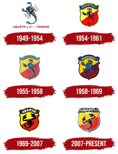
1949 – 1954
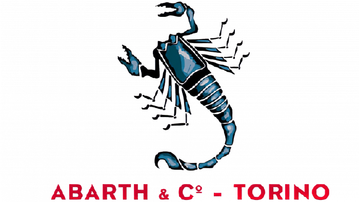
The debut version of the logo contained a single image of a scorpion. It was as close to a realistic image as possible and contained many physiological details. The exact structure of the small lateral legs, the notches on the claws, the number of segments on the tail – everything was carefully drawn. This was necessary to intimidate opponents, as befits a sports team. The color palette was restrained – black and several shades of gray. In the logo, there was also a red color: it emphasized the name of the company and its location. The inscription was located under the image. In addition, the author of the emblem was Carlo Abarth himself, who was an automobile designer.
1954 – 1961
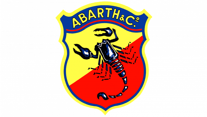
To deepen the emotional outburst and emphasize the competitive spirit of the brand, the developer placed the scorpion on a sculptural shield of bright color. The yellow and red colors provided ample adrenaline, charging some with excitement and others with fear. The differently colored areas were separated by a diagonal line, and on their background was the arthropod symbol. At the same time, the shield resembled a chevron, as the company name was placed on a separate field and located in an arch. From the outside, the logo had a double contour with blue and yellow lines.
1955 – 1958
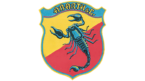
Restraint and naturalness – these are the main principles to which the Abarth logo of this period was subordinated. For this purpose, the designers revised the image of the scorpion and “put” it together. That is, they drew it as a whole, connecting disparate fragments. In addition, the artists added realism to it with the help of artistic accents:
- Deep shadows
- Light highlights on the shell
- The harmonious combination of dark and light blue colors
They kept the shape of the heraldic shield but changed the style of the letters. The result was a figural inscription in Old English script. Glyphs with sharp spikes, diagonal cuts, and triangular protrusions blended well with the poisonous shell arthropod. The colors were pastel.
1958 – 1969
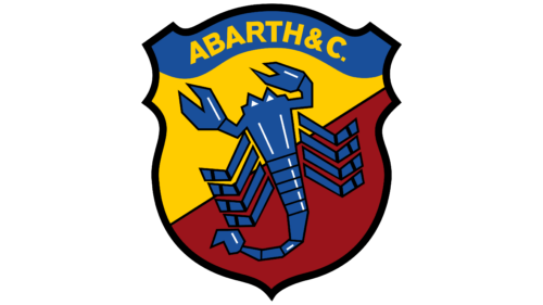
After the success of sports cars, the owner of the company decided to give the emblem originality, abandoning the detailing of the scorpion. To do this, he painted the background under the car brand in blue and the letters themselves the designer made yellow. Another change affected the artistic style of the image – aggression and detailing left him, giving way to schematic and abstraction. The artist has thinned the lateral legs, reduced the number of tail segments, and increased the claws. On the edge of the chevron, he drew a dark blue border, and on the body of the scorpion – white highlights.
1969 – 2007
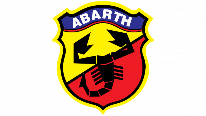
The blue color in the emblem of those years was no longer there; it was replaced by purple and black. The first served as a background for the name of the brand; the second represented the scorpion. The inscription became large and white. It was separated from the main space by a red wavy line. The yellow color acquired a pastel shade. The lateral branches of the arthropod were completely shortened. The yellow color appeared along the dark border. The scorpion was depicted in a cubist style.
2007 – today
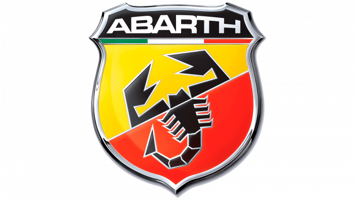
Designers filled the modern version of the logo with the spirit of patriotism, for which they used the colors of the Italian flag. As a result, the dividing line between the brand name and the scorpion is now colored green, white, and red. They also widened the chevron to maximize its resemblance to a shield. The upper field with the word “Abarth” was leveled, and the inscription itself was given an arc-shaped form. Due to this, the letters became different in height: the central ones are long, and the side letters are short. The edging of the logo is made under the metal frame with shadows and highlights. The authors placed the scorpion exactly on the diagonal strip, visually dividing it into two parts. The head and claws are in the yellow zone, and the body, legs, and tail – are in the red.
Abarth: Interesting Facts
Abarth stands for speed, performance, and a strong racing background. Carlo Abarth kicked things off in 1949 in Bologna, Italy.
- The Logo: A scorpion set against a yellow and red background is Abarth’s logo, showing the founder’s astrological sign, Scorpio. It stands for the brand’s aggressive nature and love for racing.
- Racing Roots: Abarth is big in motorsport. It began by boosting Fiat cars’ performance and built its racing cars. Abarth cars have won many hill climbing races, rallies, and sports car racing.
- Breaking Records: In the ’50s and ’60s, Abarth cars set more than 100 speed and endurance records, proving their focus on fast and innovative designs.
- Joining Fiat: In the ’70s, Abarth joined forces with Fiat, creating high-performance Fiat models. The Fiat 500 Abarth, known for mixing city driving with sporty flair, is a famous result of this partnership.
- Exhaust Systems: Abarth is also famous for its performance exhaust systems, enhancing engine performance and sound.
- Turin Workshops: The original Abarth workshops in Turin were where the magic happened, turning regular cars into performance beasts through innovative tuning.
- Rally Wins: Abarth has a rich history in rally racing, with notable cars like the Abarth 124 rally and the Abarth Grande Punto S2000 continuing its tradition of motorsport excellence.
- Collectibles: Collectors highly value Classic Abarth cars like the Abarth 595 and 1000 TC for their racing legacy and distinctive designs.
- Driving Schools: Abarth runs driving schools and events where fans can learn to drive like pros and experience Abarth cars on race tracks.
- Always Innovating: Abarth keeps pushing forward, making cars that respect its racing past while embracing new technology. It’s still a go-to name for those who love driving.
Abarth’s mix of Italian flair, racing success, and dedication to fast cars has secured its place in car culture. The brand continues to inspire car fans and racers with its commitment to speed and innovation.
Font and Colors
At the very beginning of the reorganization of the Cisitalia brand into Abarth, its new owner chose the image of a scorpion – his zodiac sign – for the logo. Since then, this arthropod is always present in the logo: only the style of its drawing changes.
The lettering is in a font close to Microgramma D Bold Extended. The authors of this font are Aldo Novarese and Alessandro Butti. The closest free analog is the typeface Grammara Normal, created by designer Thomas E. Harvey.
The color scheme of the logo is standard and consists of red, yellow, white, and black. To these are added periods of blue, purple, and green.
Abarth Logo Color Codes:
- Red: Hex: #D40000; RGB: (212, 0, 0); CMYK: (0, 100, 100, 17); Pantone: 186 C
- Yellow: Hex: #FED300; RGB: (254, 211, 0); CMYK: (0, 17, 100, 0); Pantone: 1235 C
- White: Hex: #FFFFFF; RGB: (255, 255, 255); CMYK: (0, 0, 0, 0)
- Black: Hex: #000000; RGB: (0, 0, 0); CMYK: (0, 0, 0, 100)
FAQ
What does the Abarth emblem mean?
The Abarth emblem has prominently featured the Scorpion since its creation seven decades ago. This is not only because the company’s founder, Carlo Abarth, was born under the zodiac sign of Scorpio. Scorpio means perseverance, power, and resilience.
Is Abarth the same as Fiat?
Abarth is the high-performance division of Fiat, featuring specialized tuning and luxury. Currently, only certain Fiat models have Abarth trim.
Is Fiat now an Abarth?
Following the integration of Fiat into Fiat Chrysler Automobiles, the parent company of Abarth was named FCA Italy S.p.A. in 2015.
Is the Abarth 500 the same as the Fiat 500?
The Abarth version of the Fiat 500 features higher specifications, visual enhancements, and additional features, which is why it is more expensive than the standard Fiat 500.
What does the word Abarth mean?
Founded by Italian-Austrian Carlo Abarth in 1949, Abarth & C. S.p.A. is an Italian automobile company specializing in the production of racing and road cars.
