


![]() Pininfarina Logo PNG
Pininfarina Logo PNG
The royal crown atop the Pininfarina logo is there for a reason. The emblem conveys the luxury and beauty that the company brings to the world. The geometric font in italics looks like it came off the hood of a premium car.
Battista Farina was born on November 2, 1893, in Turin, the tenth of eleven children. In Piedmont, the youngest was called “Pinin”, a nickname that later became part of the family name. From age 12, he worked at his brother’s Stabilimenti Farina, learning body construction.
On May 22, 1930, he founded Società anonima Carrozzeria Pinin Farina in Turin, with the support of Vincenzo Lancia. The factory covered 9,250 m², employed 150 workers, and produced 7–8 bodies per day. Clients included Lancia, Alfa Romeo, Isotta Fraschini, Hispano-Suiza, Fiat, Cadillac, and Rolls-Royce. In 1935, the Alfa Romeo 6C Pescara Coupé aerodinamico was shown in Milan.
By 1939, output reached 800 cars. After World War II, Italy was excluded from the 1946 Paris Motor Show. Farina drove to Paris with his son and displayed cars outside the Grand Palais, attracting press attention. In the same period, the Cisitalia 202 Coupé was completed and later exhibited at MoMA in 1951.
The MoMA exposure led to work with Nash Motors. In 1951–1952, Pininfarina designed and built bodies for the Nash-Healey and Nash Ambassador. A 1951 meeting with Enzo Ferrari in Tortona led to a long-term partnership, starting with the Ferrari 212 in 1952 and the 250 GT in 1954.
In 1961, Farina handed control to Sergio Pininfarina and Renzo Carli, and the family name was officially changed. Battista died in 1966. The company later opened a research center and a full-scale wind tunnel. Competitors such as Bertone and Italdesign competed in the same market.
In 1984, Pininfarina developed the Cadillac Allanté with production split between Turin and Detroit. In 2015, the family sold its controlling stake to the Mahindra Group.
Meaning and History
![]()
The company logo consists of a name derived from the owner’s nickname and surname: Pinin + Farina. It has a rich heritage and an incredibly elegant look. It consists of two parts: graphic and verbal signs.
What is Pininfarina?
Pininfarina is an Italian company that specializes in the design of transportation vehicles. It designs cars, airplanes, yachts, trams, buses, and high-speed trains. The firm was established in 1930 and gained fame for its work with well-known brands such as Cadillac, Peugeot, Maserati, Alfa Romeo, and Ferrari. Their innovative appearance and high quality distinguish the vehicles they create.
1906 – 1930
![]()
The original version of the logo emphasized the elegance of the cars produced under the Pininfarina brand. Its visual lightness, luxury, and dynamism convey this well. They are reflected in the details: the wings on both sides, a regal crown, and a coquettish curve.
The base of the emblem is a blue shield with a gold edge. Two mountain goats are depicted on the right and left below as symbols of overcoming obstacles, as these animals easily rush across high, rocky terrain. At the top is the attribute of monarchical power, bordered by two pairs of wings. There is also a text part: a capital “F” in an extravagant spelling and the word “FARINA” on a horizontal plate.
1930 – today
![]()
A graphic element occupies the key place with a central “f.” The letter is in a double-edged oblong rectangle. Adjacent to two miniature red triangles placed in the upper left and lower right parts for visual balance. In the middle, there is a white diagonal background.
Above the vertical rectangle is a small monarchical crown, a symbol of its elitism and its premium status. This is a testament to the impeccable quality of service. The crown features a large pearl, which further adds an aura of luxury and rich heritage to the logo.
The main detail is the lowercase “f.” With a double stroke and a large curl at the top, the letter is large, turned to the right. The leg is cut at right angles and pointed. The same technique is used on the crossbar.
Font and Colors

The text has a perfect balance of geometric rigor and creativity. The word is written in italics, in a square font with straight lines and rounded corners. It looks futuristic, balancing on the verge of simplicity and high sophistication. Ideal for classic transport brand logos.
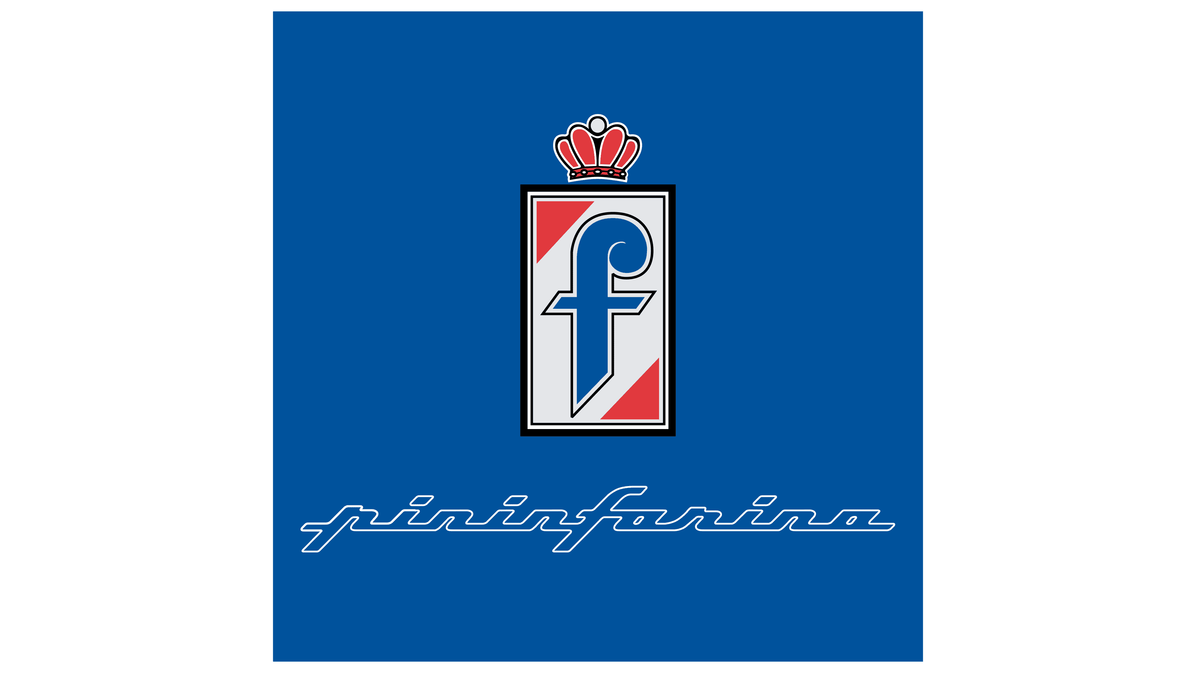
The emblem’s color palette is dark blue, red, and white. They do not have any shades or gradients, which speaks to the company’s seriousness and reflects a responsible approach to design. It also showcases her impeccable sense of style and beauty.