


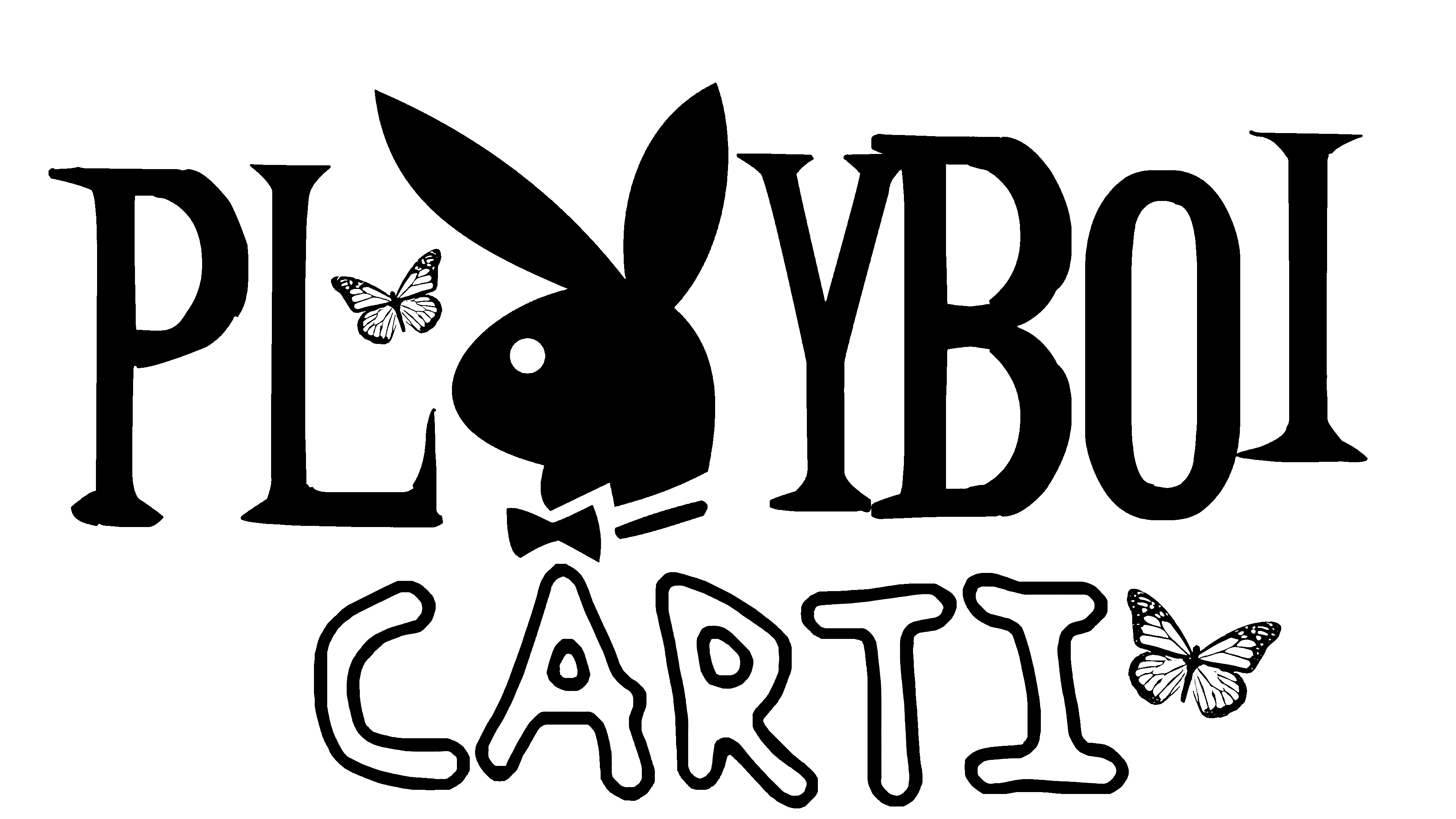
 Playboi Carti Logo PNG
The Playboi Carti logo signals an outrageous rapper unafraid to intrigue and shock the public. Entourage isn’t the only place in the singer’s performances. The emblem also hints that the musician is attractive and has many fans.
Jordan Terrell Carter was born on September 13, 1996, in Atlanta, Georgia. He skipped school to work on music and briefly worked at H&M before leaving the job to focus on recording.
In 2011, he began uploading tracks to SoundCloud as Sir Cartier. By 2013, he had become Playboi Carti. His ties to producer Ethereal and to Awful Records helped shape his early sound. Later, in New York, he connected with A$AP Mob and A$AP Rocky.
Carti broke through on SoundCloud in 2015 with “Broke Boi” and “Fetti,” recorded with Da$h and Maxo Kream. In 2016, he signed with AWGE, the A$AP Rocky and Interscope Records venture, and appeared on A$AP Mob’s Cozy Tapes Vol. 1: Friends.
His debut mixtape, Playboi Carti, was released in April 2017 and reached No. 12 on the Billboard 200. “Magnolia” hit No. 29 on the Hot 100. At the same time, “Wokeuplikethis” with Lil Uzi Vert reached No. 76. Die Lit followed on May 11, 2018, debuting at No. 3 with production from Pi’erre Bourne and a feature from A$AP Rocky. In 2019, Carti founded Opium. Whole Lotta Red came out on December 25, 2020, and debuted at No. 1 on the Billboard 200. In 2024, “Carnival” with Kanye West and Ty Dolla $ign gave him his first No. 1 single on the Hot 100. His third album, I AM MUSIC, was released on March 14, 2025.
Meaning and History

Growing up in the provincial town of Fairburn, life was not easy. So he tried to escape the environment that sucked him in by going out to meet people all the time. But Carter barely graduated from school because he was constantly working toward the future. He went to training because he loved basketball and dreamed of an NBA career. However, he did not succeed; he abandoned the sport after a disagreement with the coach.
At the same time, Playboi Carti studied music and often skipped school to work on his compositions. As a result, he barely completed his studies. He refused to pursue higher education after school because of the difficult situation he found himself in. So he was left with only one way to make a living: rapping, although he didn’t initially think about it.
The young man’s creative pseudonym, stage presence, and personal identity were strongly shaped by the environment he grew up in. The musician dressed in a pretentious, cheap, non-standard way, mostly preferring clothes from discount shops. This led him to embrace gothic aesthetics and experimental hip-hop.
The rapper considers black as the base color. This palette prevails in the design of posters and albums. It sits next to red (the color of blood) and white (an ideal contrasting background). The musician has no logo; he is searching for a way to express himself. One symbol is associated with the name of Playboy magazine, after which the performer took a nickname.
The picture shows a long-eared rabbit with a bow tie. It is found in the first third of the word “Playboi,” after the letters “P” and “L.” The signs are narrow, elongated upward, uneven in height, and misaligned with the capital font and sharp serifs. Below (on the second line), ” Carti ” is clumsily added. The letters are light and contoured, but drawn in uneven lines, like a trembling hand. Two butterflies are flying around. They are important to a musician’s identity, so they often appear on his posters.
Font and Colors
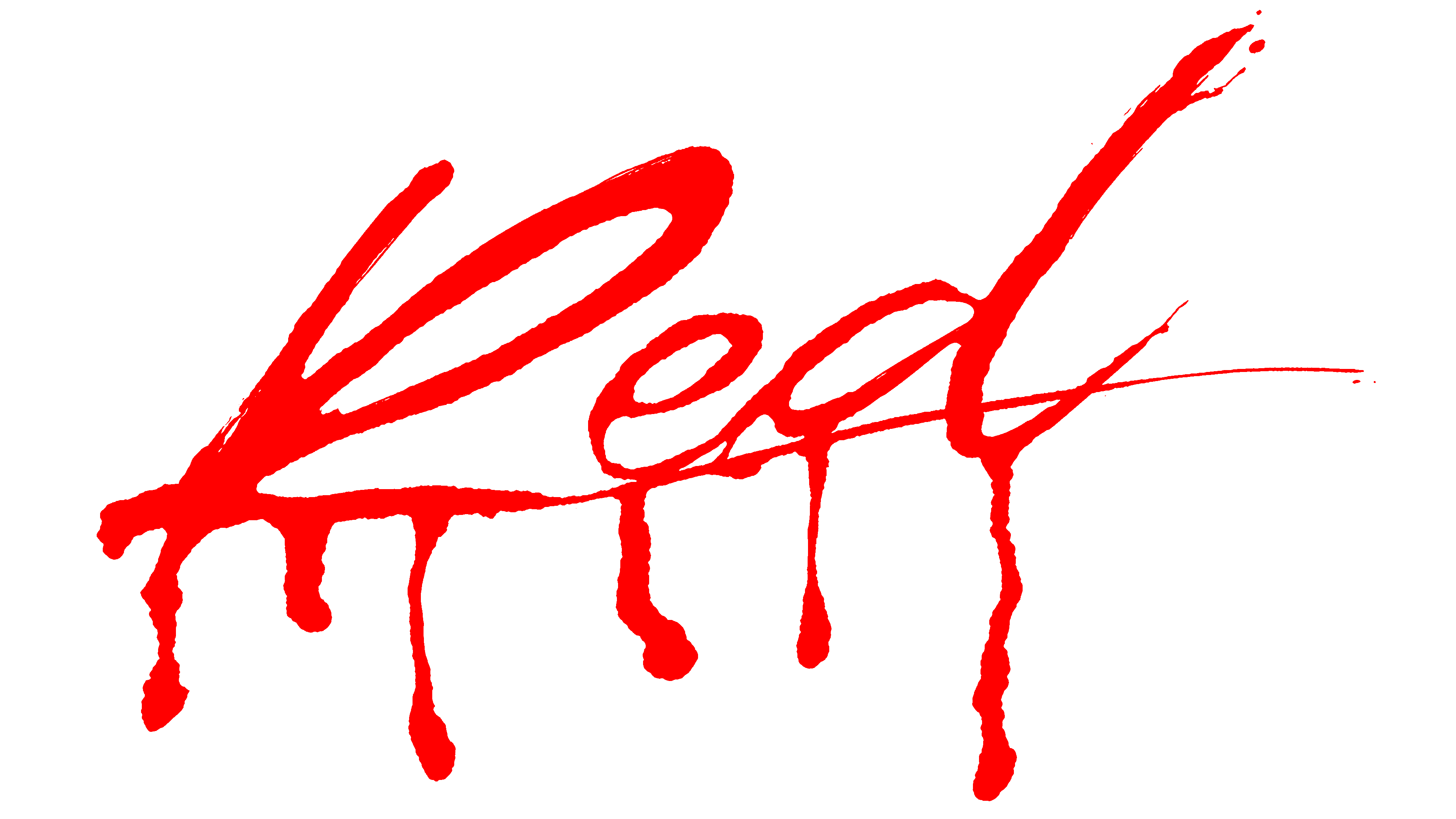
The artist chose a shocking logo for the latest album, which was released in 2020. It echoes the name Whole Lotta Red and features bloody lettering on a white background. The word “Red” is in handwritten italics. Stripes flow down from the letters, which are terrifying because they suggest cuts in the skin from which blood oozes.
For self-expression, the rapper chooses styles that have no analogs. The same approach is applied to the design of music albums. The name, like the pseudonym, is written in an individual typeface. In one case, the letters are vertically elongated with spike-like serifs; in the other, hollow characters are circled along the contour with uneven lines. The performer’s personal palette consists of black, red, and white. There are also multicolored posters.