


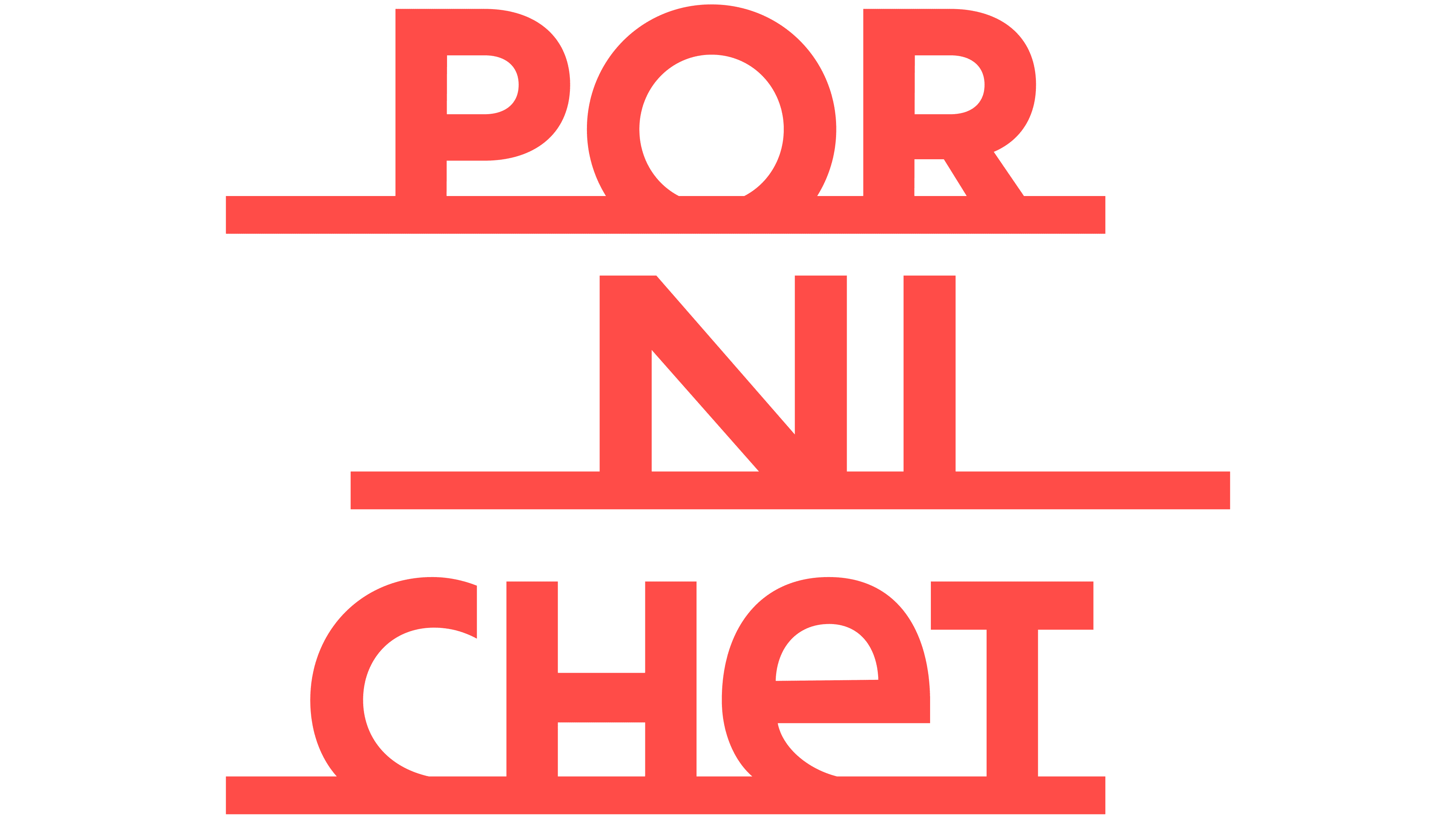
Pornichet’s name tells the resort’s story in a new tourism logo by Graphéine. The French agency split the word across three lines, incorporating a sun, a sail, the local racetrack, and seaside villas into the letterforms. Unveiled on April 23, 2026, at Villa Ker Juliette, the identity connects local history with a relaxed seaside pace of life.
Pornichet is in the Loire-Atlantique department, between La Baule and Saint-Nazaire. Its name means “cozy little port.” The similarity to neighboring Pornic’s name had long confused visitors, so Graphéine’s task was to help them distinguish the towns and give the resort a presence among other coastal destinations. Belle Époque architecture, literary connections, and leisurely vacations inspired by the slow living movement formed the project’s foundation.
The long name becomes a compact, stepped block, with “POR” at the top, “NI” in the middle, and “CHET” at the bottom. Horizontal lines beneath the letter groups match the thickness of the main strokes. The middle row is shifted to the right. A circular “O,” the diagonal stroke of the “N,” and a lowercase-style “e” sit alongside angular capitals. The primary logo is coral red.
The three tiers represent the progression from sunrise to noon to sunset. The lettering weaves in references to the town. The “O” depicts the sun above the bay, the “R” recalls the La Pierre-Percée rock formation, and the diagonal of the “N” becomes a sail above the harbor. In the bottom row, the “H” references the racetrack, while neighboring letters suggest a row of seaside villas. In animation, the wordmark transforms into views of the resort, revealing the imagery within it.
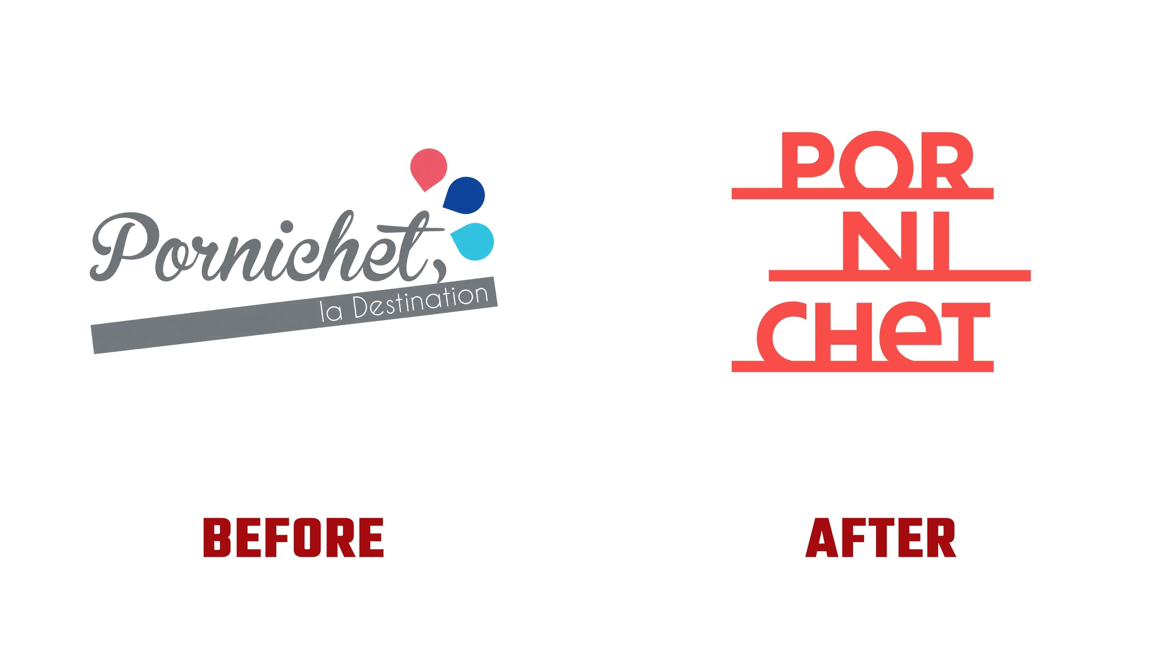
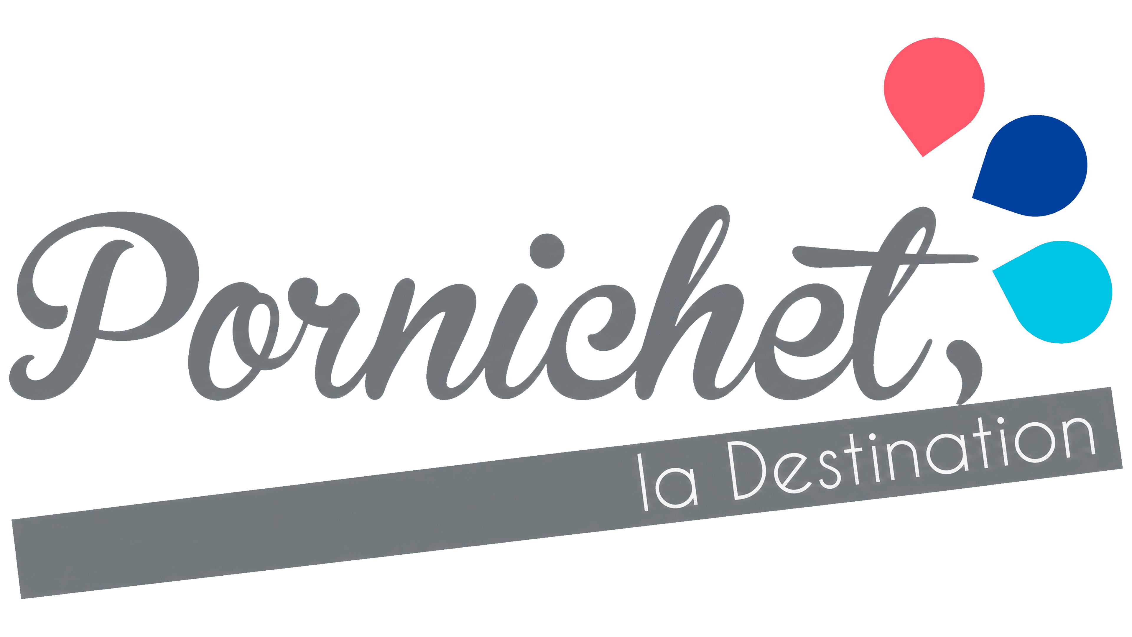
The previous logo presented Pornichet on a single elongated line. The slanted gray lettering resembled a handwritten signature. Beneath it, a gray band contained the white words “la Destination,” meaning “the destination,” while pink, dark blue, and light blue teardrop shapes appeared at the upper right. The new design replaces these separate embellishments with imagery built into the letters. Horizontal lines divide the name and reinforce the sea-horizon theme.
A reworked version of the town’s 1912 coat of arms complements the logo. Graphéine retained the heraldic dolphins, the Pierre-Percée rock formation, the maritime pine, and decorative rooftop finials. The architectural references recall the resort’s development after the railroad arrived in 1879. Villas with turrets, bay windows, and ornate roofs became part of its heritage. The coat of arms presents the town’s historical imagery in greater detail.
For large supporting text, the agency developed a typeface called Pornichétine. It draws on Art Nouveau, vintage travel posters, and local building facades. Curved strokes extend the coastal and natural themes, while the logo retains its custom lettering. Across the materials, the coat of arms and typography appear alongside cream backgrounds, areas of red, blue, green, and yellow, and coastal photography.
The tagline “Vivre plage à plage,” meaning “Live from beach to beach,” develops the literary theme. It plays on the French phrase “page à page,” or “page by page,” connecting beach vacations with reading. International versions include “Where life coasts along” in English and “Meer Zeit zum Leben” in German. The new identity appeared in promotional materials and on the tourism website, which launched on the day of the unveiling.