The Post Office logo exemplifies the successful use of color and form. The emblem informs that parcels and letters are instantly transmitted and not lost within the Post Office network. Employees are passionate about their work, so life in the branches is in full swing.
Post Office: Brand overview
Meaning and History
The company’s official foundation date was 1986 when the Post Office Counters brand appeared. However, its roots went deeper in 1660. Then, the General Letter Office was created, later known as the General Post Office. The GPO had a network of branches and sorting centers throughout the country. At the beginning of the 21st century, this organization provided various services and managed cash accounts.
1969, the GPO was disbanded, and the Post Office took over all its branches. After that, the savings bank branch turned into National Savings. The telephone and telegraph division formed the basis for the British Telecommunications Corporation. Post Office Ltd has long operated as part of Royal Mail, but legislative changes allowed it to emerge from the group’s influence in 2012 to make independent strategic decisions.
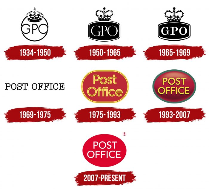
Global changes in the organization’s structure were reflected in the identity, which has had at least seven logos (since 1934). They are united by a minimalist style, manifesting classic British restraint.
What is Post Office?
Post Office is a postal corporation from the UK. It appeared in 1986 and provides the population with a wide range of services, including banking operations. Its structure includes 11,500 branches located throughout the country.
1934 – 1950
Since Her Majesty’s Government ran the General Post Office, its emblem featured a heraldic crown, which traditionally indicated belonging to the royal court. The crown hung over the letter “P” from the lettering “GPO” and was partially in the white circle. The acronym used a thin sans-serif font.
1950 – 1965
The new logo’s crown has changed shape: it looks like St. Edward’s Crown, used at the coronation of Great Britain’s monarchs. This is one of the main attributes of power. The white circle has turned into a black, deformed rectangle with a wide border. The acronym has been dyed white and given sharp and thin serifs.
1965 – 1969
In the last years of its existence, the General Post Office has carried out a small redesign. The crown has been enlarged, and the serifs on the letters have become long and rectangular. The bold type was chosen to draw attention to the organization’s name.
1969 – 1975
The Post Office Act 1969 abolished the GPO and made the creation of a new postal corporation possible. After the rebranding, the word “General” disappeared from the name. Instead of an emblem with a crown and a complex geometric background, a monochrome trademark with the words “POST OFFICE” was used. The letters’ design is close to printed correspondence’s standard font.
1975 – 1993
In 1975, the company had a yellow and red logo with a striped “Post Office” lettering. The basis was a rectangular oval. It had a double outline that matched the style of the text. Each element of the letters consisted of two parallel lines; only the dot above the “i” looked like a single ring. By the way, Royal Mail still uses a design similar to the emblem.
1993 – 2007
When the logo took on an oval shape, it appeared convex due to the gradient. The colors also changed: the designers made the base burgundy, and the outline was painted green. The lettering remained yellow but acquired small black shadows around the edges. The font has been updated to the standard sans serif.
2007 – today
In 2006, Post Office Ltd. began facing serious financial problems, eventually forcing the company to close 2,500 branches. However, this did not stop her from updating the emblem in 2007, which perhaps should have symbolized the expected exit from the crisis.
Designers have simplified the design to match the canons of fashionable minimalism. As a result, the lettering became completely white, without dark shadows. The oval has lost its gradient and green border, and the red has become brighter.
Post Office: Interesting Facts
The UK’s Post Office has a huge network of over 11,500 branches, making it the biggest in the UK. This network means nearly everyone in the UK is close to a Post Office. It’s not just about sending letters; these branches offer much more, from banking to government services.
- Everywhere You Need It: The Post Office is everywhere, more than all the UK’s banks and supermarkets. This makes it easy for nearly everyone in the UK to get to one.
- Helpful in the City and the Country: Whether you’re in a busy city or a quiet rural area, the Post Office is there. It’s especially important in rural areas, where it might be the only place to get certain services.
- A Place to Connect: Post Offices are more than just places to send mail; they’re community spots where people can meet up, especially helpful for those who might feel isolated.
- Banking and More: The Post Office offers many banking services, such as taking out cash, depositing money, and checking your balance. It also offers loans, savings accounts, and insurance.
- Government Stuff Made Easy: Need to renew your car tax or get a fishing license? The Post Office has you covered. You can access a bunch of government services there.
- Keeping Up with Online Shopping: As more people shop online, parcel services are in high demand. The Post Office has adapted and offers various parcel services to meet this need.
- Staying Modern: To keep up with the digital world, Post Offices have new self-service kiosks, better online services, and updated branch designs. This helps them stay relevant and convenient.
- Boosting the Economy: The Post Office greatly benefits the UK economy. It supports local businesses by making sending and receiving packages easier, which is important for small and medium-sized businesses.
- A Cultural Icon: The Post Office is a trusted symbol in British culture, often seen in movies, books, and art. It’s a familiar part of life in the UK.
The Post Office has evolved from dealing with mail to offering various services. This evolution shows how it has adapted to the modern world while still being a key service for the public.
Font and Colors
Post Office uses a wordmark complemented by only one element: a large red oval. The text within the geometric shape is the classic structure of all company logos, except for the 1969-1975 version, when the lettering was stylized as a newspaper headline and was in the space.
The name of the post office network is Gill Sans. This geometric grotesque appeared in 1926. It is used by various companies and distributed with Adobe products. The Merel Medium typeface created by The Northern Block in 2006 is very similar.
The base red color corresponds to the official General Post Office palette adopted during the Second World War. The selected shade is close to reddish pink (# DE0127). Against this background, the white inscription is visible.
FAQ
Can I use the post office logo?
Permission must be obtained to use the post office logo. The brand controls its logos to protect its identity and reputation.
You may request permission if you are a partner or organization using the services. Approval is given on a case-by-case basis. You must explain how you plan to use the logo and wait for their decision.
To apply, contact the brand. Provide a clear explanation of the intended use. If approved, you will receive guidelines for proper use.
What is the Post Office logo?
The modern logo is a red oval with the postal service’s name in white. The text is centered and divided into two lines for ease of reading.
Red was chosen because it attracts attention and conveys urgency. The oval shape makes the design unique. The text uses a bold sans-serif font that is clear and readable even from a distance. The white text stands out against the red background, making the brand name prominent.
This logo is used on buildings, vehicles, and uniforms, making the brand easily recognizable. The simple design ensures that it looks good in various sizes and materials.
What is a post office?
A post office is a public facility where mail can be sent and received. It accepts letters and parcels, provides post office boxes, and sells postage stamps, packaging, and stationery. The post office serves as a local hub for essential services.
Post offices offer various services, which vary from country to country. These services may include banking, money transfers, bill payments, and retail sales. In many communities, the post office plays an important role, offering services that may not be available elsewhere.


