


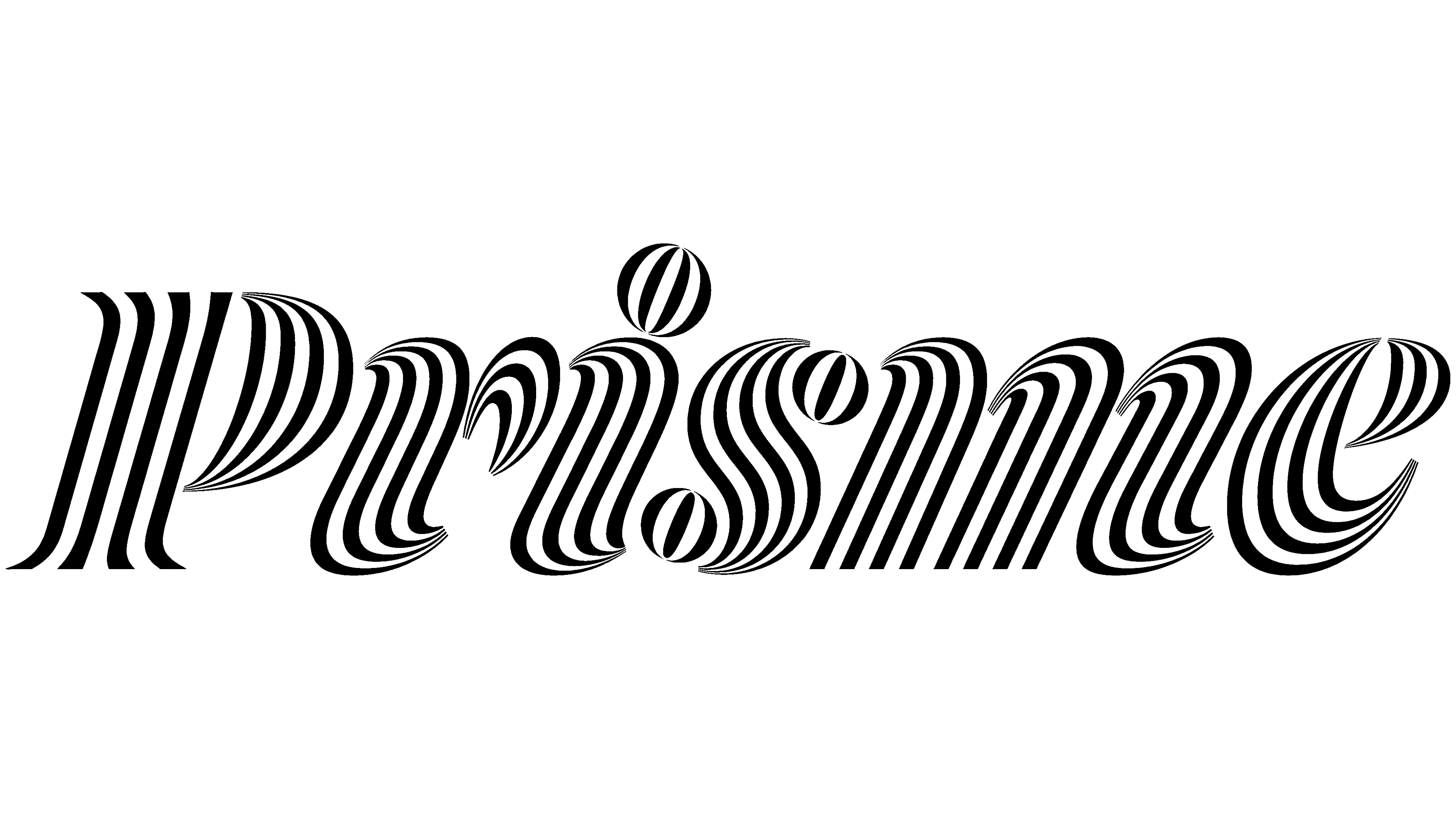
The 2026-2027 season in Namur, Belgium, was unveiled as Prisme, bringing together performances, exhibitions, and creative workshops from three of the city’s cultural teams. ōnō studio debuted the name and logo on May 18, 2026. Striped letterforms reference the refraction of light through a prism and invite audiences to experience art from different perspectives.
The shared brand brings together Théâtre de Namur, Centre culturel de Namur, and Ateliers’Bis, a center for creative expression. All three teams already belonged to the same nonprofit organization but operated under separate public-facing names. Their programs now share a name and identity. The theater in central Namur and the cultural center in the Bomel neighborhood continue to operate at their existing venues.
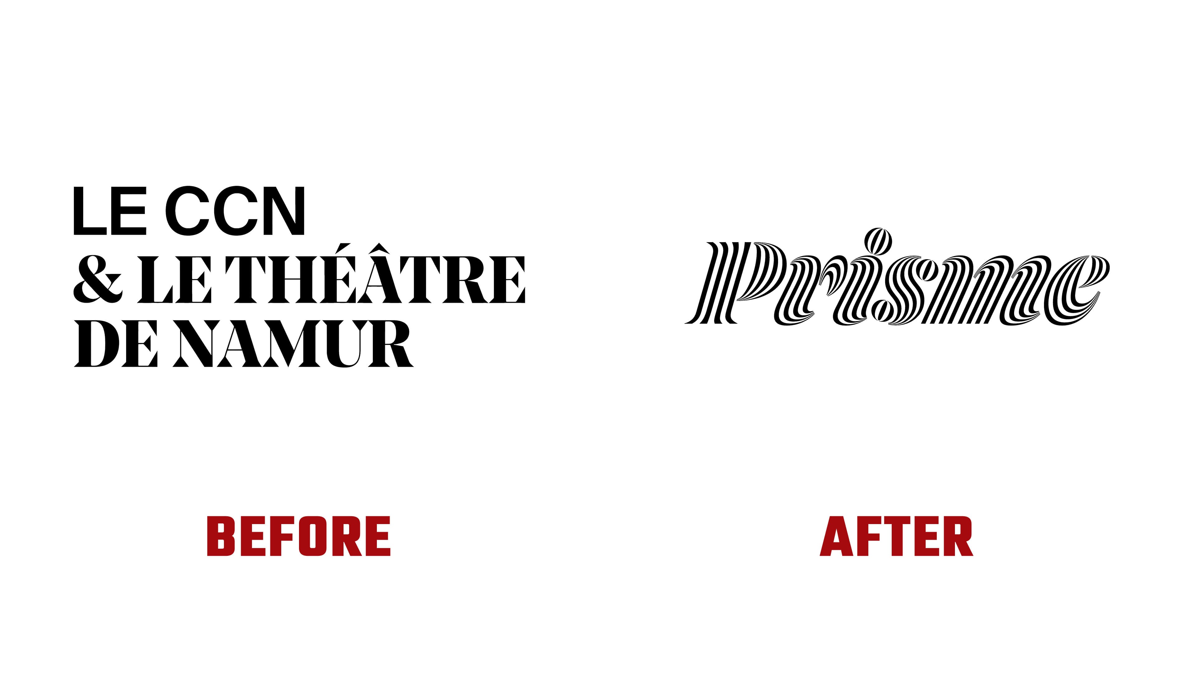
The idea of a shared name emerged during the project. The original brief addressed other concerns, but discussions shifted toward finding connections between the teams’ programs and goals. The process took several months and included group meetings and approximately 20 individual interviews with outside participants. Consultant Carole Haine guided the discussions and helped develop the name and tagline. The French word “prisme” means “prism,” while “L’art de voir autrement” translates as “The art of seeing differently.” Together, they suggest that art can reveal unfamiliar aspects of familiar things.
The previous logo arranged the institutions’ names across three lines. “LE THÉÂTRE,” “& LE CCN,” and “DE NAMUR” formed a dense rectangular block. The top and bottom lines used large serif capitals with thick vertical strokes and thin connecting strokes. Between them, the cultural center’s abbreviation appeared in a bold sans-serif typeface. The bottom line named the city both organizations called home.

The new logo replaces the stacked text with a single word. It retains the black-and-white treatment and serifs, introducing stripes within the letters. These follow the contours, wrap around rounded forms, and converge at the terminals. Alternating black lines and white spaces create an optical effect reminiscent of refracted light. The lettering itself carries the prism idea.
Prisme begins with a capital “P,” followed by lowercase letters. A rightward slant, serifs, and elongated terminals give the wordmark a decorative italic feel. The dot over the “i” is a striped, tilted oval. The logo is based on Dala Prisma, with tighter letter spacing and thicker fine terminals.
Type designer Szymon Sznajder refined the lettering. J. Xavier Chylinski, Clara Frisson, and Antoine Pilette worked on the project at ōnō studio, based in Forest, Belgium. Sébastien Lenouvel, who oversees art direction and communication design at Prisme, also contributed to the brand’s development.
The striped lettering draws on several typefaces. Commercial Type released Dala Prisma in 2014. Paul Barnes proposed combining the approach behind Rudolf Koch’s Prisma with the stencil forms of Dala Floda. Ben Kiel developed the type family, and Frederik Berlaen created a tool for constructing the stripes. Solid strokes gave way to lines of varying thickness. The original Dala Prisma family included Roman with 3 lines, Bold with 4, and Fat with 5.
For Prisme, the modified letterforms became the basis of a custom variable system with Solid, 4-Line, and 5-Line versions. The 5-Line version serves as the primary style. The 4-Line version is intended for smaller text, where the internal stripes need additional space. Solid uses continuous strokes while retaining a connection to the typeface’s stencil origins.
Throughout the identity, black-and-white patterns, curved ribbons, and shapes built from alternating filled and open areas extend the optical theme. Images of eyes reference the tagline about seeing differently through art. By the May unveiling, the identity had been applied to the theater’s facade and interior, where visitors explored the program for Prisme’s first season.