Despite the company’s close association with the energy giant, it has an individual corporate identity that distinguishes it from other divisions. The Radius logo was designed by the renowned agency Kontrapunkt. The company has been developing the visual identity and brand strategy for DONG Energy, so the visuals have some similarities. But, the Radius emblem has many unique features that emphasize its identity and significance. In general, the picture looks very minimalistic and confident. In addition, it has a stylized element directly associated with electricity and voltage.
Radius: Brand overview
| Founded: | 2016 |
| Founder: | DONG Energy (Ørsted) |
| Headquarters: | Denmark |
| Website: | radiuselnet.dk |
Radius is a separate structural unit of the leading Danish energy company DONG Energy El Distribution. It is a separate company that specializes in power distribution.
Radius spun off into a separate company not too long ago. For a long time, DONG Energy (modern Ørsted) was a large multinational enterprise that consisted of many structural units. Incredible scale, to some extent, complicated the control and management process, so the management decided to restructure. As a result of these changes, a new separate unit appeared, which worked in the direction of energy distribution but was subordinate to the central office. It became the company Radius. Her identity was also confirmed on a visual level.
Meaning and History
The best designers from the agency that directly worked on the visual concept of DONG Energy were hired to create a separate corporate identity. Their efforts resulted in a beautiful minimalistic logo, which consists of only one element. It evokes direct associations with activity, as it includes a stylized element resembling an arc through which tension flows.
What is Radius?
Radius is an energy distribution company owned by the large Danish company DONG Energy (Ørsted). She appeared as a result of restructuring and received her own visual image, which appealed to the logo of the main brand. The full-fledged work of Radius began in 2016, and every year the structural unit strengthens its position more and more.
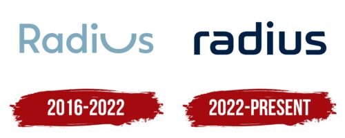
2016 – 2022
2022 – today
The decision to create a separate energy distribution company, Radius, was made in April 2016. From that moment on, it worked as a separate division with its own corporate identity. Its basis was a simple but expressive logo. It creates a full-fledged visual image of the company, reflecting its core values as much as possible.
A minimum of elements indicates simplicity and focus on a specific activity area. Radius works in the field of energy distribution and pays maximum attention to all the processes there. A fairly simple design solution creates the thematic emphasis in the emblem – a stretched letter U. It is the only decorative touch in a minimalistic picture, consisting of only one inscription.
As conceived by experts, it symbolized the range of the electrical network. This is one of the most important characteristics of the enterprise. In addition, the indicated symbol has an additional meaning. He demonstrates friendliness, comfort, and customer care. This is what potential consumers expect from the brand, in addition to the high quality of services. In addition to the modified letter U, the logo uses another interesting style solution.
It refers directly to the font. This format is distinguished by lines of medium thickness, straight cuts, and rounded shapes. The design is a great addition to the concept as it makes the letters look like cables that carry electricity. The coloring, in this case, is a little out of the thematic line. It does not use traditional colors for this area but only a basic set of shades that demonstrate the advantages of the brand.
Font and Colors
The corporate identity of Radius is built based on modern design, which provides for a bright thematic modification. The basis was a rounded stylish sans-serif typeface. Its main features are the same thickness of lines in all parts of the letters, flat shapes, smooth curves, and straight, even contours. In addition, small gaps are visible between the letters, which provide excellent readability.
The selected category of fonts symbolizes innovation, professionalism, and a high level of service, which are the direct characteristics of the company. In addition, this variety uses a modified letter U. It carries the main semantic load regarding the direction of the work of Radius. The color scheme of the logo is quite modest and neutral at the same time. It consists of white and blue colors. This combination emphasizes the basis of the brand philosophy – reliability, trust, and transparent terms of cooperation.
Radius color codes
| Space Cadet | Hex color: | #002044 |
|---|---|---|
| RGB: | 0 32 68 | |
| CMYK: | 100 53 0 73 | |
| Pantone: | PMS 2768 C |
