The Radius logo emphasizes the pragmatism and modernity of the brand, which aims to provide quality oral care. The visual appeal of the emblem serves as a reminder of the importance of regularly using hygiene products, prioritizing only safe and effective items.
Radius: Brand overview
RADIUS was founded in New York City in 1982 by Kevin Foley and James O’Halloran, two architects with backgrounds in industrial design. Their wish to reconsider the designs of commonplace items, beginning with toothbrushes, inspired the company’s concept.
Two years were dedicated to researching and developing Foley and O’Halloran’s first toothbrush. They examined brushing techniques, materials, and ergonomics to develop a product far superior to what was already on the market.
The brand unveiled the “Original,” its first toothbrush, in 1983. This toothbrush had an ergonomic handle and a wide oval head, giving it a distinctive design. It is made of cellulose, which is more environmentally friendly than plastic toothbrushes.
The corporation faced difficulties in its early years of operation. Conventional toothbrush makers resisted the new company, and customers used to conventional toothbrushes were skeptical. However, people began to notice the product over time because of its distinctive appearance and high caliber.
The American Society of Industrial Designers presented the brand with its inaugural design prize in 1985. This recognition helped the organization attract new clients and improve its reputation.
By the late 1980s, the firm started to broaden its product selection. The business began experimenting with other materials for its bristles and unveiled a children’s version of its toothbrush.
The brand expanded substantially during the 1990s. The business started exporting its goods to Asia and Europe, necessitating increased production capacity. A new facility was established in Pennsylvania in 1993, where environmental regulations set up production.
The company unveiled its first toothbrush with a changeable head in 1996. This invention, which sought to reduce plastic waste, gained popularity with customers who cared about the environment.
There were more innovations in the 2000s. In 2004, the firm increased its influence in the dental care industry by introducing a range of organic toothpaste. 2007, the business unveiled the first toothbrush ever constructed from recycled dollar notes.
To commemorate its 30th anniversary, the brand introduced a new product line in 2011 modeled after the original 1983 design but made with contemporary materials and manufacturing techniques.
2013 marked an important turning point for the business. The company’s dedication to the highest social and environmental performance levels was validated by its receipt of B Corporation certification.
Pet dental care items were added to the product line in 2015.
In 2017, the brand introduced a new range of toothbrushes made of bioplastic sourced from sustainable resources, which enhanced its reputation as an environmentally conscious company.
The company maintained its distinctive large oval head shape when launching its first electric toothbrush in 2019. Through this product launch, the business was able to break into a new market niche.
In 2020, the firm maintained its goal of developing cutting-edge, eco-friendly dental care solutions. A new range of biodegradable children’s toothbrushes was unveiled. These brushes had vivid, eye-catching designs and were made considering youngsters’ unique anatomy, encouraging the development of healthy dental hygiene practices at a young age.
In 2021, a new factory was constructed in Pennsylvania to increase manufacturing. This action boosted production and quickened the creation of new goods. With its state-of-the-art machinery, the new factory reduced its negative effects on the environment and increased production efficiency.
The company commemorated the year 2022 with the introduction of a novel dental floss product. The business unveiled biodegradable dental floss composed of natural ingredients and packaged in reusable packaging. This product addressed the increasing need for environmentally friendly substitutes for conventional oral hygiene products.
In 2023, the firm persisted in growing its market share overseas. The company expanded the availability of its products to European consumers by entering into collaboration arrangements with distributors in other European nations.
Significant technological advancements were made in 2024. The business unveiled the first “smart” toothbrush in history, constructed of eco-friendly materials. Using a smartphone app, the sensors on this brush evaluated the quality of teeth brushing and offered suggestions for better techniques.
The enterprise effectively merged environmental responsibility with technological innovation, growing its market share internationally and advancing its goal of rethinking daily product design.
Meaning and History
What is Radius?
It is an American brand that produces high-quality, eco-friendly toothbrushes and other oral care products. The company emphasizes sustainability by offering toothbrushes made from eco-friendly materials such as recycled plastic, plant-based plastic, and biodegradable materials. The brand’s products feature unique designs, such as larger, ergonomically shaped handles and interchangeable heads to reduce waste. The brand is committed to promoting better oral hygiene while minimizing environmental impact, making it a popular choice among environmentally conscious consumers.
1980s – today
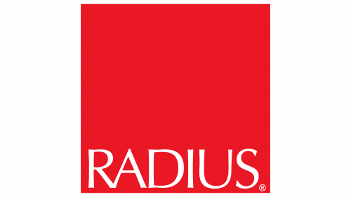
Most manufacturers of toothpaste and toothbrushes rely on traditional imagery, using symbols of freshness or stylized smiles in their logos. However, Radius took a different path—one of avant-gardism, minimalism, and modern art. It placed its name in a huge red square to stand out among competitors, which at first glance seems meaningless. Two contrasting elements—the text and the background—complement each other well, standing out through the contrast of shapes and colors.
When viewed in a cultural context, the logo’s geometric simplicity has much in common with avant-garde art, specifically Suprematism, founded by the Ukrainian artist Kazimir Malevich. The Radius brand emblem resembles one of Malevich’s works, Red Square, which was created simultaneously with the more famous Black Square. Its striking brightness embodies activity, energy, and strength.
Whether intentional or not, the American toothbrush manufacturer adopted this concept, replicating not only the color but also the shape of the painting. This means the logo is not as simple as it appears at first glance.
– The square is considered one of the most stable and balanced geometric shapes. The equal side lengths and perfectly straight angles create a sense of order and symmetry. It is synonymous with reliability, one of the main qualities personal hygiene brands must adhere to. The enclosed shape is perceived as a symbol of simplicity, completeness, and order. In other words, the square hints at the self-sufficiency of Radius products, suggesting the company offers everything necessary for oral care.
The purpose of the red color is to attract attention. Its intensity enhances the visual impact of the emblem, especially on store shelves, as consumers are more likely to remember bright, monochromatic images. Additionally, red symbolizes the technology that increases the effectiveness of toothbrushes and toothpaste. The high concentration of red may seem aggressive, but this aggression is directed solely at oral health issues.
Although the square takes up nearly all the space, it is not the primary element of the emblem. The focus is the company name, written at the bottom of the geometric figure. “Radius” is written in a font similar to Oregon LDO Medium Regular by Luke Owens. Beneath its outward simplicity lies elegance, expressed in the uneven thickness of the lines and the rounded corners, whose pointed ends evoke associations with floss.
The white color does not make the inscription pale or unnoticeable—on the contrary, it stands out in sharp contrast against the red background. In this case, white symbolizes purity, which is exactly what oral care products promise. The color draws attention to the brand, as the logo is not overloaded with extraneous details.
