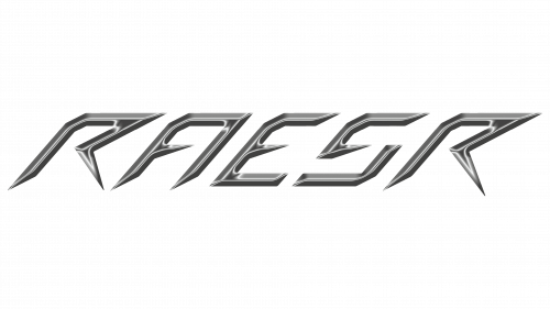
The RAESR logo is light, modern, and sleek, much like the technologies on which the brand’s equipment is based. The emblem showcases the high capabilities of electric hypercars and motorcycle manufacturers, assuring customers that they are cost-effective and stylish.
RAESR: Brand overview
The tale of this brand is a thrilling narrative of innovation, speed, and the relentless pursuit of electric vehicle excellence.
In 2014, Eric Rice founded this company in the dynamic city of Los Angeles, California. His vision was audacious: to create electric hypercars that would redefine the boundaries of automotive engineering and performance.
By 2015, the brand had embarked on the ambitious project of crafting its first electric hypercar, the Tachyon Speed. This endeavor marked the beginning of an intensive period of research and development, where cutting-edge technology and futuristic design took center stage.
In 2017, the brand unveiled the Tachyon Speed prototype. This sleek, avant-garde vehicle captivated the automotive world, promising extraordinary performance and generating significant buzz and anticipation.
Throughout 2018, the brand focused on rigorous testing and refinement of the Tachyon Speed. The company proudly revealed the car’s astonishing specifications: a power output exceeding 1250 horsepower and a top speed of over 240 mph (390 km/h). These figures positioned the Tachyon Speed as a formidable contender in the hypercar arena.
Development and fine-tuning continued into 2019. The brand concentrated on enhancing the car’s aerodynamics and the efficiency of its electric powertrain, ensuring that every aspect met the highest performance and innovation standards.
The global pandemic in 2020 presented significant challenges. Despite these hurdles, the brand remained undeterred, focusing on perfecting the Tachyon Speed’s technologies and preparing for limited production runs. Their commitment to innovation and excellence persisted, even amid global disruptions.
By 2021, the brand continued working diligently on the Tachyon Speed, striving to make it one of the world’s fastest and most technologically advanced electric hypercars. Their dedication to this project highlighted their passion for pushing the limits of what is possible in electric vehicle technology.
Meaning and History
What is RAESR?
American automobile company known for developing electric hypercars. The company combines advanced technologies with innovative designs to create vehicles that provide exceptional speed, power, and efficiency. The flagship Tachyon Speed model is known for its futuristic design and impressive performance, including extreme acceleration and high top speeds.
2014 – today
Founded in 2014, RAESR immediately embraced the latest technologies and developed a logo that aligns with its concept. Unlike typical industry logos, the resulting emblem has minimal emphasis on traditional engineering elements. Instead, it conveys progress, innovation, and even electrical engineering technologies, demonstrated in every meticulously crafted detail.
The symbol’s style is modernist yet simple and understandable. In this case, minimalism effectively highlights that the brand’s motorcycles and hypercars are powered by electricity. This is effectively and communicated through:
- Thin strokes
- Sharp ends
- Metallic texture
- Light reflections
- Geometric glyphs
These elements create an appropriate atmosphere and set the right tone for customers, forming an accurate impression of the products. This informative emblem provides valuable insights, indicating that it belongs to the technology sector and represents advanced transportation.
Remarkably, the main feature of the logo is its texture. It is prominently displayed in the chrome letters with a shiny metallic surface, enhanced by smooth, glossy glyphs reflecting bright light. This indicates that the company engages in high-precision processes, where attention to detail, seriousness, and responsibility are paramount. Such an approach to visual identity makes the automaker widely recognizable and boosts its competitiveness.
The emblem perfectly matches the brand: the slanted lettering conveys dynamism and energy, while the abrupt glyphs evoke a sense of movement. At the same time, the bright letters create a positive impression, as the reflected light makes them incredibly bright and shiny. The font is uppercase, sans-serif, and italic. The lack of serifs signifies the company’s openness and commitment to responsibly meeting customer needs.


