The Ramones logo is quintessentially American, just like the musicians themselves. There’s something legendary and memorable about it. The emblem represents a band that made history as the founders of punk rock and influenced the evolution of American music.
Ramones: Brand overview
| Founded: | 1974 – 1996 |
| Headquarters: | Forest Hills, Queens, New York, U.S. |
| Website: | ramones.com |
Meaning and History
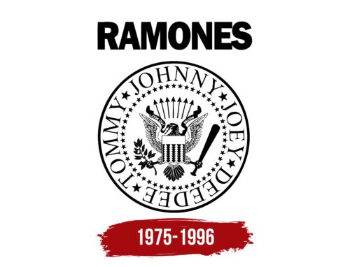
Graphic designer Arturo Vega designed the logo, and it first appeared on the cover of “Leave Home.” The artist understood the band well, being their artistic director and attending almost all of their concerts. The emblem captured the American spirit of the musicians and their love for their homeland. It drew a parallel between a principal national symbol and the pivotal role the Ramones played in the emergence of punk rock.
Who are the Ramones?
A musical group whose fame and real influence emerged after they finished their career. The band ranks 26th on the 100 Greatest Artists of All Time, and the American magazine Spin ranked them second among the most significant groups in history. In 2002, they were inducted into the Rock and Roll Hall of Fame, and in 2011, they received a Grammy. Their music has inspired 48 tribute albums.
1975 – 1996
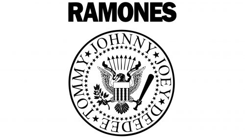
At the top of the emblem, “Ramones” is written in large capital black letters. The band’s name was derived from Paul McCartney’s pseudonym, Paul Ramon, which he used as an alias. Each band member adopted a similar name: Joey Ramone, Dee Dee Ramone, Johnny Ramone, and Tommy Ramone. Following them were other members, C. J. Ramone, Marky Ramone, Richie Ramone, and Elvis Ramone.
Below the name is a slightly modified seal of the USA. This choice emphasizes the band’s enduring legacy and its truly American essence.
Around the seal are the names of the band members. The eagle in the center holds a bat instead of arrows but faces the apple branch that replaces the olive branch. The apple is an analogy for apple pie, which, for the designer, epitomized American cuisine.
The bat symbol hints at the song “Beat on the Brat,” which talks about beating someone overbearing with a baseball bat. Moreover, guitarist Johnny Ramone was a big baseball enthusiast.
The blue cloud with stars was replaced by soaring arrows, symbolizing the strength and aggression in the band’s songs.
Changed the inscription on the ribbon held by the eagle’s beak. On one half, it reads “look out”, and on the other, “below.” After the song “Blitzkrieg Bop” was released, the inscription was replaced with “Hey ho, let’s go.”
The pattern used instead of the American shield was taken from Arturo Vega’s shirt and consisted of arrowheads.
Thus, thanks to these subtle details, the well-known image of the presidential seal became very personal for the band and immortalized in history.
Font and Colors
The black-and-white theme of the emblem resonates with the covers designed by Arturo Vega for the band. The contrast in colors embodies something timeless and historic. It’s as if the band’s creativity touched both past and future generations.
The font of the inscription resembles Ryman Gothic Black with majestic letters. Each character is a monument to the legendary band, made with confident and bold strokes.
Ramones color codes
| Black | Hex color: | #000000 |
|---|---|---|
| RGB: | 0 0 0 | |
| CMYK: | 0 0 0 100 | |
| Pantone: | PMS Process Black C |

