The Remind logo stands for educational betterment through strong family-school connections. It advocates for a united approach to improve academic outcomes for student.
Remind: Brand overview
| Founded: | 2011 |
| Founder: | brothers Brett and David Kopf |
| Headquarters: | San Francisco, California, U.S. |
| Website: | remind.com |
Originating in San Francisco, Remind existed in 2011, courtesy of siblings Brett and David Kopf. Originally named Remind101, the venture was driven by Brett Kopf’s academic challenges stemming from dyslexia and attention deficit disorder. The platform, designed to improve communication between teachers, parents, and students, is a distribution center for notifications about class assignments, exams, and other educational activities.
Experiencing a surge in usage, Remind was implemented in over half of America’s public schools by 2016, boasting an impressive user base exceeding 20 million active participants each month. In 2014, the company had streamlined its identity two years prior, shifting from Remind101 to Remind.
The financial backing for Remind has been robust, amassing $59.5 million in investment capital. Notable contributors include Kleiner Perkins Caufield & Byers, Social Capital, and First Round Capital. The company also made headlines in 2016 when it brought on board Brian Grey, previously the CEO of Bleacher Report, to steer the organization.
Today, Remind remains steadfast in its mission to improve communication within the educational landscape, specifically targeting the K-12 sector. Its multifaceted platform offers a variety of functionalities, such as messaging and scheduling utilities, all designed to keep educators, students, and parents in the loop and engaged in the educational journey.
Meaning and History
The platform started as an ordinary startup, but it has grown into a powerful education support system over time. Along this journey, the product’s visual symbols have changed multiple times. Yet, in every case, the emblem represented an interpretation of the name. Simple and clear symbols, carrying the idea of support and care, have attracted a large audience to Remind and received approval from the Department of Education.
What is Remind?
It is an American platform related to the field of education. It was founded as part of a startup ecosystem aimed at improving education. It is an online link between parents, teachers, school administrators, and students. The platform features video lessons, messaging, notifications, and reports.
2011 – 2013
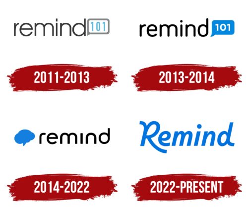
The first logo of the system consists of a thin black inscription of “Remind” and a chat icon that reads “101.”
The platform’s name relates to its creation story. One of the brothers, Brett, suffered from ADHD and dyslexia. Special attention from teachers was required for the boy, as he found it difficult to focus, read, and write.
His brother David invented a specific system through which teachers could contact Brett and remind him about upcoming tests and quizzes. This system was quite effective, enabling Brett to achieve good academic performance.
The brothers decided to make the system global. They named the platform after the reminders that teachers sent to Brett. 101 indirectly refers to something better—a system that helps achieve higher results. Like 100%, and then there’s 101.
Lowercase letters in the inscription symbolize informal, friendly interaction between platform participants. The website is designed for support rather than dominance, commands, or control. Teachers remind students about required tasks or tests through the system.
The chat icon indicates messaging between followers. It was designed and built for mobile-first messaging. At the time, chat was a less conventional communication method, as teachers relied on paper letters or calls. Thus, the program was revolutionary for its time, significantly simplifying communication.
2013 – 2014
The 2013 rebranding gave the emblem richer elements, indicating the platform’s growing usage and initial positive outcomes.
The name now had bolder lettering. The system enhanced dialogue between a student’s family and teachers, leading to a 42% increase in completed homework.
The dialogue icon turned blue, typical for chat correspondence. The number 101 turned white, hinting at news or new information.
2014 – 2022
In 2014, Remind received a large investment of 55 million dollars. The platform was upgraded so that messages could be sent in both directions. Previously, only the teacher distributed information.
As a result of the expansion, the brothers changed the name to “Remind,” as the platform evolved into a communication system, not just a reminder tool for education. The new name led to a logo update.
The logo retained its smooth, lowercase lettering featuring rounded edges. This change showed that the platform’s main goal is to reduce challenges and complexities in children’s education and to assist schools and parents in collaboration.
A blue cloud icon has replaced the dialogue symbol before the name. This graphic element indicates correspondence and hints at cloud technologies, online storage, and the ability to connect from anywhere.
2022 – today
The most significant changes to the identity occurred in 2022. The emblem showcased the platform’s transformation into a powerful hub that extends beyond messaging. In 2018, the platform introduced the Remind Hub system, enabling connections to entire schools or districts, posting community-wide messages, and sharing reports and presentations. Online tutoring was launched in 2020 to support students during the COVID-19 pandemic.
The new blue emblem consists of the platform’s name written in uppercase. Uppercase letters emphasize its global reach and draw attention to spelling norms requiring capitalizing the name. The extended leg of the letter ‘R’ embraces the subsequent letters from below, embodying the platform’s purpose of providing support and care.
Font and Colors
The emblem’s blue color symbolizes dreams, development, and growth. The platform’s global mission is to help children receive quality education to fulfill their aspirations. The shade indicates comprehensive support for the younger generation by parents and teachers.
The inscription’s font is unique, featuring elongated glyphs for ‘R’ and ‘d.’ It resembles Facit SemiBold Italic, with finely-tuned letters that mimic a school handwriting sample.
Remind color codes
| Celtic Blue | Hex color: | #0074de |
|---|---|---|
| RGB: | 0 116 222 | |
| CMYK: | 100 48 0 13 | |
| Pantone: | PMS 285 C |
