The Revlon logo is sophisticated and modern. It tells about the connection of generations and the gradual growth and expansion of the brand, which covers the whole globe. The emblem has leadership, passion, and bright colors that the brand offers to its customers.
Revlon: Brand overview
| Founded: | March 1, 1932 |
| Founder: | Joseph Revson, Charles Revson, Charles Lachman |
| Headquarters: | New York City, New York, United States |
| Website: | revlon.com |
Revlon is an American cosmetics company that was the first in the 1930s to offer opaque nail polish, develop a line of colors, create America’s first designer fragrance, and launch the fashion for the identical tone of lipstick and polish. Sold in 150 countries and had eight branches worldwide. Demonstrated a $2.5 billion asset reduction in 2021 and declared bankruptcy in 2022.
Meaning and History
Brand owners focused little on the logo when conducting advertising campaigns. From 1938 to ’53 and into the ’60s, the brand did not have a full-fledged common mark for all products. The fame and recognition of the company had more to do with print ads and the celebrities who participated in them. The logo style was unified only after the management change, and it did not change for many years.
What is Revlon?
Headquartered in New York City with many affiliates in Europe, Asia, and South America, the cosmetics company offers nail polishes, perfumes, and hygiene products. Revlon has about 6 thousand employees in 150 countries. The company has been bankrupt since 2022.
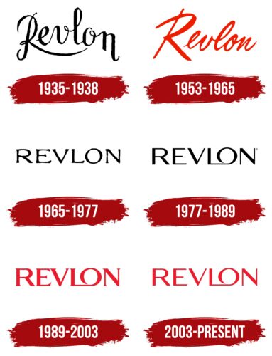
1935 – 1938
The brand logo is wordy. The name is written in capital letters and curved like a rainbow. The brand’s name came from a modified surname of the project’s mastermind Charles Revson. The letter “s” was changed to “l” to honor the second important participant, the chemist Charles Lachman. It was as if he stood in the middle between the brothers, splitting their last name in half, as the team included another Revson – Joseph, a pragmatic businessman.
The technique was unusual and original for the time. The result was a unique word, which in Esperanto meant “dream.” Relying on this lexical play, the founder claimed that the company was selling a dream. And the style of the inscription matched that idea.
The letters of the name are airy and light, woven with thin threads. They are reminiscent of the stream of varnish with which the brand’s name was written out. The rainbow curve conveyed a great mood and told about a rich palette of colors. In the first years, the company specialized in nail polish and constantly expanded the number of shades.
The smooth letters, with no slant, spoke of a focus on one product.
1953 – 1965
Thanks to the idea of opaque nail polishes, the company made a multi-million dollar profit and became the second-largest cosmetics company in the United States. In addition to a whole line of manicure products, lipsticks appeared in the range. The new logo reflected these changes.
The company name is written in bright red, indicating the predominant pigment in the products. The lettering represents scarlet lips and nails. The hue also shows the rise and development of the brand and its popularity.
The slant of the letters to the right shows the aspiration for the future and the desire to advance and create new cosmetic products. New palette colors appeared every fall and spring, making the offer always fresh. The sequential connection of the elements is an indication of the importance of the relationship between the tones of the lipstick and nail polish.
The bright hues of the lettering also hint at print ads with models discussing beauty and the prevalence of red hues in brochures. Famous models and stars in cosmetics ads were new, and red reflected this sensation.
1965 – 1977
The company went through a reorganization which resulted in separate divisions, each responsible for a specific range of customers. For example, Natural Wonder worked for the youth, and Ultima II produced cosmetics for the premium segment.
The brand logo has also changed. The name is printed in capital letters with slight thickening on the ends. The disappearance of the link between the characters emphasized the division into sectors. The use of upper case indicated the importance and equality of each division.
The thickening symbolized the accumulation of experience and customers.
1977 – 1989
Sales reached $1 billion. However, the company is experiencing strong competition and wants to strengthen its position and attract attention to rebrand.
The new logo receives large black letters, speaking of high financial performance. A special highlight is the transformation of L and O into one symbol, which became the main distinguishing feature of the subsequent logos.
The tandem looks as if O is a curl from L. The composition alludes to curls, styling, and chic. Embodying flirtatiousness, it presents the brand as playful and glamorous. Shows the letters and the connection of generations. The brand’s founder died in 1975, but his business continued to live.
1989 – 2003
By 1989 Pantry Pride became the owner, buying Revlon shares and turning the corporation back into a private enterprise.
In the emblem, the transformation is shown by the thickening of the letters, indicating a strengthening of positions and increased assets. The red color of the lettering conveys aspirations for the return of the brand’s leading position in the market. The letters are serifed, showing the narrow specialization of the company, a farewell to additional directions unrelated to cosmetics.
The red color of the emblem tells about leadership and innovation. In 1989 Revlon became one of the first companies which stop testing products on animals.
2003 – today
In 2003 the mark underwent a minor transformation, thanks to which its letters became more refined and stripped of serifs. The logo’s color also lost its saturation, following the popular trend of thin and slim models. The transformation brought the logo closer to the canons of beauty and fashion.
Font and Colors
The two main colors accompanying the brand throughout its history are red and black. They have alternated between emphasizing stability and confidence and growth and innovation. Red was the main color of the product line. It conveyed the energy, assertiveness, and demandingness of Charles Revson and the resourcefulness and ingenuity of Charles Lachman. Told of multi-million dollar sales and worldwide distribution. The black looked great on the brand’s multi-colored products, providing a presentable look.
The lettering font is unique. Has similar features to Resort Sans Regular.
Revlon color codes
| Pigment Red | Hex color: | #eb1c2d |
|---|---|---|
| RGB: | 235 28 45 | |
| CMYK: | 0 88 81 8 | |
| Pantone: | PMS Bright Red C |
