Movement and expression are seen in the Rexona logo. The tool hits the target exactly, destroying the unpleasant odor. The emblem gives off a feeling of freshness, and the more active the user’s day, the more intense the antiperspirant works.
Rexona: Brand overview
| Founded: | 1908 |
| Founder: | Unilever |
| Headquarters: | Australia |
| Website: | rexona.com |
Meaning and History
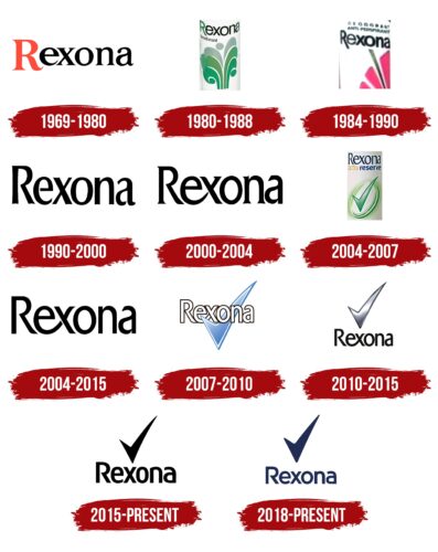
For more than a century of history of the trademark, it has had many emblems. They all share the same spelling style for the word “Rexona.” In total, the brand has about eleven logos.
What is Rexona?
Rexona is a brand of antiperspirants and deodorants launched in 1908. It is owned by the international company Unilever, which produces food products, cleaning agents, and other consumer goods. Rexona products are designed for both women and men and are positioned as effective protection against perspiration. They are sold in more than 100 countries under different names, including Shield, Rexena, Degree, and Sure.
1969 – 1980
By that time, a version with a classic inscription resembling the Times New Roman font belongs. The emphasis is on the first letter, so “R” is highlighted in size and color: it is larger than the rest of the characters and is colored bright red.
1980 – 1988
In this version, the designers lengthened the right leg of the capital “R” but kept it on the lower border of the name. In addition, they removed the serifs and made the letters bold.
1984 – 1990
During this period, a variant with an elongated right leg “R” appeared. It goes beyond the lower word limit.
1990 – 2000
A fundamentally new emblem with neat elongated signs has been approved. The letters are closely spaced, and the middle “R” stroke is not connected closely to the left sidewall.
2000 – 2004
The designers played with the transition from “e” to “x” in an interesting way: they lengthened the leg “e,” making it part of the “x.”
2004 – 2007
After redesigning the Rexona logo, the serifs on the tops of the letters are turned in the opposite direction – to the right. The sharpening on the transition line between the “e” and “x” disappeared, and instead, a smooth stroke appeared, the thickness of which became the same along the entire length.
2007 – 2010
The designers shortened the “R” leg, made the letters contour, and reduced the distance between them. Also, a checkmark appeared on the emblem for the first time. It is wide, blue, with a dark blue edging.
2004 – 2015
The connection line between “e” and “x” is much wider. The serifs have disappeared from the letters, which makes the characters look thinner and more accurate.
2010 – 2015
The transition between “e” and “x” has become continuous. In addition, the developers returned the signature checkmark to the logo and played with it in an original way by placing it above the name. They painted it silver with a gradient and added a raised hem.
2015 – today
The current emblem consists of graphic and text parts – the trademark’s name and a large checkmark next to the word “Rexona.”
2018 – today
The modern Rexona logo is a toned-down version of the previous one. Firstly, all corners are rounded in it, and secondly, the height of the letters is reduced. The designers also changed the color of the inscription, painting it in dark purple.
Rexona: Interesting Facts
Rexona is a top brand for deodorants and antiperspirants and is part of Unilever. It’s called Sure in the UK, Degree in the US and Canada, and Shield in South Africa. The brand is famous for fighting sweat and bad smells.
- Beginnings: In 1908, Australian chemist Mrs. Alice Sheffer started Rexona. She wanted to create a better way to stay fresh, so she made Rexona soap with antiseptic properties to fight odor from sweat.
- Product Evolution: Rexona keeps creating new products, such as roll-ons, sticks, sprays, and creams, to suit everyone’s needs.
- Motionsense™ Technology: This cool feature in Rexona products releases freshness when you move. Tiny capsules break with friction, keeping you fresh all day.
- Worldwide Presence: Rexona is available in over 100 countries. The brand changes its name in different places to become more popular locally.
- Sports Partnerships: Rexona works with sports teams and events, like Formula 1 and athletic competitions, to prove it can handle sweat in any situation.
- Eco-friendly Moves: Rexona is working on being more eco-friendly by using less aluminum in aerosol cans, lowering its carbon footprint.
- Ad Campaigns: The ads for Rexona focus on how it won’t let you down, showing that it offers protection all day, no matter what you’re doing.
- Constant Innovation: Rexona invests in research and development to create products that meet consumers’ needs, including options for sensitive skin and trendy scents.
- Products for Everyone: Rexona has different products for men and women, recognizing that everyone has different preferences and needs.
- Boosting Confidence: Rexona also wants to help people, especially young ones, feel more confident. They run campaigns about staying active and feeling good about yourself.
Rexona has come a long way from starting with antiseptic soap to being a leading global deodorant brand. It keeps innovating and adapting to meet user needs while focusing on reliability and performance.
Font and Colors
Regardless of the year of appearance, the brand symbol has one common element – the word “Rexona.” In 2015, a checkmark was added to it – as a sign of confirmation of the slogan “It won’t let you down.”
The logo uses a custom typeface with a capital “R” and a unique transition from “e” to “x,” which has now been removed. The color scheme is monochrome and consists of white (background) and black (text). The opening inscription also featured red.
Rexona color codes
| Space Cadet | Hex color: | #212c54 |
|---|---|---|
| RGB: | 33 44 84 | |
| CMYK: | 61 48 0 67 | |
| Pantone: | PMS 655 C |
