


![]() Roundup Logo PNG
Roundup Logo PNG
The herbicide manufacturer goes to great lengths to emphasize the safety of its products, doing so at every level of visual identification. The Roundup logo inspires confidence because it is associated with naturalness, the natural world, and purity. But it is worth noting that the glyphosate-based drug itself is toxic.
Roundup began in Monsanto’s laboratory, not as a marketing project. In 1955, organic chemist John Edward Franz joined Monsanto, a company founded in 1901 in St. Louis by John Francis Queeny. In May 1970, Franz synthesized glyphosate while working on synthetic herbicides. Early greenhouse tests showed that it killed persistent perennial weeds without staying active in the soil.
Monsanto filed a patent application in 1971 and launched Roundup in 1974. The herbicide worked through the leaves, moved into the roots, and killed the whole plant. It entered a market that included ICI’s Gramoxone, based on paraquat, a much more dangerous compound for people. At first, Roundup was mainly used before planting and between crop rows. In 1987, Franz received the National Medal of Technology from President Ronald Reagan.
The major shift came in 1996, when Monsanto released Roundup Ready soybeans, genetically modified to tolerate glyphosate. Corn, cotton, canola, sugar beet, and alfalfa followed. Farmers could spray entire fields without killing the crop, and glyphosate became the world’s most widely used herbicide. After Monsanto’s U.S. glyphosate patent expired in 2000, producers in China, India, and Europe entered the market, including Syngenta, which introduced Touchdown.
In 2015, the WHO’s IARC classified glyphosate as a “probable carcinogen,” while Monsanto and later Bayer rejected that view, citing national regulators. Bayer bought Monsanto in 2018 for $63 billion and soon faced major Roundup verdicts, including the Dewayne Johnson case. In 2020, Bayer agreed to pay more than $10 billion to settle over 100,000 claims and removed glyphosate from consumer Roundup for home gardens, while agricultural sales continued.
Meaning and History
The brand logo has remained unchanged since the change of ownership. The chemical sells well and does not need additional investment in rebranding.
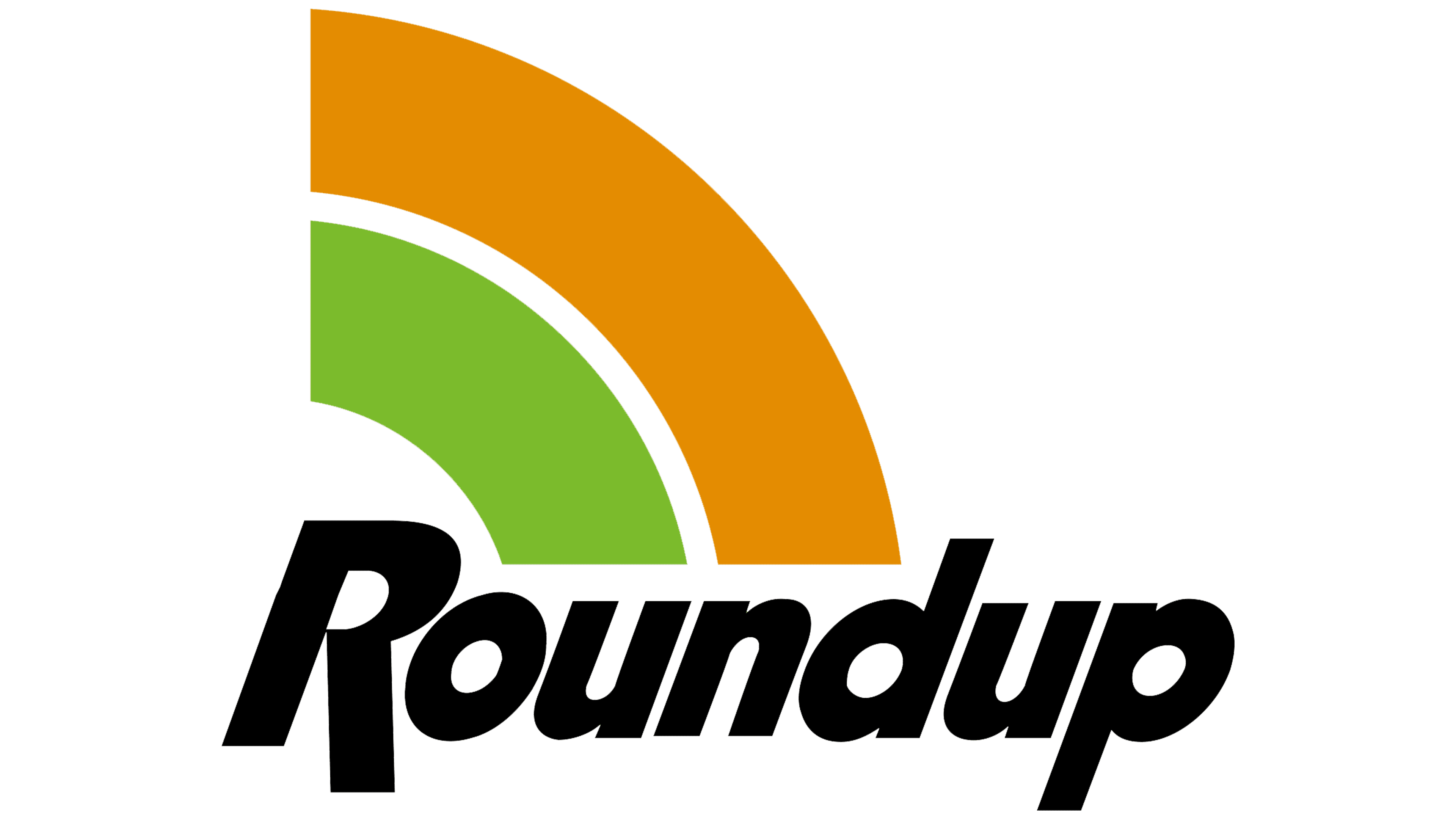
The product’s visual identity consists of the brand name and an emblem in the form of a quarter circle consisting of two stripes: green and orange.
What is Roundup?
A widely used glyphosate-based field herbicide in the U.S. and Brazil. Since 2018, the German pharmaceutical company Bayer has owned the brand’s rights.
The brand name itself gives a general idea of its essence. The word Roundup has two parts: Round (round, around) and up (up). This separation into two components is visible on some product bottles due to the use of different colored fonts. The word combination conveys the active growth of plants after being sprayed with herbicide.
The logo is distinguished by the unusual lettering of the letter R, whose right foot extends well below the word level. It symbolizes the root, and the entire letter represents the rooted plant.
The quarter circle beginning above the R has several meanings:
- Elimination of weeds. The green stripe, in this case, shows a green, rooted, and beginning-to-grow weed. And yellow is a prototype of the desiccation caused by Roundup exposure. The herbicide inhibits amino acid production, leading to starvation and plant death. The chemical works best on weeds with deep or branching roots that are difficult to remove (burdock, thistle, couch grass).
- Protection of cultivated seedlings. The rooted green plant (green band) grows, develops, and bears fruit (orange band) thanks to Roundup.
- Spreading. The stripes indicate the formation of airborne microdroplets when the product is sprinkled. The product usually adheres to green leaves and is well absorbed, thereby disrupting metabolic processes.
- Plants can survive the herbicide application. Since the discovery of glyphosate, genetic modification of cultivars has been developed, allowing them to continue growing while weeds die when treated with the chemical. These discoveries increased farmers’ demand for herbicide solutions. The logo shows the plant (R) growing under protection.
- Dart target. The active ingredient hits unwanted plants like a dime on a target.
If you continue the stripes, they will form a circle with the plant represented by the “R” inside. This supports the brand logo’s idea of targeting and protecting cultivated seedlings.
Font and Colors

The main colors of the emblem are black, green, and orange.
- The green shade is closer to lettuce. It represents the young shoots. Herbicide treatment is possible only during the plants’ active growth phase. Green is the color of life and development. It shows that the company’s product interacts with the plant world.
- Orange is the color of dry grass, which weeds turn into after contact with Roundup. The shade symbolizes the sun and growth, the life energy that the herbicide acts on.
- Black is a symbol of the earth from which sprouts emerge, of cultivated fields, and of plant death.
The font corresponds to Aktifo Aktifo A Black Oblique with distinctive, unique R lettering. The small, round letters correspond to the word “Round”. They represent the leaves, the main point of contact of the chemical with the plant, and the droplets that adhere to the surface due to the added surfactant.