The Royal Jordanian logo conveys the national character of the country to which this brand belongs. The airline takes great pride in its homeland, highlighting Jordanian culture’s distinctive visual identity. Additionally, the emblem symbolizes luxury, prestige, and high service.
Royal Jordanian: Brand overview
In 1963, King Hussein of Jordan issued a royal decree establishing Royal Jordanian Airlines on December 9th. Originally named Alia Airlines, after his eldest daughter, Princess Alia bint Al-Hussein, the airline was a crucial step in developing Jordan’s transportation infrastructure and symbolized the country’s growing significance in the region.
The company embarked on its inaugural flight from Amman to Beirut on December 15, 1964, utilizing a leased Handley Page Dart Herald aircraft. This historic flight marked the commencement of regular air travel under the Jordanian flag, initiating a new chapter in the nation’s aviation history.
Between 1965 and 1970, the airline rapidly expanded its network across the Middle East. The company began modernizing its fleet, acquiring more advanced aircraft such as the Sud Aviation Caravelle and Boeing 707.
In 1971, the airline made a significant leap by launching its first transcontinental flight to Madrid, marking its entry into the European market and showcasing its global ambitions.
1975, the company further solidified its international presence by starting flights to New York. It became the first Arab airline to establish a direct route between the Middle East and the United States, significantly boosting its status globally.
1977, the airline was rebranded as Royal Jordanian Airlines, emphasizing its status as the national carrier and close ties to the Jordanian monarchy.
Throughout the 1980s, the company continued to modernize its fleet with the addition of Boeing 747s and Lockheed L-1011 TriStars. These acquisitions increased passenger capacity and allowed the airline to introduce new long-haul routes.
The 1990s presented challenges, particularly during the Gulf War, significantly dropping passenger numbers. The company undertook a major restructuring to streamline operations and navigate the financial difficulties of the era.
In 2000, the Jordanian government announced plans to partially privatize the airline to enhance efficiency and attract private investment.
By 2005, the company initiated a major fleet renewal program, ordering new Airbus A320s and Embraer E-Jets to replace aging aircraft and improve service.
On April 1, 2007, the airline became the first Middle Eastern carrier to join the Oneworld alliance, significantly expanding its collaboration with international carriers.
The company completed its privatization process in 2008, becoming a publicly traded entity on the Amman Stock Exchange.
From 2010 to 2014, the airline further modernized its fleet by adding Boeing 787 Dreamliners, enhancing operational efficiency and passenger comfort.
Between 2015 and 2019, the company focused on optimizing its route network, strengthening its presence in key markets, and improving its financial performance. Continued investments were made to enhance passenger service quality.
In 2020, faced with unprecedented challenges in the aviation industry, the airline adapted its operations to the new market conditions, concentrating on cost optimization and maintaining essential routes.
Meaning and History
What is Royal Jordanian?
This is Jordan’s national carrier, based in Amman. It is known for its role as a link between the Middle East and the rest of the world. The company operates a modern fleet, including Boeing 787 Dreamliners and Airbus A320s, serving routes to Europe, Asia, North America, and Africa. The airline’s Royal Club loyalty program offers privileges tailored to regional characteristics.
1963
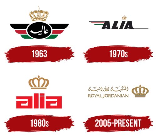
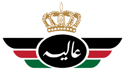
In 1963, the King of Jordan ordered the creation of the national airline Alia, named after his daughter Alia bint Al Hussein. This word is written in Arabic at the logo’s center, occupying the place of honor. It is depicted in white letters inside a black oval, crowned with an elegant gold crown. Here, the traditional symbol of authority has two meanings:
- First, it shows the brand’s dependence on the reigning monarch.
- Second, the crown demonstrates the airline’s special status and high prestige.
Stylized wings are drawn on the sides, colored in the colors of the Jordanian flag: black, red, green, and white. This palette emphasizes the brand’s national pride. The wings symbolize Alia’s connection to the sky and flying. The feathers on both sides are symmetrical, creating a balanced design. However, due to the predominance of black, the emblem looks restrained and formal.
1970s
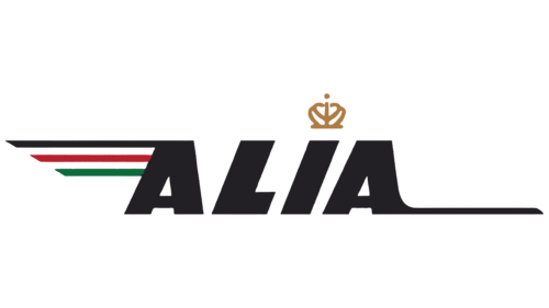
The airline continuously expanded its route network, necessitating a universal logo understandable to passengers worldwide. The Arabic script was replaced with the English brand name: “ALIA.” It consists of bold, black capital letters.
The strict font conveys the safety and stability of the airline. Interestingly, the “L” and “I” are tilted to the right, while both “A” letters are straight. This design creates an intriguing contrast: the tilted glyphs symbolize movement and energy, while the straight letters evoke a sense of confidence and reliability.
Instead of a dot over the “I,” there is a small gold crown. This symbolizes excellent service, luxury, and comfort. It also reflects the traditional symbol of the airline, established by order of the King of Jordan. A thin, long line extends to the right from the last “A.” This line has several meanings:
- It is a symbolic representation of a runway.
- Its elongated shape adds dynamism, highlighting the brand’s association with high-speed air travel (shortly before 1970, Royal Jordanian introduced jet aircraft to its fleet).
- It symbolizes a commitment to progress and development.
The same line is on the first “A,” extending to the left and positioned at the top. Below it are two more lines of varying lengths: medium red and short green. The color scheme corresponds to the Jordanian national flag palette, attracting the attention of tourists and passengers who identify the country by its official colors.
The three lines symbolize the global route network and serve as a simplified depiction of the wing from the airline’s old identity. However, this emblem is not as harmonious as the previous one. It features asymmetry, which is evident in the font and the placement of additional elements. This design is more memorable than symmetrical forms, which tend to appear more conservative. The asymmetrical Royal Jordanian logo emphasizes movement and boundless energy.
1980s
The airline enlarged the text to bright red to attract customers’ attention and evoke an emotional response. The font was also transformed beyond recognition: now, the word “alia” is written in lowercase letters in a futuristic style. The side “a” letters look the most unusual, resembling two square spirals.
The geometric shapes highlight the brand’s modernity and rigor, reflecting its professionalism and organization. The straight angles suggest punctuality and precision, which are crucial in the aviation industry.
The letters “l” and “i” are the same height and very similar, as the “i” has a rectangular dot above it. Here, the designers aimed for symmetry to convey the company’s adherence to long-standing traditions.
A large crown above these glyphs indicates the airline’s connection to the King of Jordan. Its golden color symbolizes power, exclusivity, and wealth. This logo was used until the brand was officially renamed Royal Jordanian.
2005 – today
The new emblem looks luxurious and sophisticated. Designers altered the crown’s shape, embellishing it with intricate cutouts and a wavy edge. They added fine details to show the company’s attention to detail, an important aspect of the service industry. The crown no longer hovers above the text but sits beside it, indicating Royal Jordanian’s respect for its history, where the country’s king played a decisive role.
The brand name is written in both Arabic and English. This makes the logo more understandable to a wider audience, which is crucial for an airline aiming to attract international tourists or business passengers. Using two languages emphasizes the company’s global accessibility, enhances its international presence, and helps create a more friendly and inclusive image.
Notably, the English inscription “Royal Jordanian” is styled authentically in the Middle Eastern manner, harmonizing with the Arabic text. The letters have long, sharp serifs pointing in opposite directions:
- The upper ones point left.
- The lower ones point right.
This gives the brand name dynamism. The glyphs’ elongated and slightly curved parts also appear in motion, showcasing unique Jordanian culture and expression.
The emblem conveys the energy that enables the airline to transport passengers worldwide. The timeless design demonstrates how proud the brand is of its roots. The gold color evokes a sense of elegance and nobility, ensuring no one doubts the quality of Royal Jordanian’s services.
