The Royal Mail logo personifies royal dignity and impeccable quality of service. Combining a rich history with a modern approach to customer service makes the emblem recognizable and the mail popular.
Royal Mail: Brand overview
| Founded: | 1516 |
| Founder: | King Henry VIII |
| Headquarters: | London, England, UK |
| Website: | royalmail.com |
Meaning and History
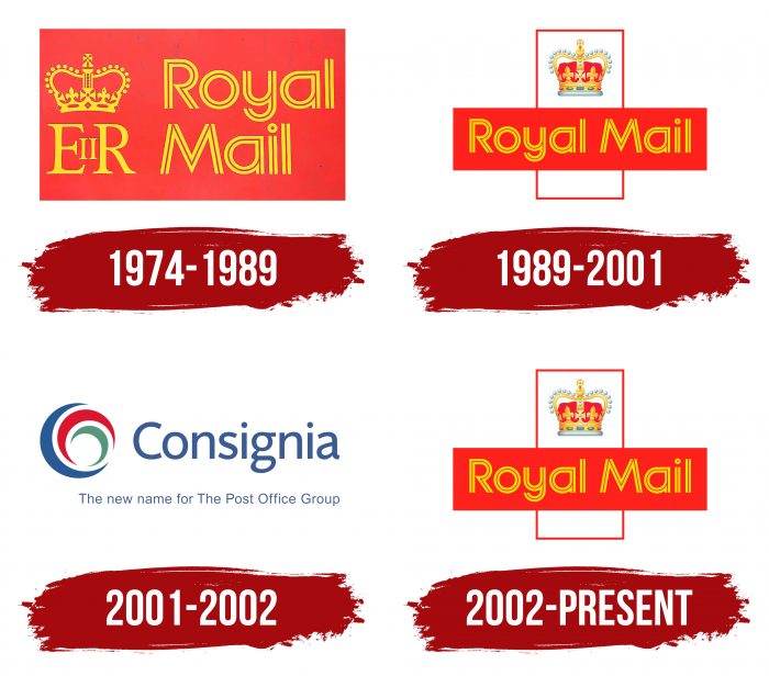
Royal Mail has had a huge number of logos in its more than 500 years of history. This is one of the company’s main legacies, as the classic design has passed through the centuries. There are no significant differences between the options from different eras, which makes the brand truly recognizable. The only exception is the short period between 2001 and 2002 when the name Consignia was used.
What is Royal Mail?
It is the main postal service in the UK. It appeared in 1516 and was created by the decision of King Henry VIII. It has now grown to a national and international operator with 15,000 offices across the country.
1974 – 1989
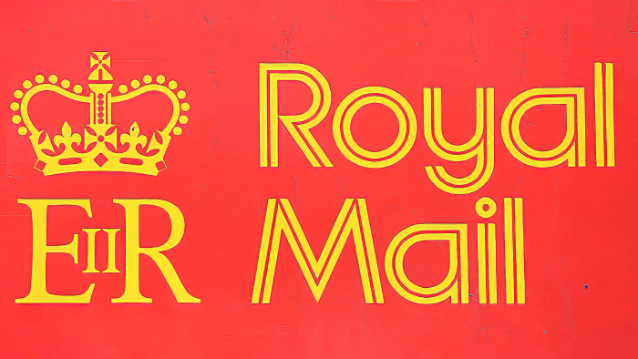
In 1974, the emblem appeared in the form of a red rectangle with three elements. The right half was occupied by the yellow inscription “Royal Mail.” In the upper left corner was the crown of St. Edwards, symbolizing the sovereignty of the ruler. And right below it was the abbreviation “EIIR.” To those who don’t know about the existence of Royal Cypher, it might seem like a simple set of letters. This is an abbreviation for Queen Elizabeth II. The company has always used the initials of the reigning monarch to decorate its mailboxes. This tradition at some point moved to logos.
1989 – 2001
The end of the 1980s made new changes to the brand identity. Royal Mail owners have decided not to use the ‘EIIR’ acronym anymore due to a title dispute over the current queen. The fact is that Elizabeth I occupied the throne only in the Kingdom of England, and in Scotland, she was not. Therefore, the Scottish nationalists demanded to call the current Elizabeth first and smashed mailboxes with the initials “EIIR.”
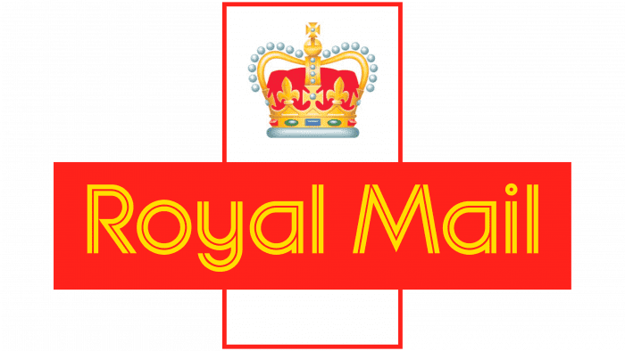
The name of the postal service has moved to a separate red rectangle, located horizontally. It intersected with a horizontal white quadrangle, which was framed in red. The crown took pride of place at the top.
2001 – 2002
It was a short period when the company was called Consignia. The logo contained her new name in blue and a three-crescent pattern. One curved line was green, the second was dark red, and the third was blue.
2002 – today
In 2002, a rebranding took place, which returned everything to its place. The Postal Service has regained the recognizable Royal Mail name and its traditional two-rectangle and crown logo. This option is no different from what it was in 1989-2001.
Royal Mail: Interesting Facts
Royal Mail is a historic postal service in the UK with a history stretching over 500 years.
- Beginning: In 1516, Henry VIII created the Royal Mail by naming Sir Brian Tuke as the first “Master of the Posts,” starting an organized postal system in England mainly for government use.
- To the Public: By 1635, Charles I made the postal service available to everyone, setting up a network for secure, nationwide communication, which changed how people and businesses interacted.
- Penny Post: In 1840, Royal Mail introduced the Penny Black, the first adhesive stamp, along with a flat rate for postage. This made mailing letters affordable and drastically increased mail volume.
- Red Pillar Boxes: The iconic red pillar mailboxes first appeared in 1852. Initially green, they turned red in 1874 for better visibility and have since become a British symbol.
- Transport Fleet: Royal Mail has one of the UK’s largest vehicle fleets, including vans, trucks, and bikes. For sustainability, it is moving towards electric vehicles.
- Rail and Air Services: Royal Mail once used Travelling Post Offices on trains for quicker mail sorting and delivery and has used planes for faster international shipping.
- War Time Role: During both World Wars, Royal Mail was essential in keeping soldiers in touch with home, delivering millions of letters and parcels to the front lines.
- Going Private: In 2013, Royal Mail was privatized and listed on the London Stock Exchange, starting a new phase as a private company.
- Keeping Up with Time: Always evolving, Royal Mail has embraced technology and innovation like automated sorting and online tracking to stay competitive in logistics and e-commerce.
- Cultural Impact: With its long history, Royal Mail has become intertwined with the UK’s story, celebrated through landmarks like the red postboxes and the Royal Mail Museum & Archive.
Royal Mail has transitioned from a government-run service to a modern postal and logistics provider, maintaining its crucial role in connecting people and businesses through the centuries.
Font and Colors
The unifying element of all Royal Mail logos is the crown. It is revealed that she is named after St. Edwards and has been used since the 13th century for the formal procedure for adopting power by the monarch. Moreover, you can see it in the Jewel House, where it is now kept and on the United Kingdom’s emblem, in the Royal Cypher, on the symbol of the British Army, and other national heraldic symbols.
The “Royal Mail” lettering is sans serif, which is all there is to say about the font, as it doesn’t have a specific name. Each letter consists of two parallel lines, which means it is a modified typeface designed specifically for the postal service.
The dark red, which is now used in large numbers, matches the General Post Office palette adopted during the Second World War. In addition to it, the logo has different shades of yellow and gray, although there are also white details. The individual elements of the crown are decorated with a gradient.
FAQ
What font is Royal Mail?
The company has used the Chevin typeface as its corporate font. Designed by Nick Cooke, Chevin is modern, clean, and highly legible. It is used across all brand communications and branding materials, making it a key part of the company’s visual identity.
Chevin appears on signage, promotional materials, and official documents at every Post Office in the UK. The typeface’s distinctive look helps the brand stand out, making it instantly recognizable to customers nationwide.
Why does Royal Mail have a crown?
The crown emblem on Royal Mail signifies its connection to the British monarchy. This symbol shows that Royal Mail operates under the royal family’s authority, emphasizing its historical and national importance.
The crown has been part of the brand’s uniqueness since its beginning, reflecting its status as a national institution. It highlights the service’s reliability and role in connecting people across the UK. Royal Mail postboxes feature the crown emblem and come in different shapes and sizes depending on their location and purpose.
What does the Royal Mail logo mean?
The logo company signifies its status as a royal operator, tracing its origins to serving the British monarchs. The logo features the crown of St. Edward from the 13th century, symbolizing the Royal Mail’s royal connection and heritage.
The logo, which includes St. Edward’s crown, highlights Royal Mail’s historic and ongoing relationship with the monarchy. It reflects the company’s long-standing role as a national institution integral to British society. It reinforces Royal Mail’s identity as a trusted and official service that has served the country for centuries.
What does the Royal Mail logo look like?
The Royal Mail logo has the company’s name in double yellow letters on a red background, making it highly visible and recognizable.
Above the name, there is St. Edward’s crown, symbolizing the royal connection and heritage. This crown, used in coronations since the 13th century, is set within a white geometric shape with a thin red border.
The design uses rectangular elements for a clean and structured look. This design highlights the company’s royalties and emphasizes its status as a trusted and established institution in British society.
Can I use the Royal Mail logo?
You can use the Royal Mail logo but must legally follow specific procedures. First, you must submit a formal request to the company explaining how and why you intend to use the logo. If your request is approved, the company provides the necessary permissions and guidelines for using the logo.
Unauthorized use of the logo is strictly prohibited and can lead to legal action. The company monitors the use of its logo closely to prevent misuse.
What Color is Royal Mail red?
The Royal Mail logo features a vibrant shade of red, specifically Hex #da202a. Red was chosen because it has the longest wavelength of any color in the visible spectrum, making it easy to see, even in dense fog. This choice ensures that the Royal Mail’s branding stands out in all weather conditions, enhancing its recognition and reliability. This distinctive red color is a key part of the brand’s uniqueness, symbolizing its long-standing presence and service.

