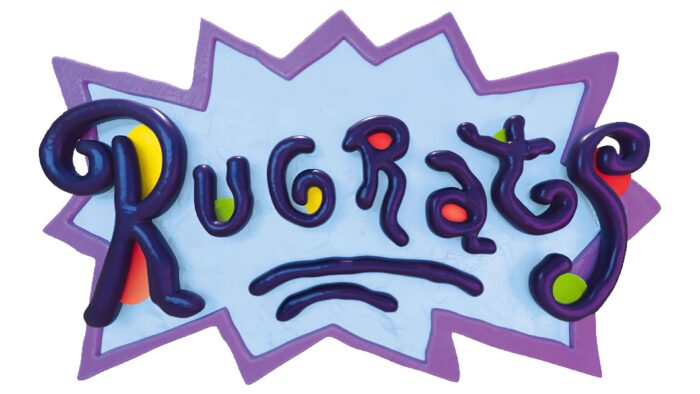
In the style of a spilled tube of paint, the emblem immediately takes the viewer to the magical world of childhood. Vivid fantasies, as if fashioned from plasticine, appear before your eyes—the Rugrats logo as a sign above the entrance to cartoon land.
Rugrats: Brand overview
| Founded: | August 11, 1991 – August 1, 2004; May 27, 2021 – present |
| Headquarters: | United States |
The Rugrats media franchise is best known for its first animated series, which premiered in 1991. This is a comedy adventure show about the lives of young children who constantly find themselves in difficult situations. The broadcast was conducted until 2004 on the Nickelodeon TV channel. There were over 170 episodes in total. They were all filmed by Klasky Csupo, Inc. Based on the series, several full-length cartoons were created, as well as comics, video games, and books of the same name. Now comes the continuation of Rugrats with 3D animation.
Paul Germain, Arlene Klasky, and Gábor Csupó produced an animated series about babies for the Nickelodeon cable network. They were assisted in character development by Peter Chung. In his opinion, the children were not “cute” but very “strange.” The biggest resonance was caused by the girl Angelica – the main antagonist. Paul Germain made her look like a bully from his childhood memories. The cartoon’s creators often argued about her: Arlene Klasky condemned the behavior of Angelica and did not want her to act so cruelly.
The trio began work on Rugrats in 1989. The pilot episode was completed in 1990. The customers liked it, so they signed a contract to buy the content. When enough episodes had accumulated, Nickelodeon aired the first season.
Meaning and History
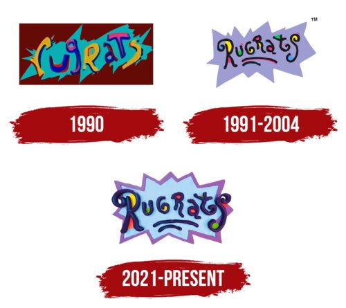
In 1991, viewers first saw the logo of the animated series – as funny and childish as the TV show itself. Klasky Csupo, Inc created it. The graphic changed slightly in 2021 with the reboot of Rugrats. It became bright and three-dimensional to match the colorful computer animation.
1990 (pilot)
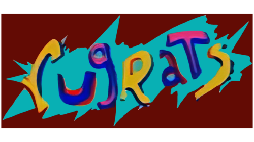
This logo contained the illegible “Rugrats” lettering. It used letters located in different registers, and if the first “r” was lowercase, the second one was uppercase. The colors were also different: both “r” and the final “s” were yellow, and the “u,” “g,” “a,” and “t” between them had a blue-red or blue-pink gradient. The word was written diagonally in a large, sharp-edged blue smudge against a maroon rectangle.
1991 – 2004
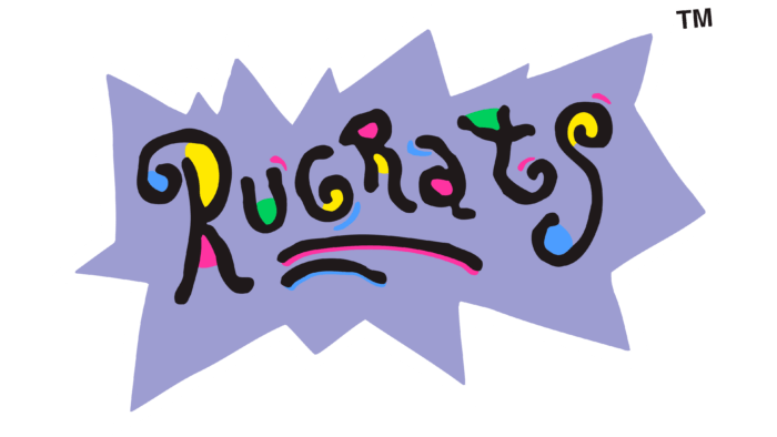
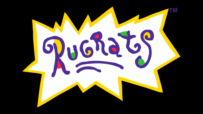
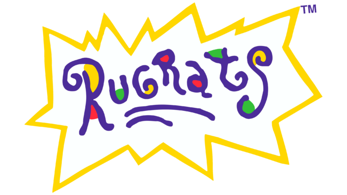
The logo of the first animated series looked like an explosion in the style of comics. It was a large dialogue bubble with sharp asymmetrical edges. Against the background of the light purple figure was the black inscription “Rugrats,” underlined by two uneven lines. Each letter was hand-drawn carelessly as if it had been drawn by a child in Paint. Multi-colored spots were visible in places of folds and intra-letter gaps: blue, yellow, green, and pink.
2021 – today
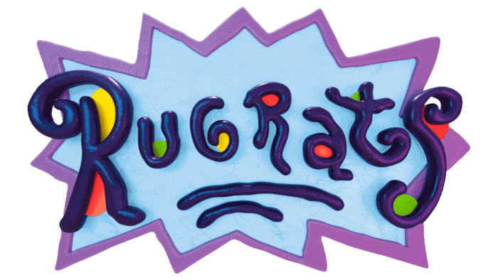
The original series left a significant mark on the history of pop culture, so Nickelodeon decided to give it a second life. The sequel to Rugrats premiered in 2021 on the Paramount Plus online service. The new TV show differs from the old one in its modern format: the developers made three-dimensional animation to make the cartoon colorful. The same effect was used for the logo. Its structure resembles the previous version, but in design, it is completely different.
Now the inscription “Rugrats” looks like plasticine. Volume is given to it by dark blue shadows and a gradient. The base is blue but not monochromatic: a lilac line with a 3D design is drawn along the edge.
Font and Colors
The style of the graphic sign corresponds to the animated series. It resembles a child’s drawing, and if the first option was two-dimensional (as in the Paint program), then the second is closer to modern computer graphics. This evolution reflects the desire of Rugrats to keep up with the times to be more understandable to the younger generation of the 21st century.
The name of the animated series is written very poorly – as if it was done by a child. The letters jump: some hang over the line, while others go down. The jagged strokes and trembling lines only support the theory that the logo is stylized as a child’s drawing, or rather an appliqué, as can be seen from the 3D design. Lowercase and uppercase characters are mixed. Both “R” and “G” are in upper case, “u,” “a,” and “t” are in lower case. “S” generally has an indefinite shape: it looks like an arc with twisted spirals at the ends.
The emblem colors of the two Rugrats series are almost the same. In the new version, a dark blue gradient (instead of black) was added to light purple, yellow, blue, green, and red came to replace pink.
Rugrats color codes
| Pale Cornflower Blue | Hex color: | #b8d6f2 |
|---|---|---|
| RGB: | 184 214 242 | |
| CMYK: | 24 12 0 5 | |
| Pantone: | PMS 543 C |
| Deep Lilac | Hex color: | #8f60a8 |
|---|---|---|
| RGB: | 143 96 168 | |
| CMYK: | 15 43 0 34 | |
| Pantone: | PMS 2583 C |
| Russian Violet | Hex color: | #32275f |
|---|---|---|
| RGB: | 50 39 95 | |
| CMYK: | 47 59 0 63 | |
| Pantone: | PMS 274 C |
| Golden Yellow | Hex color: | #fde31a |
|---|---|---|
| RGB: | 253 227 26 | |
| CMYK: | 0 10 90 1 | |
| Pantone: | PMS 803 C |
| Coral Red | Hex color: | #f34345 |
|---|---|---|
| RGB: | 243 67 69 | |
| CMYK: | 0 72 72 5 | |
| Pantone: | PMS Warm Red C |
| Apple Green | Hex color: | #8fc10a |
|---|---|---|
| RGB: | 143 193 10 | |
| CMYK: | 26 0 95 24 | |
| Pantone: | PMS 375 C |
