


![]() Run DMC Logo PNG
Run DMC Logo PNG
One of the most powerful symbols in hip-hop history is the Run DMC logo, reflecting the group’s dynamic character and its influence on the music industry. The emblem is associated with strength, resilience, and authority. Its contrasting colors and shapes emanate unstoppable energy, reflecting the spirit of street culture.
Run-DMC, founded in 1983 by Jason Mizell (Jam Master Jay), Darryl McDaniels (DMC), and Joseph Simmons (Run), emerged from Queens, New York, and transformed hip-hop by combining minimalist beats, aggressive delivery, and street-inspired fashion, featuring unlaced Adidas sneakers and leather jackets. Named partly after the DeLorean Motor Company, Run-DMC’s innovative fusion of rap and rock, particularly their groundbreaking collaboration with Aerosmith on “Walk This Way,” helped propel hip-hop into mainstream consciousness and onto MTV, breaking cultural and musical barriers. Their influential albums, like King of Rock and Raising Hell, achieved multi-platinum success, making them the first rap act to earn major corporate sponsorship from Adidas. Despite internal struggles and evolving music trends, the group’s impact endured even after Mizell’s tragic murder in 2002. Run-DMC was inducted into the Rock and Roll Hall of Fame, solidifying their legacy as hip-hop pioneers who changed the course of music history.
Meaning and History
![]()
The members of Run-DMC set fashion trends in the 1980s, inspiring fans to wear fedoras, laceless sneakers, baggy jeans, tracksuits, and gold chains. However, the key element of their image was items featuring the square logo, consisting of black letters and red stripes. It became popular after the “Walk This Way” music video was released, frequently shown on MTV in 1986. Interestingly, the emblem was repeatedly featured on compilation and single covers but never appeared on any studio album, at least not in its primary version.
For a long time, the logo’s authorship was erroneously attributed to artist Cey Adams, who designed the 1984 album. However, it was recently revealed that the real creators of the iconic symbol were a team of designers at Island Records, including Stephanie Nash and Bruno Tilley. Working on another promotional campaign for Run DMC, they were tasked with creating a branded t-shirt. The result was so successful that the hip-hoppers decided to adopt the clothing design as their official emblem.
What is Run DMC?
Run-DMC was an American group that significantly influenced hip-hop culture, from fashion to music. It existed from 1983 to 2002 and earned a Gold Record for its first studio album, titled Run-D.M.C., released in 1984. Their work was nominated for a Grammy Award and included in the National Recording Registry.
1985 – 2002
![]()
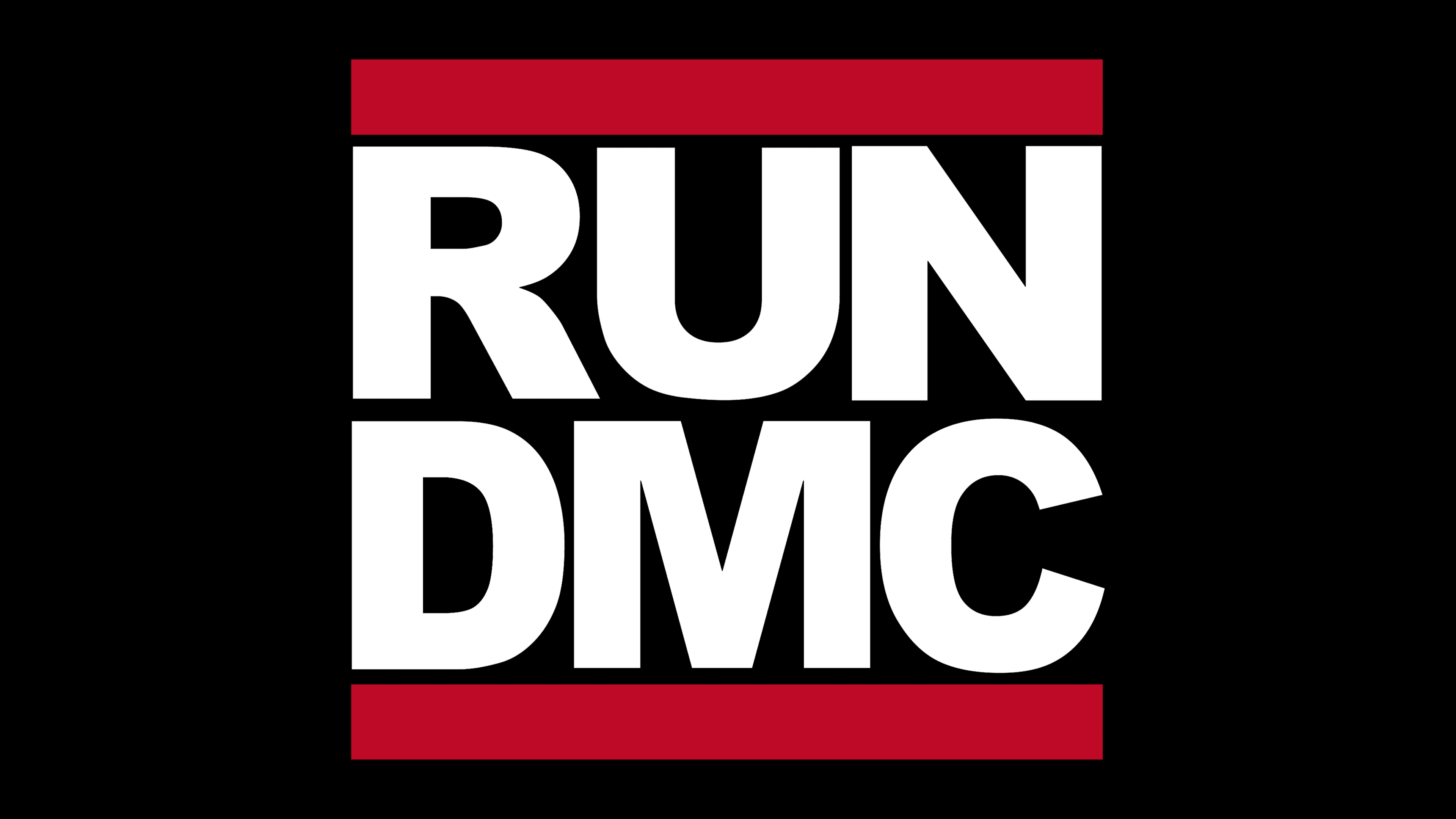
Designers utilized the group’s double name and stacked the words one above the other. In doing so, they ignored punctuation, even though “Run” should be followed by a hyphen, and “D,” “M,” and “C” are sometimes followed by periods. Removing these small elements allowed the letters to be arranged so that both lines were the same length. Wide red stripes border the inscription at the top and bottom. These perfectly straight lines give the emblem’s geometric shape a square appearance.
The bold, sans-serif font conveys strength and fully reflects the hip-hop musical style. The lines are also associated with confidence and rebellion. According to Discogs, this logo debuted in 1986 alongside the single “My Adidas.” However, it appears on some inner covers of the 1985 album “King of Rock.”
Font and Colors
The massive letters correspond to the Franklin Gothic Heavy style. This grotesque was created by Morris Fuller Benton in 1902. Despite its age, it does not look outdated or irrelevant. The logo uses a modified version of the font, with altered thicknesses of some glyphs.
The inscription in rich black creates an impression of strictness and seriousness, while the two red stripes harmoniously complement it. The contrasting palette is eye-catching, especially when the emblem is white.