![]() Sainsbury’s Logo PNG
Sainsbury’s Logo PNG
A simple Sainsbury’s logo conveys all the features of its visual identity. The company uses a version created in 2013 as its main one. But it also uses an emblem developed in 1999. The brand icons are similar in many ways and support the company’s unified message. It is based on friendliness, confidence, reliability, and accessibility. These traits are reflected in every detail of the stylish, bright logo. Customer focus is conveyed through warm colors, and the high level of service is reflected in the expressive font.
Sainsbury’s began on 20 April 1869, when John James Sainsbury and Mary Ann Staples opened a small dairy shop at 173 Drury Lane in Holborn, London. Their slogan, “Quality perfect, prices lower,” matched the needs of local working-class customers looking for clean, fresh food at fair prices. A second shop followed within a year, then another in Kentish Town.
In 1882, Sainsbury’s opened its first store outside central London in Croydon. The branch helped define the company’s early retail style: white tiled walls, open displays of meat and cheese, and visible price signs. That year, it also opened a distribution depot and began producing its own bacon. By 1890, the family ran about 20 shops. By 1922, the chain had 136 stores and became J. Sainsbury Limited.
In 1950, Sainsbury’s opened Britain’s first full self-service supermarket in Croydon. In 1961, it installed the EMIDEC 1100 computer for stock control. The company was listed on the London Stock Exchange in 1973, while the family kept 82% of the shares. In 1984, it opened the first SavaCentre hypermarket in Edinburgh, and in 1992, it entered the Scottish market.
The 1990s exposed pressure from Tesco. After Tesco launched Clubcard in 1993, Sainsbury’s refused to respond with a similar loyalty program. In 1995, Tesco overtook it in market share, and in 2003, Asda pushed it into third place. Justin King became CEO in 2004 and launched “Making Sainsbury’s Great Again,” cutting prices and improving availability. Sainsbury’s Bank was established in 1997 as a joint venture with the Bank of Scotland. In 2016, Sainsbury’s bought Argos for £1.4 billion, while its 2019 merger attempt with Asda was blocked.
Meaning and History
![]()
All major changes in the company’s activities have always been reflected in the brand identity. This manifested itself in periodic changes to the logo. The earliest version was presented in a restrained, simple format without frills. Gradually, it was replaced by more stylish variants featuring bright colors and a friendly design. They all had distinct characteristics but were also aligned with a single visual concept that reflected comfort, trust, and care for customers.
What is Sainsbury’s?
Sainsbury’s is one of the largest retailers in the UK. The company has a network of over 1000 stores nationwide. It also has its bank (Sainsbury’s Bank), the Argos brand, theme cafes in supermarkets, and a network of petrol stations. Thanks to its wide range of services, the company periodically ranks among the top in local rankings.
1869 – 1960
![]()
Sainsbury’s was founded in 1869 as a small store on a poor London street. John James Sainsbury and his wife initially sold quality products at low cost. Later, the business received official registration, with which it began its gradual development. At that time, the company logo was the lettering on the store sign: J. Sainsbury.
A simple wordmark displayed the brand’s founder’s name. In those days, this design was considered a style standard and confirmed the owners’ trustworthiness. Traditional serifs, straight, confident lines, and decorative dots at the ends of some letters characterized the font’s overall style. All of the characters were capitalized. It was credible and also conveyed a sense of reliability and quality. In addition, it was highly recognizable, which positively influenced the brand’s development.
1960 – 1999
![]()
In 1960, Sainsbury’s already owned a small chain of supermarkets, which required a more modern brand name. This was the reason for the appearance of a neat, expressive logo, which became the basis for further experiments with corporate design. The basis was still the J Sainsbury lettering.
But the design became fresher and more modern. It was achieved by replacing the traditional serif font with a smoother, modern one with straight cuts. It demonstrated professionalism, firmness, and integrity. Strict features were diluted by a friendly orange hue, which was associated with positive emotions. That’s what the chain’s owners wanted to ensure for everyone who went shopping at the supermarket.
1960 – 1999
![]()
In 1960, another version of the logo appeared, which the brand used alongside the J Sainsbury emblem. It represented Sainsbury’s, the name under which the company was operating at the time. The design of this version was very similar to that of J Sainsbury’s badge. The only difference was noticeable in the small details. The Sainsbury’s version was presented in a thinner font, providing a stylish look, excellent readability, and a lighter shade of orange.
1994 – 1999
![]()
In 1994, the brand had another logo. It was used together with the two previous logos until 1999. But unlike the 1960 logo, this one appeared mainly in advertising campaigns. It was based on Sainsbury’s lettering in an elegant, slim serif typeface.
It reflected the company’s roots and the value of experience. The sleek lines also showcased the brand’s flexibility to evolve despite different circumstances. The saturated blue color also emphasizes trust and reliability, two of the company’s founding principles.
1999 – today
![]()
1999 saw the relaunch of Sainsbury’s, which had been in decline. It was rebranded at this point, resulting in a bold yet friendly new logo. The M&C Saatchi agency handled the design. The designers created an excellent image that conveys the power of a large retailer and its client-oriented approach.
For the word mark design, a dense font with rounded shapes and soft lines was used. Overall, the style was consistent with Abbott Mead Vickers BBDO. It reflected several important meanings: comfort, customer care. These traits were part of Sainsbury’s philosophy, for which the customer’s interests were originally put first. The meaning line also continues with the rich orange coloring, which is associated with warmth and a pleasant atmosphere.
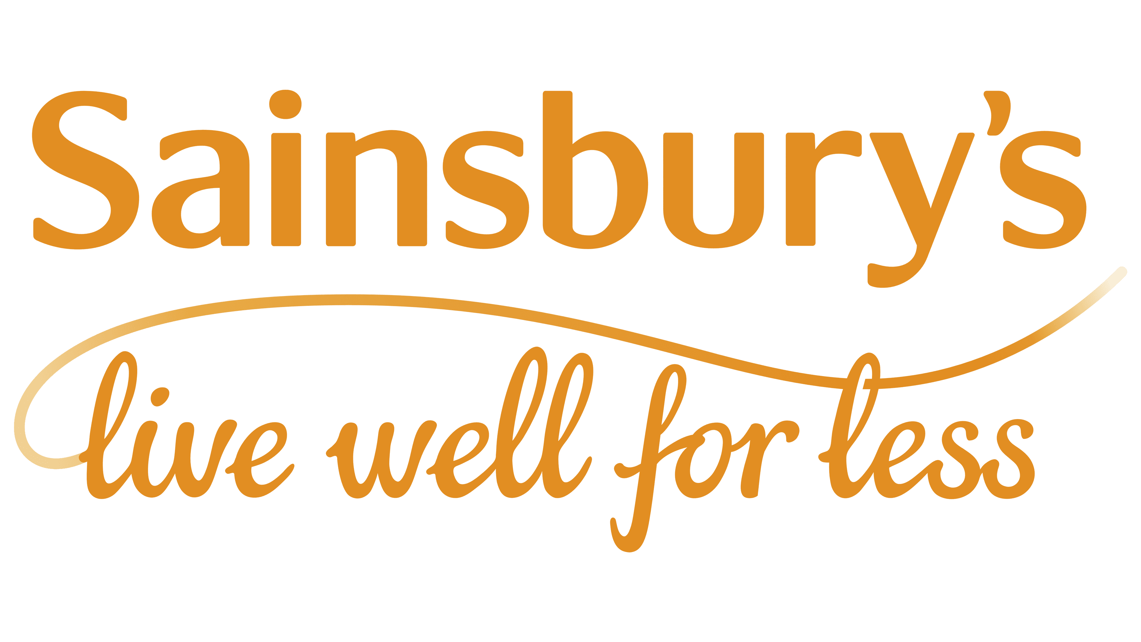
2013 – today
![]()
In 2013, the company again combined its visual concept with an attractive emblem that highlighted key aspects of the business. It was used along with the version created in 1999. The centerpiece of the new version was the distinctive Sainsbury’s lettering. The appearance of the letters is almost the same as the design of its predecessor.
But a decorative element was absent in the 1999 logo. It is a smooth, curved line that emphasizes the bottom inscription. According to the designers’ idea, it shows the wide range of products represented on the shelves of the chain’s supermarkets.
Font and Colors
Sainsbury’s now uses two logos: a 1999 version and an emblem created in 2013. Both versions use a similar design style. It uses a soft, dense font characterized by uneven line thickness, smooth curves, and rounded shapes. The chosen variant resembles the Abbott Mead Vickers BBDO logo. Both versions are orange. But the 2013 logo uses a lighter shade. Combined with a smooth, modern font, it conveys the company’s core message of quality, reliability, and customer comfort.