


 Saks Fifth Avenue Logo PNG
The Saks Fifth Avenue logo has two key components: a clean white background and fifteen elegant black letters, each appearing refined and stylish. These letters form three words that represent the name of one of the most renowned and prestigious department stores in New York, originally opened in Washington.
Over time, the emblem has undergone many transformations, adopting more expressive and original features. Its current version has a trend towards simplification and lightness, making it more modern and dynamic. The letters seem to “come alive,” aligned in a single row, resembling a calligraphic masterpiece as if handwritten. The swirls and decorative elements, completed with smooth lines, add to the aesthetic. The first letters of each of the three words seem to “touch” their neighbors slightly, creating a unified, cohesive image that symbolizes the brand’s harmony.
Saks Fifth Avenue began in 1867, when Andrew Saks opened a menswear store in Washington, D.C. He moved the business to New York’s Herald Square in 1902. In 1923, Horace Saks joined Bernard and Adam Gimbel of Gimbel Brothers, and the Fifth Avenue flagship opened at 49th Street on September 9, 1924. The store sold fashion, accessories, and home goods. A Palm Beach shop followed in 1926, then a Chicago branch in 1929.
Despite the Great Depression, stores opened in Beverly Hills and San Francisco during the 1930s. Wartime production included officers’ uniforms, while the 1950s brought suburban expansion. BAT Industries subsidiary BATUS Inc. acquired the retailer in 1973, supporting growth and private-label goods. Investcorp bought the business in 1990 and continued opening and modernizing locations.
Saks Holdings merged with Proffitt’s in 1998 to form Saks Incorporated. Online retail began in 2000, and regional department stores were sold in 2005 as the company concentrated on luxury retail. Hudson’s Bay acquired Saks for $2.9 billion in 2013. The first Canadian store opened in Toronto in 2016, alongside the OFF 5TH discount format.
The Manhattan flagship received a $250 million renovation in 2019, with a rebuilt first floor and beauty department. In 2021, HBC separated physical stores from the Saks online business to attract investment. By 2023, the retailer operated more than 40 stores in the United States and Canada while expanding e-commerce and omnichannel sales.
Meaning and History
What is Saks Fifth Avenue?
This is a luxury department store company, known for its flagship location on Fifth Avenue in New York, offering a carefully curated selection of designer clothing, home goods, accessories, and cosmetics. The store’s recognizable black-and-white bags and emblem have become symbols of status, elegance, and wealth. It provides a personalized shopping experience enhanced by professional stylists and top-notch amenities, including private shopping areas and fashion consultants. The store is well known for its lavish window displays, attracting visitors and locals during the holidays.
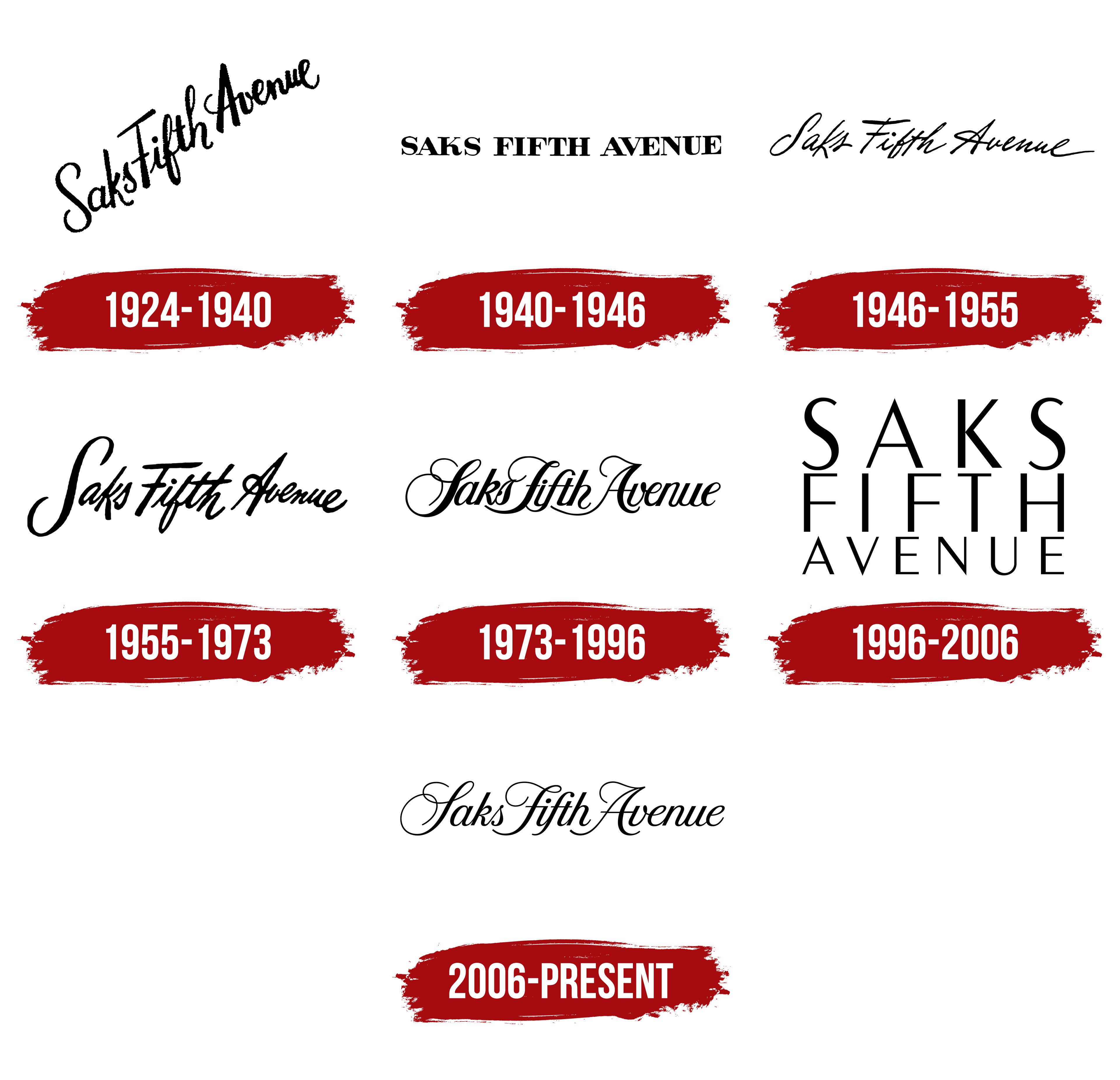
1924 – 1940
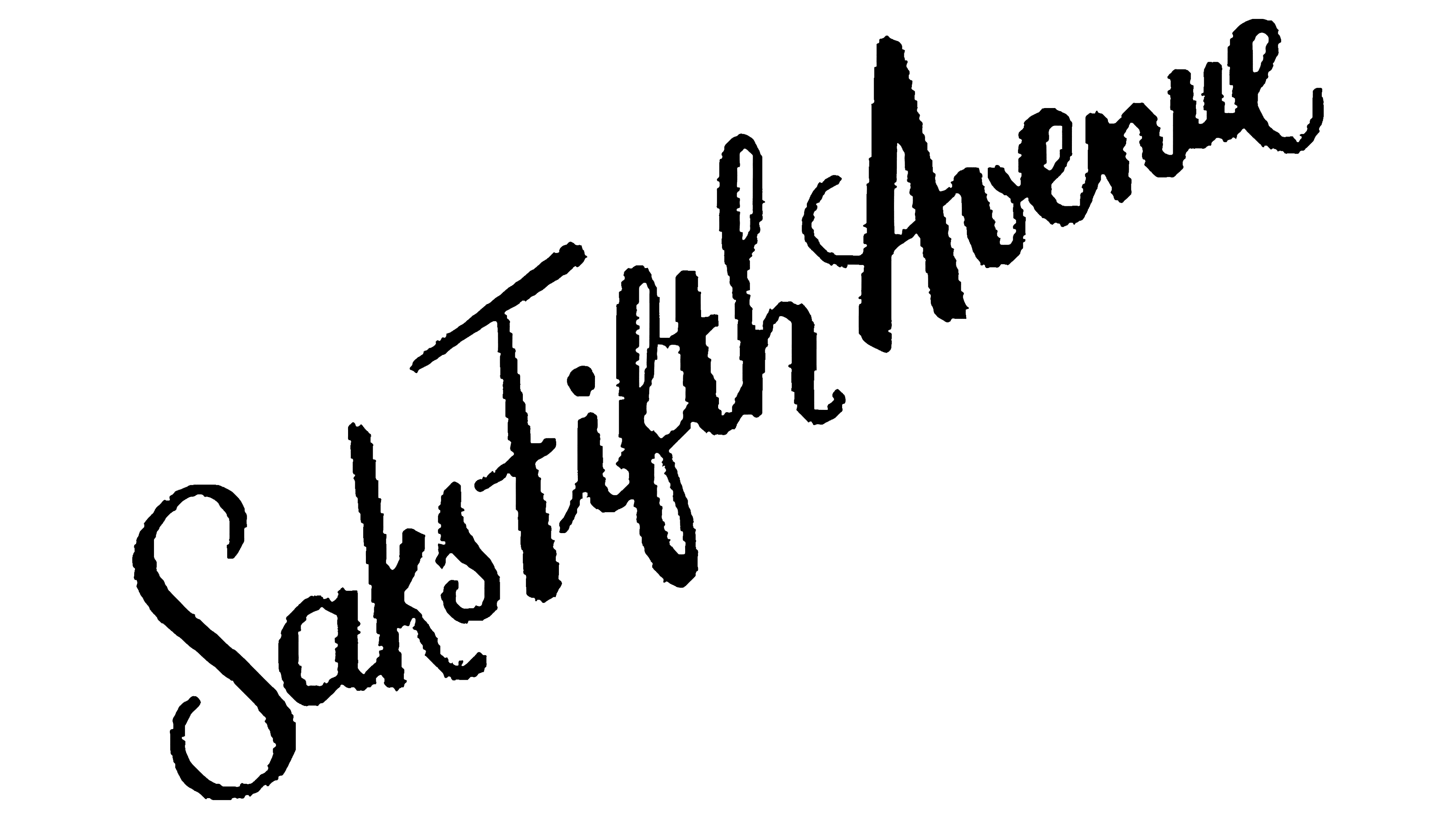
The Saks Fifth Avenue department store was named after its founder, Andrew Saks, who brought his vision to life by introducing a new format for selling a range of products. The company’s history dates back to 1867, but the first emblem was unveiled in 1924. In 1920, the department store moved to New York, marking a pivotal moment in its development.
The first logo was very interesting from a design perspective. The color palette retained the traditional features of that time. Many brands and fashion houses preferred a white background; this department store was no exception. Against this background, the black letters stood out, creating an impression of clarity and elegance.
The black symbols, rich and contrasting, stood out on the white background, emphasizing their sophistication and individuality. Each character was unique yet maintained overall harmony. The visual symbol conveyed dynamism through the diagonal arrangement of the text, symbolizing the company’s growth and success. The flourishes of the letters extended freely beyond the lines, creating a sense of movement and giving the logo a lively and original character.
1940 – 1946
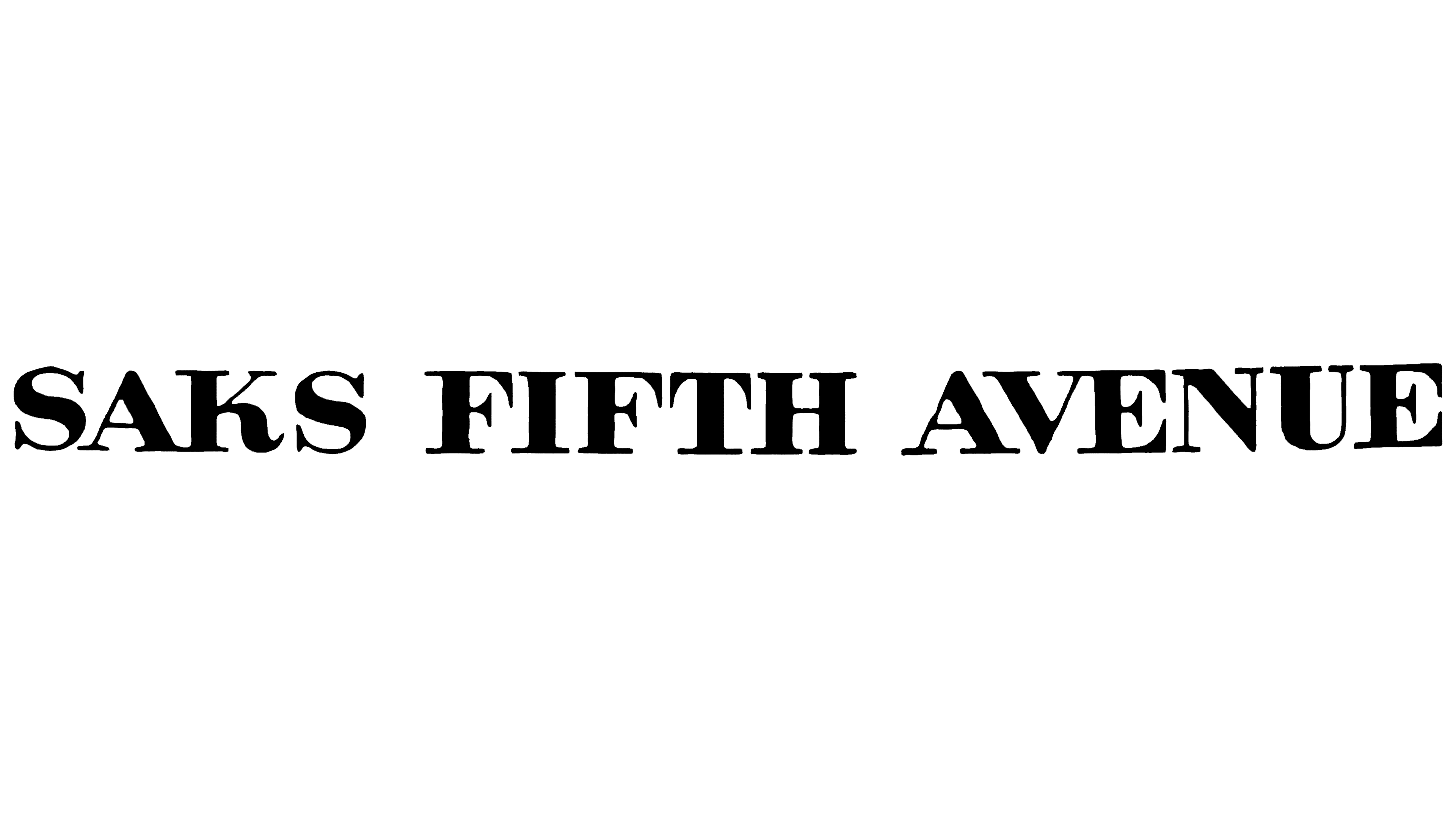
The new logo’s color palette remained unchanged, preserving the traditional combination of two contrasting shades, which adds a certain depth to the identity. This color scheme enhances the sense of reliability and confidence in the future while emphasizing the company’s commitment to tradition. It shows respect for history and the connection between the past and present.
The identity has become more restrained and concise. While the text appeared dynamic, it has gained clarity and elegance, making it more expressive. The brand name has moved to the center of the logo, placed on a single horizontal line, introducing an element of conservatism and simplicity.
Each letter stands out with its superscript and bold font. This emphasis gives the emblem stability and solidity. Each letter has gained expressiveness and firmness, symbolizing the brand’s reliability. The serifs at the base of the letters suggest that this is a well-known department store and a symbol of growth with global prospects, aiming to become recognizable across the U.S. and worldwide.
1946 – 1955
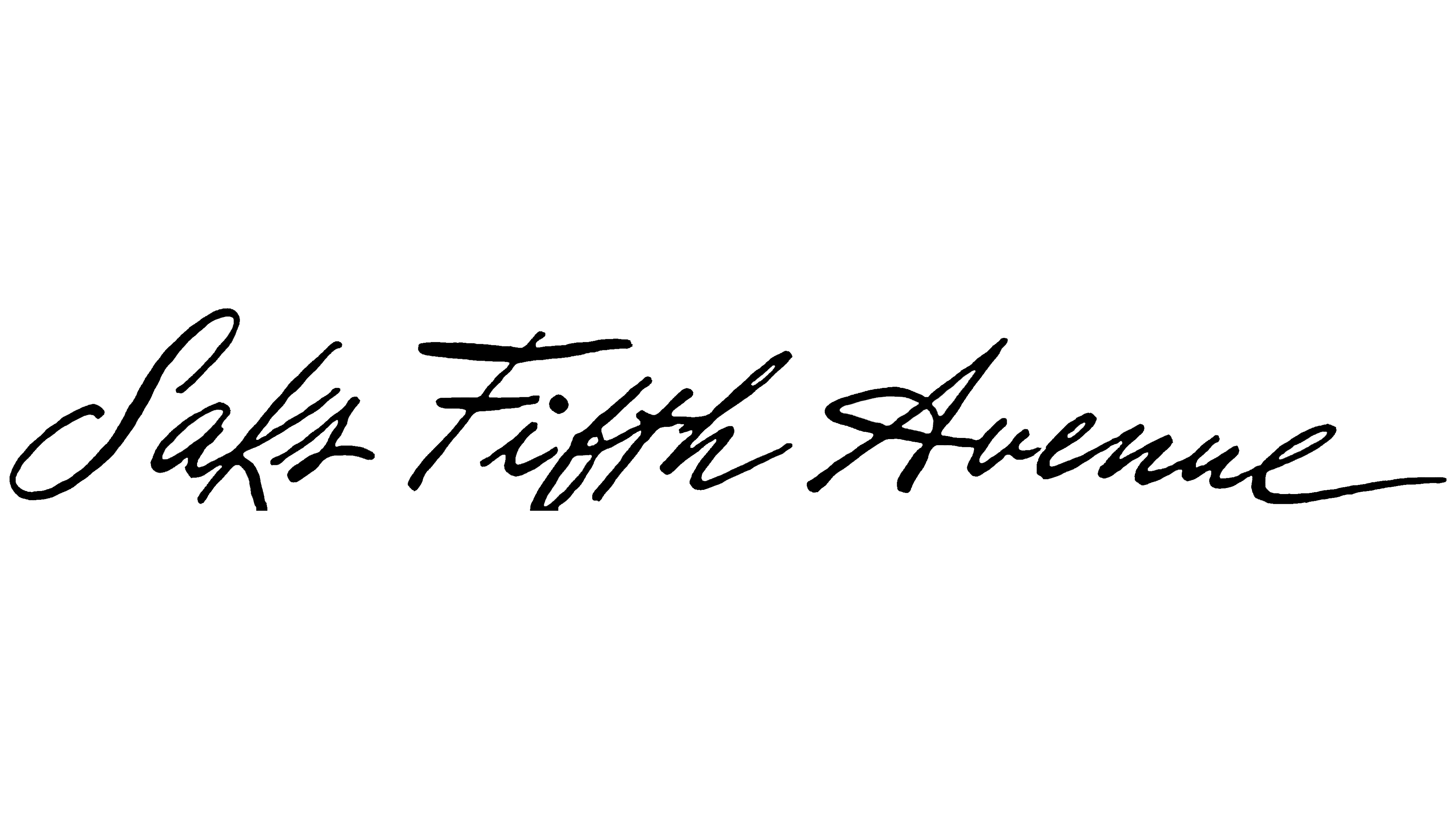
1946 marked an important milestone in the brand’s development when the identity acquired a modern look while retaining elements from the past. Some letters and typographic symbols resemble earlier versions of the visual mark, but the lines have become sharper and more elegant, emphasizing the design’s refinement.
The white background is ideal for the letters, which stand out brightly like stars in the night sky. Their expressiveness and simplicity attract attention and hold it. The logo is easy to remember, making it one of its main strengths. Each element carries multiple meanings, conveying both the brand’s past and its aspirations for the future.
The italicized letters, leaning to the right, symbolize the company’s reliability and stability. The font’s subtle dynamism highlights continuous growth, forward movement, and the pursuit of success. The increased spacing between the words adds a sense of freedom and openness, reflecting the brand’s progression toward its goals while maintaining the unity of all its elements.
1955 – 1973
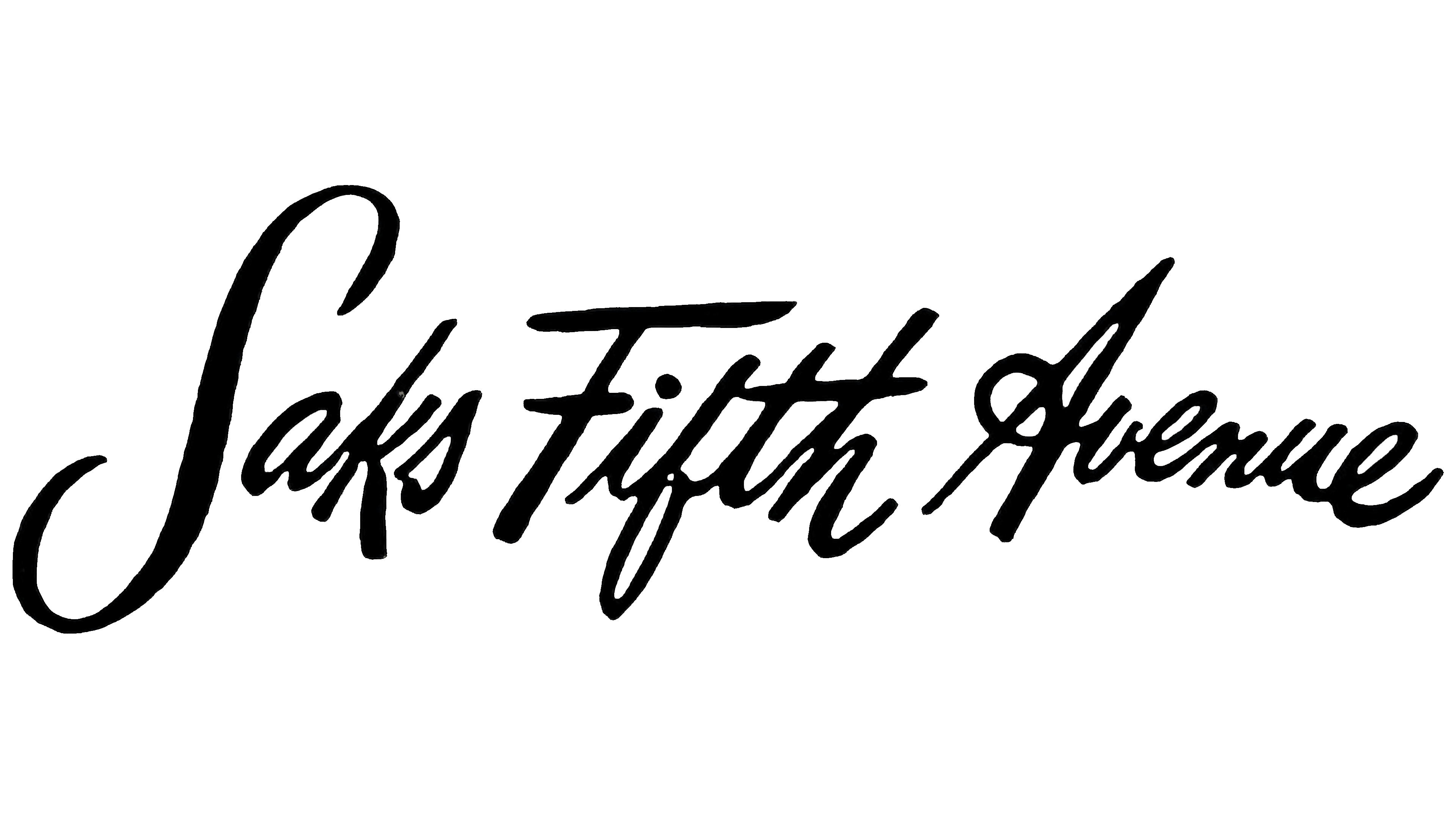
The logo was introduced in 1946, and its 1955 update is often called “twins.” This perspective is quite justified. The font, letter placement, and size are nearly identical, with only slight changes in the color scheme.
In the new version, the letters took on a rich black hue, which added expressiveness and aesthetic charm to the logo. The bold font looks striking and draws attention, creating a positive perception of the visual identity. Thanks to its clarity and brightness, the identity became easily recognizable, and the symbol of one of America’s largest department stores became memorable for adults and children alike.
The three words, written as if by hand, are filled with simplicity, elegance, and mysterious beauty. The letters’ soft lines and smooth curves transform the text into an image. The emblem combines functionality and aesthetics, and because of this, it lasted for nearly two decades, remaining relevant and in demand throughout that time.
1973 – 1996
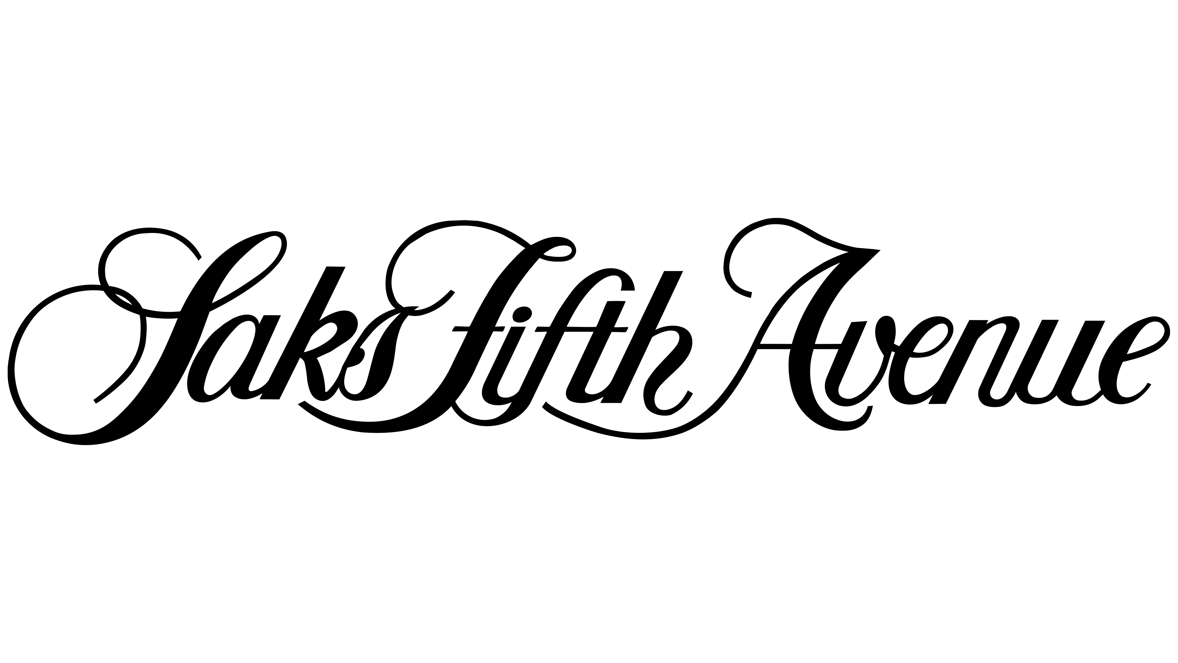
By mid-1973, as the department store’s popularity and prominence grew, the need for a refreshed visual identity arose, with the logo needing to reflect the center’s successful development and emphasize its stability and reliability. As the center expanded, the new visual mark gained its unique style and strong individuality.
Now, elegant letters stood out against the white background. The first letters of each of the three words were capitalized, giving them primary significance. Their flourishes and increased size made the logo noticeable even from a distance. The entire inscription was neatly centered, positioned on a single horizontal line. This design emphasized strict symmetry, giving the logo an elegance and harmony that symbolized the department store’s success and confident growth.
1996 – 2006
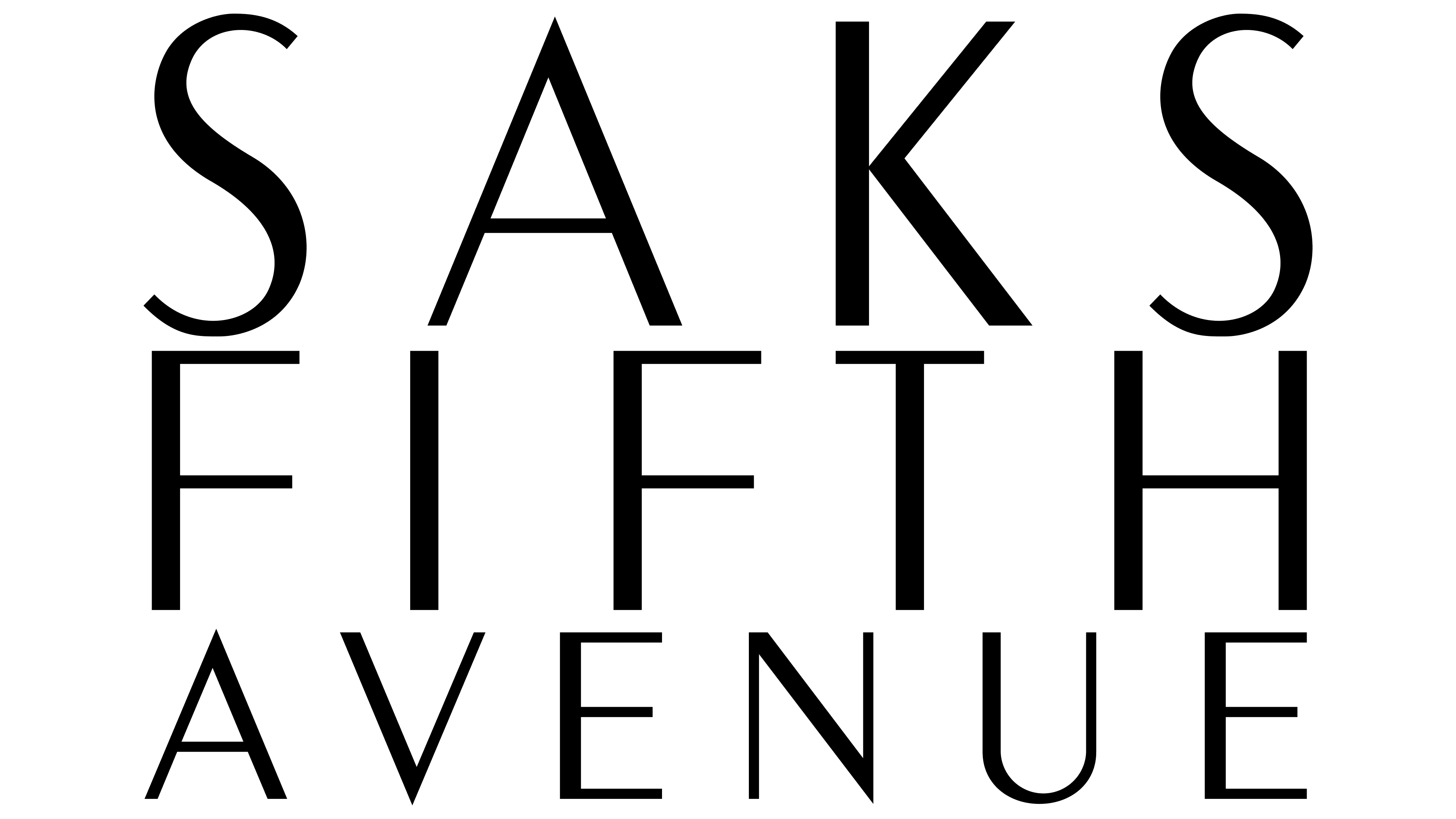
If we evaluate the transformation of the emblems throughout all periods, the last one became truly unique. It differed from all previous versions by not retaining familiar elements, making it distinctive.
In 1996, the center introduced the boldest and most original logo. The designers departed from traditional formats and radically changed the arrangement of the text. Whereas the department store’s name had almost always been placed on a single line, now each word occupied its own space. The words were aligned in three rows, bringing logic and harmony to the design. Each word seemed to take on its own unique meaning and significance.
The visual mark became larger, with capital and bold letters symbolizing progress and the successful results of years of effort. The font remained clear and elegant, emphasizing the brand’s refinement. The varying letter heights added dynamism and originality to the design. The traditional black color of the symbols highlighted the brand’s status and confidence, making the logo both memorable and impressive.
2006 – today
The Saks Fifth Avenue logo, introduced in 2006, embodies classic luxury and elegance, reflecting the brand’s prestige and long history. This refined design emphasizes attention to detail, which is important for the department store’s high level of service. The inscription is in a calligraphic style, with smooth, graceful lines that seem to flow into one another, creating a sense of ease and effortlessness.
The visual mark’s color scheme uses a traditional black-and-white contrast, making it both strict and distinctive. The black color symbolizes luxury, elegance, and authority, while the white background highlights the brand’s purity and transparency. This color choice maintains a classic look and visually makes the emblem simple and easily recognizable.
The font resembles classic handwriting, with each letter meticulously drawn. Unique flourishes and connections among the text elements give the logo individuality, emphasizing the department store’s exclusivity, in which every detail, from product selection to service quality, is carefully considered.
The logo reflects the department store’s history as one of the first luxury destinations on Fifth Avenue in New York. The brand has consistently demonstrated its commitment to high standards in fashion and retail, reflected in its identity. The simplicity and sophistication of this symbol underscore the department store’s reliability and status, and it remains an icon of style and quality.