


 Reserved Logo PNG
The Reserved logo is truly unique and special. Despite the minimalist accents, it remains refined. The main element is effectively highlighted, creating a cohesive style and distinct character. The visual mark is free of excessive embellishments, lending it elegance and rich informational content.
The identity relies on a two-tone palette. The color scheme is expressive and built on contrast, uniting artistic elements with text blocks. The Polish affordable clothing brand deliberately avoided emphasizing status and luxury. The simplicity of the emblem underscores the brand’s accessibility, making this approach symbolic and fitting for its products.
Reserved grew from LPP, founded in Gdynia in 1991 by Marek Piechocki and Jerzy Lubianiec. The company first imported clothing from Asia for wholesale distribution in Poland, giving its founders experience with local demand and apparel supply. In 1998, LPP created Reserved as its own label, and the first store opened in Gdynia in 2000 with women’s and men’s clothing at mid-market prices.
International expansion began in 2002 with a store in Estonia. LPP listed on the Warsaw Stock Exchange in 2003, providing capital for further growth. Reserved entered the Czech Republic in 2004, Russia in 2005 and Romania in 2007, building a network across Central and Eastern Europe. A Warsaw flagship followed in 2008 as the chain increased its presence in major cities and busy shopping centres.
The brand moved further west in 2014 with its first German store. Online sales began in 2015. In 2017, Reserved opened a flagship on London’s Oxford Street and used Kate Moss in the launch campaign. Entry into Israel followed in 2018, while 2019 brought new stores, stronger e-commerce and temporary retail formats in several European cities.
During 2020 and 2021, LPP improved delivery systems, added order-and-collect services and accelerated digital sales. By 2022, the group operated more than 1,700 stores in 25 countries. In 2023, Reserved continued developing omnichannel retail, opening locations through local partnerships and expanding clothing design and production across key markets.
Meaning and History
What is Reserved?
This Polish retail fashion brand quickly expanded across Europe, gaining a wide customer base for its stylish, affordable clothing. The brand offers a variety of styles, from casual wear to more formal office attire, and has an extensive range for men, women, and children. It is known for quickly responding to changing fashion trends, often drawing inspiration from runway styles and creating affordable alternatives. The brand’s boutiques are designed to be clean and modern, creating a pleasant atmosphere for shoppers. Partnerships with global designers and celebrities have increased the brand’s recognition and strengthened its position in the competitive fast fashion industry.
1998 – 2014
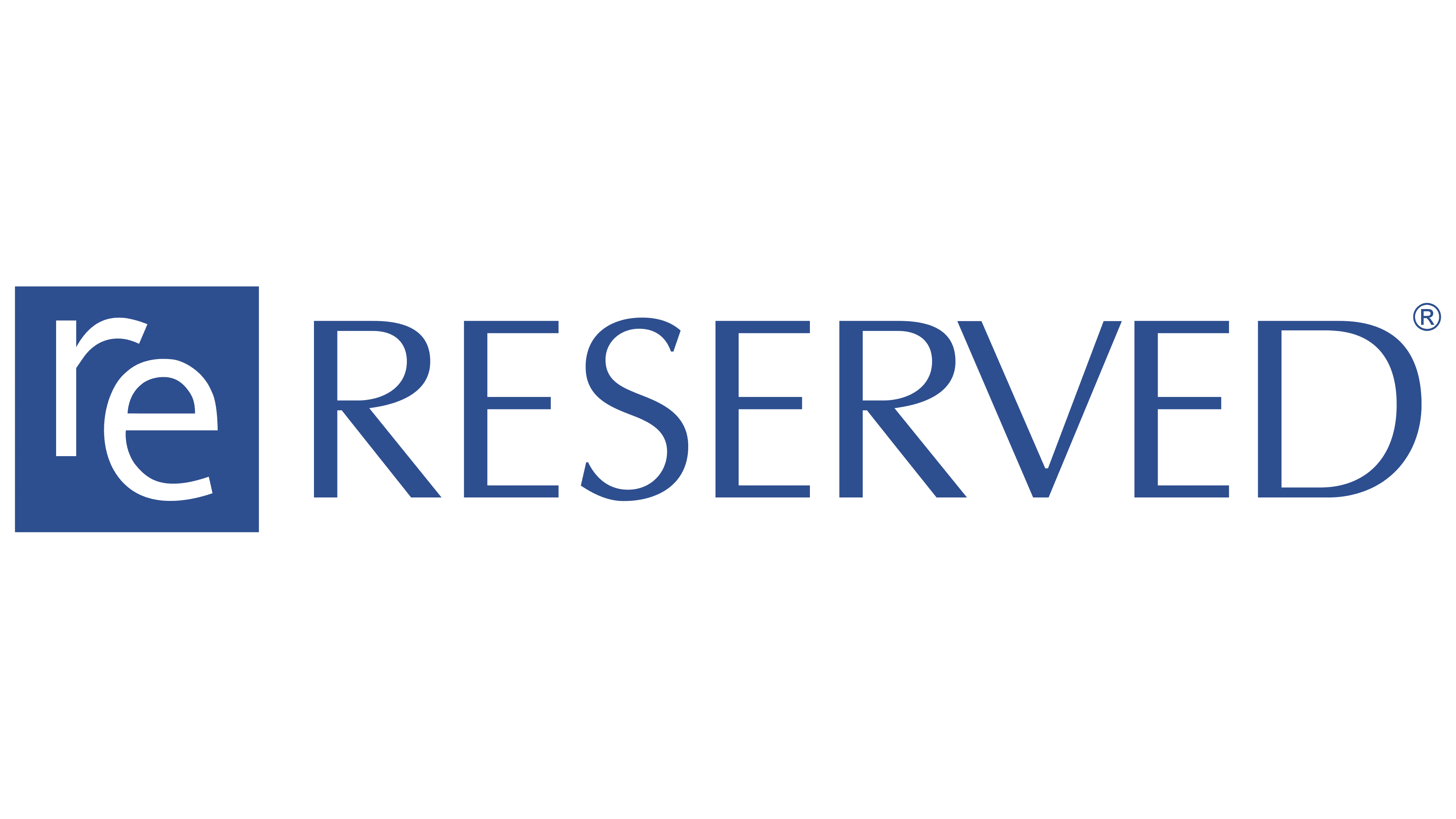
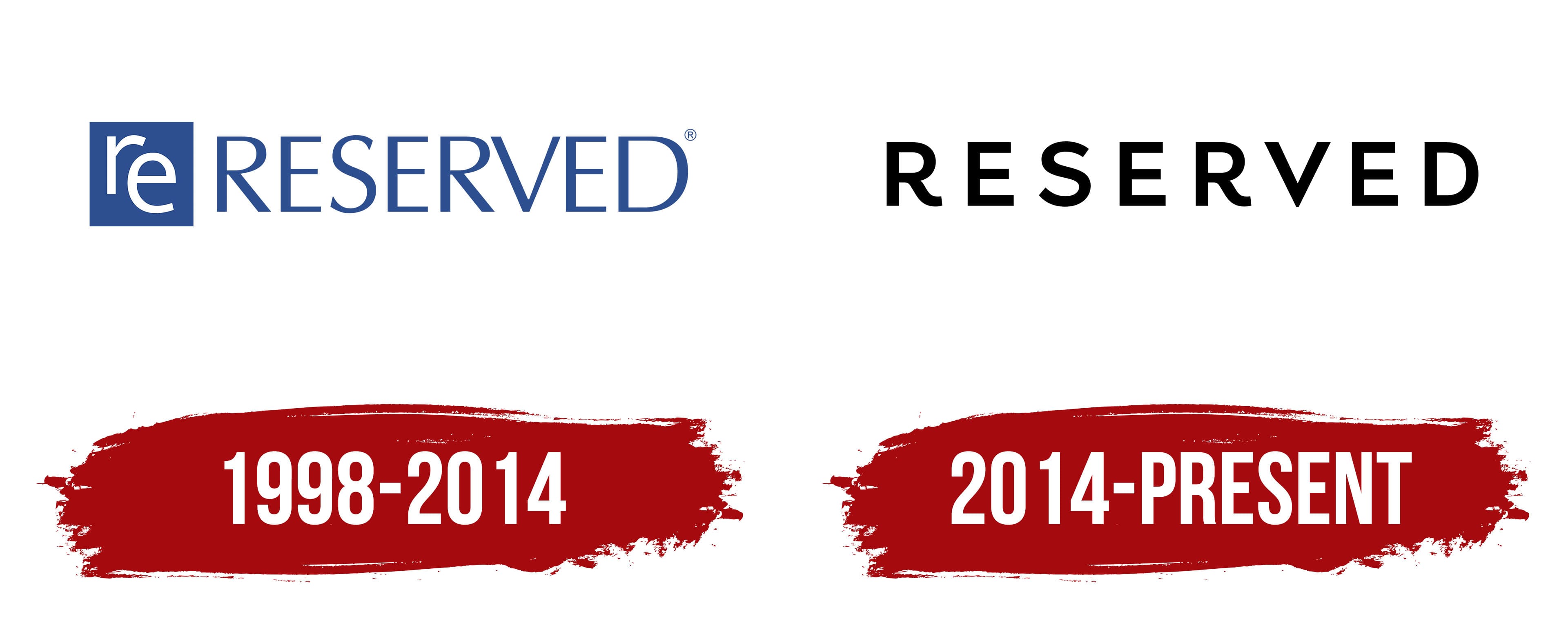
The brand was founded in 1998, and its first logo was introduced at the same time. From the outset, the brand positioned itself as an affordable clothing seller, and this emphasis was reflected in its identity.
The Reserved visual mark was highly informative, helping new customers become acquainted with the brand and communicating its core product concept. Bright colors were not used; instead, the logo consisted of two shades, one serving as the background and the other filling each letter. White was the primary color, complemented by a light blue secondary color. Their combination appeared unconventional and intriguing: the letters stood out, with the white gaining additional expressiveness in this pairing.
The visual mark was divided into two main parts, each containing its visual element. At the center of the emblem, on the left, was a square in which the letters were carefully drawn as though interchanging. They formed a unified cluster of “r” and “e.” The use of white highlights their elegance and sophistication.
The name “Reserved” was displayed in a gentle blue shade on the right side. The thin lines of the letters looked very precise, creating a memorable visual effect. All letters were uppercase, large, and aligned with the “r” and “e” symbols, though slightly shorter than the geometric figure, giving the logo a unique visual harmony.
2014 – today
The modern Reserved logo is designed in a strict, classic tone and focuses on an impactful and memorable brand presentation. The predominant monochrome style gives it a stylish appearance that perfectly aligns with current identity trends.
The emblems emphasize simplicity and logically reflect the main concept of this Polish brand, which offers affordable clothing and accessories. The logo is free of excess luxury, with its minimalism highlighted against a white background. It features small yet uppercase letters, and a relatively large spacing between characters creates an effect of visual depth and volume.
This identity effectively underscores the brand’s reliability through static symbols. It maintains the traditional idea of product accessibility, so the brand name remains the only element on the logo, without any additional details.