



SAPO, one of the first internet portals in Portugal, has introduced a new design. The update marks the platform’s transition into a new phase of development, with key goals including increased transparency of information, enhanced ease of interaction, and increased user trust.
For thirty years, SAPO has remained a universal digital space for the Portuguese, bringing together news, services, and entertainment. The frog, which serves as the portal’s symbol, has become a recognizable character and part of the cultural code. However, the previous logo with its geometric shapes and sharp lines had lost relevance.
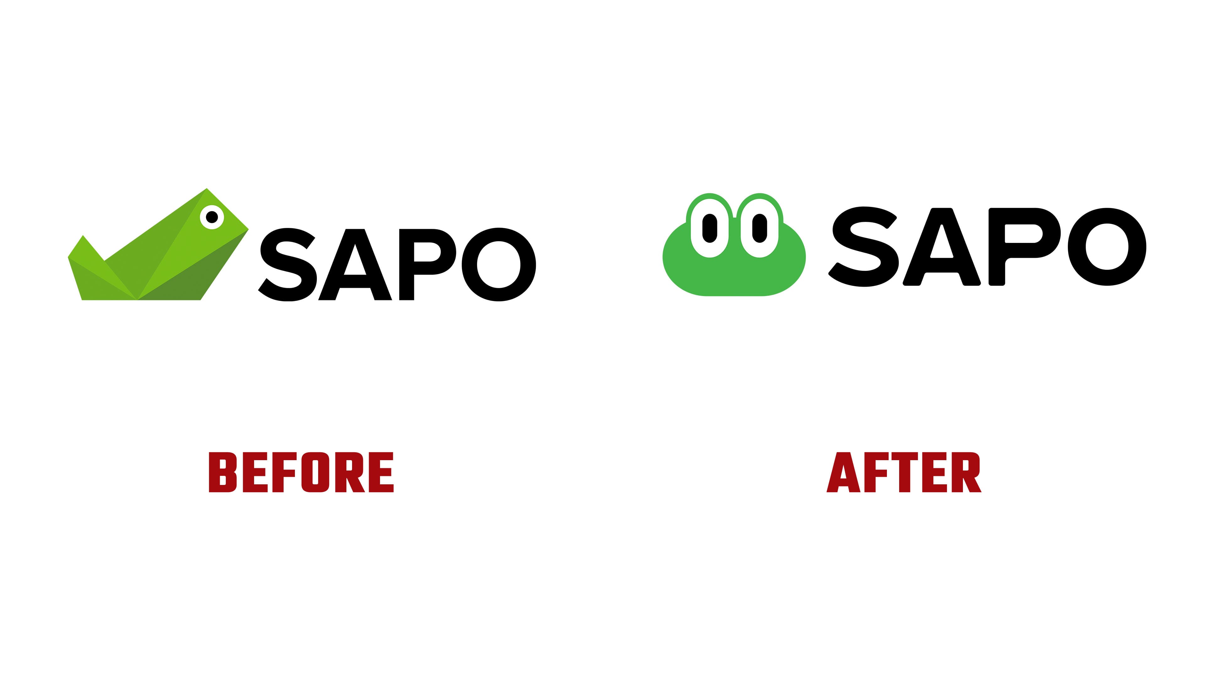
The new version of the logo retains the frog image but presents it differently. The character now features softer shapes and expressive eyes, making it feel closer to users. The image works as a mascot, reflecting openness and readiness for communication.
The slogan “See for yourself” has become part of the updated visual language. It emphasizes SAPO’s position as a platform where users can access verified information and evaluate events independently.
The color system remains based on green, but the tone has been softened, enhancing the brand’s perception as friendly and modern. The typeface of the name has been redesigned. The letter “S” has taken on a smoother form. The new font is optimized for the digital environment and works seamlessly across various formats, ranging from mobile applications to outdoor advertising.

The studio WYCreative developed the new look. The design is based on the idea of presenting SAPO as a portal that extends beyond news, offering a comprehensive ecosystem of services. The focus is now on multimedia content, as photos, videos, and infographics are seamlessly integrated into the interface, making information easier to absorb and comprehend.
The rebrand coincides with the expansion of the portal’s audience. SAPO is increasingly integrated into users’ daily lives, offering services for work, leisure, and communication. The new style is designed to ensure the platform’s usability for users across different generations, from younger users to those who have been familiar with SAPO since its early years.

Today, SAPO remains one of Portugal’s key digital resources, maintaining a balance between tradition and digital innovation. The company’s mission is to help people navigate the flow of information and provide them with access to relevant data and modern services. The updated identity emphasizes this direction.