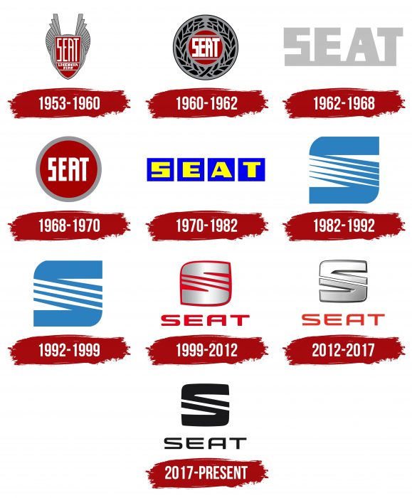
The smoothness and gliding that are seen in the emblem indicate the smooth running of the machines. The SEAT logo represents high-tech vehicles with a perfect combination of stylish body and interior.
SEAT: Brand overview
| Founded: | 9 May 1950 |
| Founder: | Instituto Nacional de Industria |
| Headquarters: | Martorell, Catalonia, Spain |
| Website: | seat.com |
Meaning and History
Volkswagen owns SEAT, but this hasn’t always been the case. The history of the company began in 1950, when the state-owned INI holding opened Sociedad Española de Automóviles de Turismo to motorize Spain. Representatives of the organization signed an agreement with Fiat, according to which the Italian company must produce its cars at the SEAT factories (an abbreviation for the full name). By the way, at that time, all the emblems of the Spanish brand had a lot in common with the visual identity of Fiat.
The project developed successfully until the 1980s when the parent company refused to cooperate due to the need for large capital investments. As a result, the brand redesigned the logo and found itself another owner – the Volkswagen Group.
The SEAT brand name changed quite often, and not only due to restructuring. Sometimes the redesign was associated with the release of new models or the desire to keep up with the times. In any case, the automaker has created a unique styling element: the ‘S’ symbol, which first appeared in 1982. It has evolved from a complex blue letter to a minimalistic black emblem.
1953 – 1960
The Fiat logo influenced the debut SEAT emblem. She looks very majestic, especially the two semicircular wings on the sides. In the middle is a dark red shield that is divided into three segments. Most of it is the brand name. In the center is the inscription “FIAT LICENSE,” and the bottom is left blank. Behind the shield, the artists depicted a winged oval and detailed the “feathers” in the form of stripes. This badge adorned the first cars of the company, for which it was made chrome.
1960 – 1962
In the early 1960s, the designers placed a red circle with the white word “SEAT” inside the gray ring and surrounded the inscription with a laurel wreath. The presence of the laurel connects this logo with the Fiat emblem, which was used in 1925. The font is now bold and not as elongated as before, although the general shape of the letters has been preserved.
1962 – 1968
In 1962, the company embarked on the path of minimalism. She presented a simple wordmark with no graphic elements. The only thing that reminds of the past SEAT design is the wide horizontal stripe that emphasizes the lettering. In the new version of the logo, it practically merges with the letters. The only color on the palette is gray. The font is bold and rectangular.
1968 – 1970
The 1968 version became round again, but the designers decided not to return the laurel wreath. Instead, they enlarged the brand name and added a wide gray border to the image. The classic combination has returned to fashion – white lettering on a red background.
1970 – 1982
In 1970, the circle finally disappeared and had not returned since then. All that remains is the word “SEAT,” with each letter being placed in its square. This design is as close as possible to one of the Fiat logos. The symbols are yellow, and the background quads are blue.
1982 – 1992
Having severed all relations with Fiat, the Spanish brand SEAT decided to move away from traditional images. She needed something of her own – unique and inimitable so that there would be no associations with the previous parent company. This decision was the emblem with the image of a large blue letter “S.” It looks unusual because it consists of two wide horizontal stripes and five narrow diagonal lines. Moreover, this is not an abstract drawing but an imitation of the piston rings of automobile engines.
1992 – 1999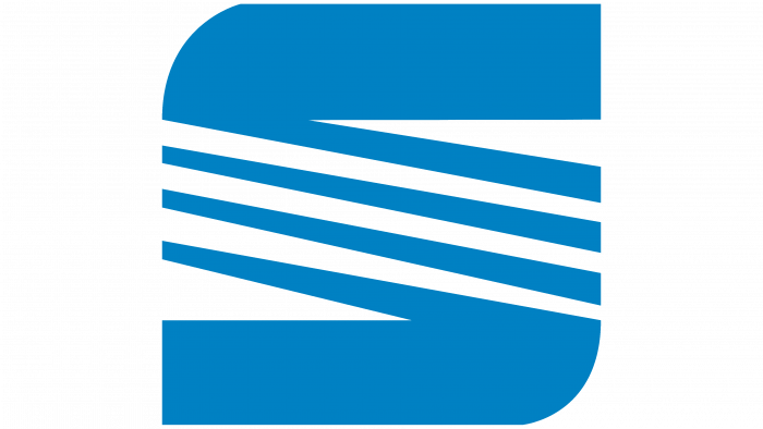
After a small redesign, the number of horizontal elements decreased: only four lines out of five remained. The rest of the stylized letter “S” has not changed – neither its color nor shape.
1999 – 2012
Another logo update took place at the turn of the century. The designers retained the S-shape but removed another diagonal stripe and rounded off almost all corners. The badge has turned silver, and a linear gradient radiates from the center to the edges vertically. At the same time, he got a red background and the same red signature, “SEAT.” The company name is located at the bottom, separate from the rest of the elements. It was made voluminous using darkened contours. The font is not similar to those used before: the letters are not so bold, although they cannot be called thin. The upper corner “A” on the left side is noticeably rounded.
2012 – 2017
In 2012, the Spanish car industry fell sharply. Due to the crisis, the demand for cars fell by almost 40%. To enter new markets and at the same time improve its position within the country, SEAT was forced to carry out a small rebranding. In general, the change of image began in 2010, but all the procedures took two years.
Representatives of Marketing-Communication and SEAT Design Center worked on the new logo. Together, they created a 2D hand-drawn icon. It looks remarkably like the old S-shaped symbol. Unlike the previous version, the letter looks straighter and smoother. The red base has disappeared, and a broad outline of a silvery-gray color has appeared.
The chrome symbol contains only two diagonal lines instead of three. They connect with horizontal stripes at the top and bottom. The red lettering has not disappeared anywhere, but the font has changed slightly. The “E” now has the same rounding as the “A.” The middle line “S” has become diagonal to resemble the brand name as much as possible. This logo was unveiled in Paris on September 27, 2012. Earlier, it featured in advertising photos of the Seat Léon.
2017 – today
The symbol of the car brand evolved again in 2017. Designers have maintained symmetry to show a balance between old and new. The unmistakable S-shape is combined with the traditional lettering. Moreover, the font has not changed at all. The developers repainted all the elements in black and removed the outlines, shadows, and gradients, making the image two-dimensional.
SEAT: Interesting Facts
SEAT, standing for Sociedad Española de Automóviles de Turismo, embodies a storied tradition within the Spanish and global automotive landscapes.
- Origins: Established in 1950 by the Instituto Nacional de Industria, SEAT embarked on a mission to enhance Spain’s automotive landscape. Starting with the SEAT 1400 in 1953 marked the nation’s foray into car manufacturing.
- Fiat Collaboration: SEAT’s initial lineup was shaped by a licensing deal with Fiat, which produced Fiat models under the SEAT brand until 1982. This partnership was pivotal to SEAT’s early development.
- Integration into Volkswagen Group: Post-Fiat, SEAT aligned with the Volkswagen Group in 1986, evolving under its umbrella to become a key player within one of the auto industry’s largest conglomerates.
- Spanish Manufacturing Pioneer: SEAT is celebrated as the inaugural Spanish car manufacturer, playing a vital role in the country’s mid-20th-century economic and industrial growth.
- Motorsport Heritage: SEAT’s ventures into rallying, particularly with the SEAT Ibiza’s triumphs in the World Rally Championship in the 1990s, highlight its competitive spirit and engineering prowess.
- Cupra Evolution: Starting as SEAT’s performance division with models like the Leon Cupra, Cupra branched out in 2018 as its standalone entity, focusing on high-performance cars.
- Design Excellence: SEAT’s dedication to aesthetic and functional design is showcased at its Martorell facility’s Design Center in Spain, where it has earned numerous accolades.
- Forward-Thinking Innovation: SEAT’s commitment to the future is evident in its electric and hybrid vehicle initiatives, aiming to spearhead sustainable mobility solutions.
- Global Reach: Beyond its Spanish roots, SEAT enjoys widespread recognition, especially in Europe, for its stylish, efficient, and value-driven vehicles, which are sold in over 75 countries.
- Environmental Stewardship: SEAT actively pursues eco-friendly initiatives, focusing on reducing emissions and waste and exploring sustainable mobility options to lessen its environmental footprint.
From its inception aimed at propelling Spain into the automotive era to its current status under the Volkswagen Group, SEAT exemplifies a legacy of innovation, design, and environmental consciousness, firmly positioning itself as a dynamic force in the automotive domain.
Font and Colors
When the automaker SEAT moved away from Fiat styling, it got its badge with the traditional “S.” Due to the parallel diagonal lines in the middle, many critics have compared it to the dollar symbol. But company executives immediately denied this assumption.
Officially, the diagonal stripes were inspired by Avenue Diagonal, one of the widest streets in Barcelona. They symbolize dynamics, speed, and development. And although there are only two of them left (three more disappeared during the evolution of the logo), this is the most important element of SEAT’s identity.
The company’s wordmark was created based on a personalized font. The closest similar option is Audiowide from Astigmatic. The current color palette consists of only black and white. Previously, completely different colors prevailed: silver (stylized chrome-plated metal) and red (the embodiment of Spanish charisma).
SEAT color codes
| Eigengrau | Hex color: | #121114 |
|---|---|---|
| RGB: | 189 17 20 | |
| CMYK: | 10 15 0 92 | |
| Pantone: | PMS Black 6 C |
