The GlaxoSmithKline brand markets effective oral care products. The Sensodyne logo, representing the company, depicts two cleaning methods that significantly enhance the effect of using this cosmetic product.
Sensodyne: Brand overview
| Founded: | 1961 |
| Founder: | GSK (until 17 July 2022), Haleon (from 18 July 2022) |
| Headquarters: | United Kingdom |
| Website: | gsk.com |
Meaning and History
The brand of toothpaste for sensitive teeth originated in Brooklyn, New York, where pharmacist Alexander Block introduced it. This happened in 1907. The company Block Drug took care of the sales. Gradually, the business started bringing in more profit and became the main family business. In 1938, it was moved to New Jersey. In 2000, the company was acquired by Smith Kline Beecham PLC, later renamed GSK (GlaxoSmithKline). In the summer of 2022, it became part of Haleon, so the famous toothpaste brand now belongs to it.
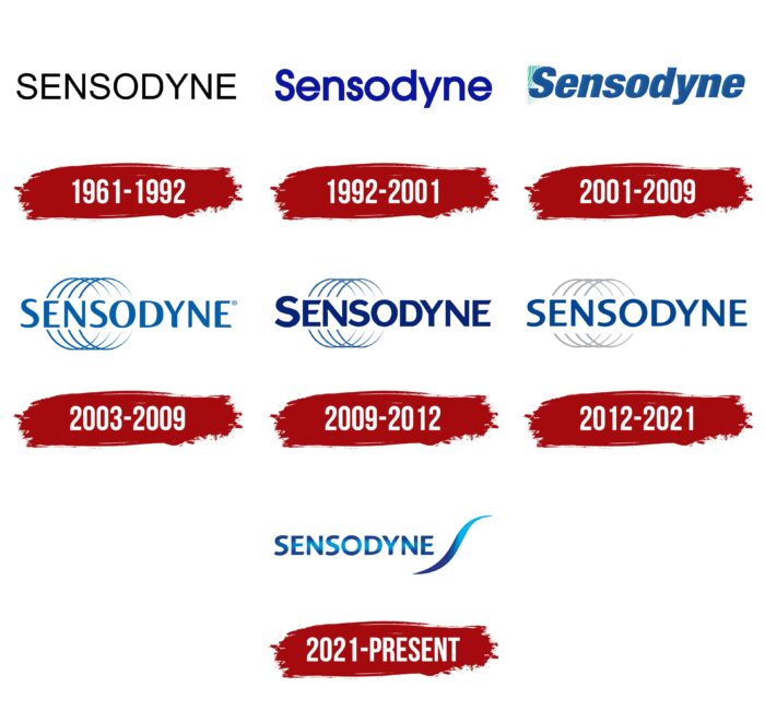
Since its inception, the Sensodyne trademark has changed several logos. They are characterized by practicality and the presence of a large inscription that predominates over graphics. The main attention has always been paid to text design: better readability, optimal spacing between letters, and font type. Therefore, there are seven different emblems.
What is Sensodyne?
Sensodyne is an oral care brand owned by the British pharmaceutical company GlaxoSmithKline. It gained fame for its toothpaste, which reduces sensitivity when in contact with acidic, sweet, hot, and cold food. This is achieved through the use of potassium nitrate and fluoride. The product range includes toothbrushes, mouthwashes, gum protection products, tooth whitening, and enamel strengthening products.
1961 – 1992
The origins of the Sensodyne cosmetics logo were laid by originally concentrated circles of the same diameter. The manufacturer invested two meanings in them: effective cleaning of the entire oral cavity and the circular tooth cleaning method. For greater authenticity, the emblem was painted in a soft pink color. To the left of the label was the brand name, executed in a strict font with wide letters. Despite the text being printed and not handwritten, all the signs were connected – they had a connection at the joints.
1992 – 2001
After the black and white version, the cobalt inscription looks impressive. Thanks to the even bold symbols with free internal space, it is easy to read. The exception is the letter “e,” whose sides converge so tightly that the glyph is visually perceived as an “o” with a crossbar in the middle. All letters, except for the first one, are translated into lowercase.
2001 – 2009
The inscription received a rightward tilt, needle-like protrusions at the ends of the letters, and curved lines on the left, becoming the prototype of semicircles. The color changed from cobalt blue to dark blue, with lighting on one side to give volume.
2003 – 2009
After a long break, the company redesigned the layout using existing elements. The developers clarified the circular lines, shifting them closer to the center, and placed the brand name above. They also standardized the palette, replacing all colors with blue, and offered a different style of inscriptions.
2009 – 2012
The logo of this period is almost a complete clone of the previous one. The exception is the font type and color, which have slightly changed. The rest of the composition remained the same.
2012 – 2021
In the new millennium, the brand modernized its logo. The current version is almost identical to the previous one, with minimal differences. For example, the round stripes have become silver, the letters dark blue, and the font thin.
The font used for the cosmetic brand’s name has changed twice. The first letters were low, wide, and bold. Then, a version appeared with narrow sans-serif characters and a small bulge in the middle. The third variant is now used – even characters from the Sans Serif family. The font is grotesque and uppercase.
The color palette also went through two stages of transformation. Initially, the logo was pink and dark blue, then blue; now it is silver blue.
2021 – today
The set of circular lines disappeared, as did the old font. In the current version, the emphasis is on simplicity. As a result, designers placed one smooth stripe to the right of the brand name, replicating the form of a sinuous wave. At the same time, it resembles a light feather – an allegory of soft touches, as this is a care brand. The word “Sensodyne” is executed in a smooth font with soft cuts at the ends of the letters, resembling curves. In contrast, the edges of the line are pointed.
Sensodyne: Interesting Facts
Sensodyne is a brand that makes toothpaste for people who have sensitive teeth.
- Starting: Sensodyne was made by Block Drug, which started in 1907. The first Sensodyne toothpaste came out in 1961 to help people with sensitive teeth feel better.
- How It Works: Sensodyne toothpaste has special ingredients like potassium nitrate that help calm the nerves in your teeth. Eating something hot, cold, sweet, or sour won’t hurt as much.
- Worldwide: Dentists recommend Sensodyne as the top toothpaste for sensitive teeth. It is available in many countries and helps many people.
- Always Improving: Sensodyne works on new ideas to improve toothpaste. For example, they have a type called Repair and Protect that can fix sensitive spots on your teeth.
- Teaching People: Sensodyne also helps educate people about tooth sensitivity and how to care for their teeth. It runs ads and campaigns to spread the word.
- More Than Toothpaste: In addition to toothpaste, Sensodyne now offers mouthwash and toothbrushes for people with sensitive teeth, offering a full set of tooth care products.
- Joining GSK: In 2001, GlaxoSmithKline (GSK) bought Sensodyne. This allowed Sensodyne to use GSK’s research resources and reach more people worldwide.
- Dentists Like It: Many dentists suggest using Sensodyne if you have sensitive teeth. It’s a part of keeping your mouth healthy every day.
- Ads That Stand Out: Sensodyne’s ads are unique because they often show real dentists and patients talking about how Sensodyne has helped them.
- Caring for the Planet: Sensodyne is working on being better for the environment. They’re trying to use packaging that’s better for the earth and responsibly get their ingredients.
Sensodyne is all about helping people with sensitive teeth through their products, research, and teaching them how to care for their teeth while trying to do good for the planet.
Font and Colors
Smooth strokes have appeared on the grotesque font. The letters have become squat and bolder. The “graphics-text” ratio has shifted towards the icon, so the name is made of medium-sized characters that look small compared to the wave. The word “Sensodyne” is painted in blue with a gradient. The transition to a light shade is concentrated in the center and positioned horizontally along with the entire inscription.
Sensodyne color codes
| Dark Cornflower Blue | Hex color: | #19418a |
|---|---|---|
| RGB: | 25 65 138 | |
| CMYK: | 82 53 0 46 | |
| Pantone: | PMS 7687 C |
| UNICEF Blue | Hex color: | #03b2ea |
|---|---|---|
| RGB: | 3 178 234 | |
| CMYK: | 99 24 0 8 | |
| Pantone: | PMS 312 C |
