 Shopkins Logo PNG
The Shopkins logo attracts young buyers, as children love bright colors, unusual patterns, and dynamic shapes. It establishes an emotional connection between the brand and its fans so that each tiny toy finds its loving owner.
Shopkins was created by Moose Toys, part of Australia’s Moose Creative Management Pty Ltd, and launched in June 2014. The first series contained 148 miniature characters based on supermarket goods, including fruit, vegetables, dairy products, sweets, and groceries. Distinct names, faces, and packaging turned ordinary retail items into a collectible format. A second series followed in October 2014.
Growth accelerated in 2015 with the third and fourth series, plus clothing, stationery, and plush merchandise. Shopkins received the Toy of the Year award in the girls’ category at the Toy Industry Association ceremony in New York. In 2016, an animated online series expanded the cast, while the fifth, sixth, and seventh collections introduced new themes.
The eighth and ninth seasons appeared in 2017, along with the feature-length animated film Shopkins: World Vacation on digital platforms and DVD. Real Littles debuted in 2018 with miniature versions of branded consumer products. A fifth-anniversary collection followed in 2019, reissuing characters from the original series.
Mini Packs introduced another collecting format in 2020 and expanded in 2021. The online series Shop It Up! arrived in 2022. Moose Toys released Eco Friends figures made from recycled materials in 2023. For the franchise’s tenth anniversary in 2024, the company issued new figures, re-released earlier characters, and planned fan events in several countries.
Meaning and History
What is Shopkins?
They are a popular line of collectible toys produced by the Australian company Moose Toys. These small, colorful toys depict a variety of food products, each with a different face and personality. The brand includes several toy seasons, each with a different theme and set of characters. In addition to collectible figures, the brand has expanded to include playsets, accessories, and merchandise such as clothing and books; it is aimed primarily at children. The brand has inspired animated web series and a variety of multimedia content, increasing its appeal and engagement with young fans.
2014 – today
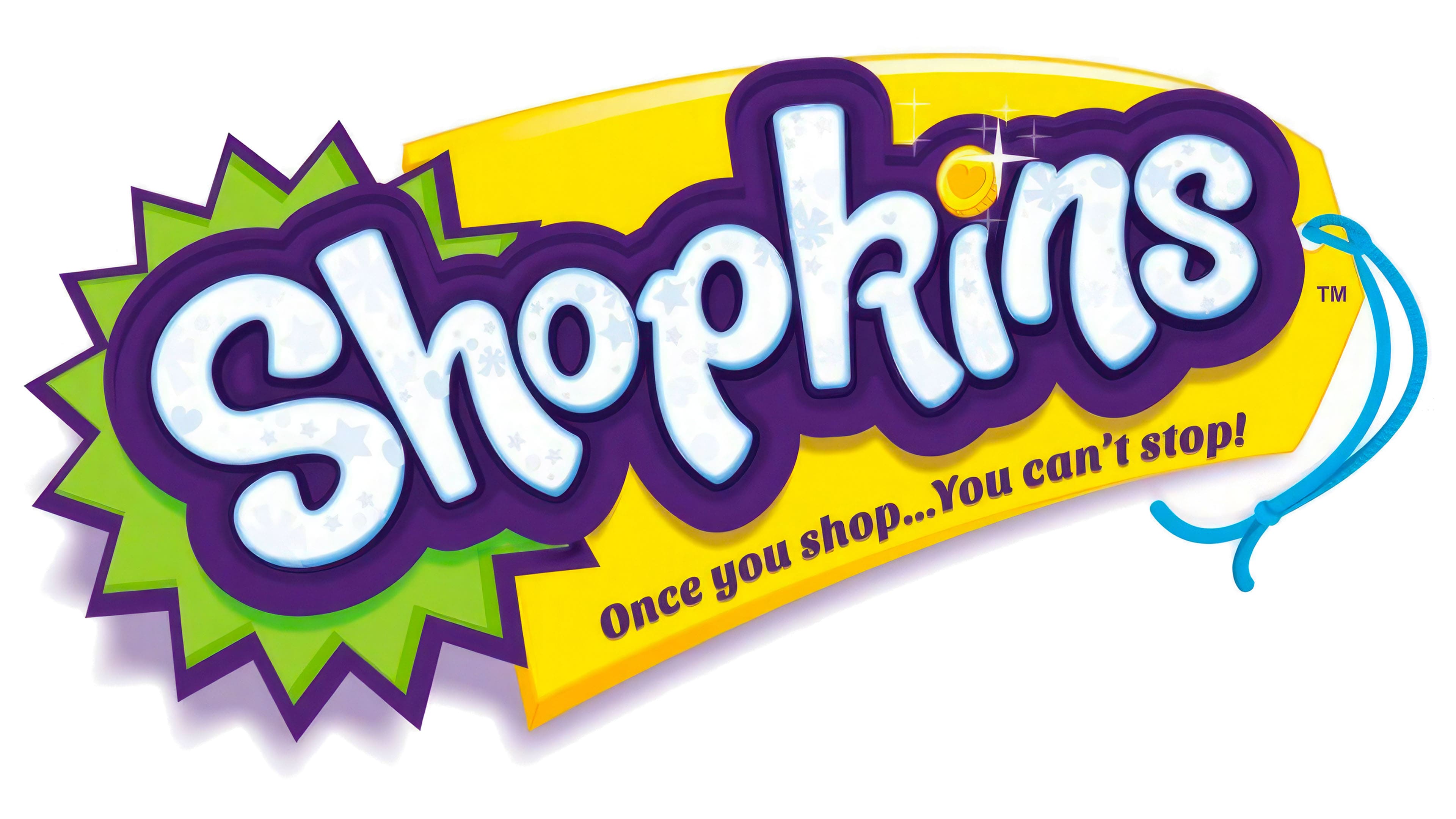
The tiny size of Shopkins toys is compensated for by their brightness, as without a colorful design, no one would notice the miniature figurines. The brand’s logo matches the bold and provocative style aimed at children. This explains why it is so layered: the more patterned details and textures, the greater the interest from the target audience.
- The word “Shopkins” is in the foreground, done in an original bubbly font. The uneven shape of the glyphs reflects the brand’s playful nature, and the softened ends of the curved lines suggest the safety of its products. The white letters are covered with translucent bluish hearts, stars, and snowflakes, creating a festive atmosphere.
- The dot above the “i” is replaced with a gold coin, hinting at the figurines’ size, which usually does not exceed a quarter. The designers made the drawing realistic by adding a wide ribbed edge to create a three-dimensional effect. A heart is depicted on the coin’s face, symbolizing warmth, attachment, and love. This shows that the brand strives to establish a close emotional connection with its young customers. The coin also symbolizes commerce, as many Shopkins toys resemble mini versions of real grocery items.
- Small four-pointed stars around the coin create a sparkle effect. It doesn’t seem overwhelming because the thin white lines dissolve into the space like fireworks. This hints at the varied texture of the collectible figurines, which can be sprinkled with glitter or covered with bright metallic finishes.
- The base for the word “Shopkins” is a large purple spot that follows the outline of each letter. This part of the logo has an uneven color, especially at the top, where thin dark purple stripes are drawn. The area around the inscription is also darkened, making the brand’s name clear and expressive. The distinct shadows create a sense of depth.
- The next layer is a circle with triangular notches resembling a green burst. It enhances the emblem’s expressiveness and helps grab children’s attention. A large yellow polygon is used in the background for the same purpose. The designers turned it into a tag by adding a blue string threaded through a small round hole on the right side.
- The brand’s slogan, “Once you shop… You can’t stop!” is on the tag. Behind its friendly playfulness lies the desire to “hook” children on Shopkins toys, making them crave buying the next tiny figurine. Both sentences are in a graceful italic font, echoing the bubbly design of the upper text.
Overall, the emblem looks like a large tag with many colorful elements. Its vibrancy, brightness, informality, and visual depth are aimed at children who love everything bright and unusual. The soft shapes are intended for parents, as the rounded lines create a feeling of safety. The diagonal tilt of the logo conveys an upward motion, intended to reflect progress in toy production.