


![]() Sierra Mist Logo PNG
Sierra Mist Logo PNG
The Sierra Mist logo reflects the coolness of melting snow and the sourness of lemon, which combine to create a super-cooling, explosive taste, complemented by a volcano of gas bubbles. The emblem makes you want to take a sip of the drink.
Sierra Mist grew out of a long attempt to challenge Sprite in the U.S. lemon-lime soda market. In the 1960s, the company had Teem, later replaced by Slice in the 1980s. In 1998, a caffeinated test drink called Storm appeared, but it never moved beyond trial sales.
The Sierra Mist name came from a marketing study with 2,000 people and more than 1,000 name options. PepsiCo used the image of mountain mist and snow-covered peaks to suggest freshness and a cleaner profile. In 1999, Sierra Mist launched in selected U.S. regions without caffeine, while first-year sales of the regular and diet versions passed $100 million.
Diet Sierra Mist followed in 2000, and by 2003, the drink reached national distribution. In 2004, it passed 7UP in annual U.S. retail sales and became the No. 2 lemon-lime soda behind Sprite. The gap with Coca-Cola’s Sprite remained large, and later changes did little to close it. Sierra Mist Cranberry Splash arrived in 2006. In 2010, the brand became Sierra Mist Natural, replacing high-fructose corn syrup with cane sugar.
In 2015, the company announced the Mist Twst name, launched in 2016 with corn syrup back in the formula. The move confused consumers, and in 2018, the Sierra Mist name returned. In 2022, signs of a replacement appeared in the form of a new domain and a Starry trademark filing. In January 2023, Sierra Mist was discontinued and replaced by Starry, a Gen Z-focused brand with new packaging, a revised formula, NBA sponsorship, and a Super Bowl 2024 advertising debut.
Meaning and History
![]()
Sierra Mist soda replaced several unsuccessful fruit-flavored PepsiCo drinks that the manufacturer attempted to launch in 1960 and 1984. It was based on Storm’s proprietary formulation and included lime juice, lemon juice, and caffeine. But it, too, did not pass the tests in its pure form because of a slight bitterness that many customers disliked. After unsuccessful sales attempts in 1998, the parent company removed the caffeine and introduced a new composition, which was highly appreciated by the target audience.
Like the brand itself, the brand’s products changed their name several times but almost always returned to the original version. These moves are related to shifting consumer tastes and emerging industry trends. The most recent renaming occurred in 2016, when, under a sponsorship agreement between PepsiCo and the NBA, a version of Mist Twst appeared. It lasted until the summer of 2018, then reverted to its previous name. The parent company has had eight redesigns of the Sierra Mist logo.
What is Sierra Mist?
Sierra Mist is a non-alcoholic beverage that contains lemon juice, lime, and sparkling water. The product is made from natural ingredients and is the second-most-popular drink globally, behind only Sprite. It first appeared on the market in 1999. PepsiCo is the founder and owner of the brand.
1999 – 2001
![]()
The theme of the freshness and naturalness of the carbonated water’s main ingredients dominates the debut logo. For this purpose, the designers placed slices of lemon and lime one after the other, leaving space for them above the letter “S.” They conveyed juiciness with transparent drops covering the name. The blurry green background supports the sense of vagueness and the citrus theme.
As for the text part of the logo, it consists of the brand’s full name, located in two lines. The main word (“Mist”) is set in large, grotesque type. The bold typeface has several distinctive features: the “t” has a shortened lower bend and upper rung, the “m” has triangular gaps, and the “s” has obliquely cut ends. The word “Sierra” is much smaller and fits on just the first two letters of the bottom half of the name.
2001 – 2005
![]()
In 2001, the parent company decided to revitalize its successful brand logo and make it more appealing to the younger, active generation. To do so, it added a touch of trendiness. The designers drew three geometric shapes: a vertical black rectangle and two trapezoids, a small yellow one and a large blue one. Against them, they placed a lemon, a lime (in whole, not slices), mountains, and the name. The developers made the first word handwritten and the second printed, but the proportions were disproportionate. The letters are angular, vary in size, have trapezoidal serifs, and are sharpened at the ends. The gradient in the lettering has disappeared: it is now clear white, with a dark shadow on the left.
2005 – 2008
![]()
After the upgrade, the label now features three-peaked mountains in the center, with the word “Sierra” in a handwritten style below them. It is placed exactly in the middle. Below is the second part of the soft drink’s name, “Mist,” in a tweaked font. The letters in it are coherent, as if flowing into one another. However, they are still angular, except for the last one: the lines of the “t” are smoother than those of the other characters. Each character in the main word is outlined in blue. At the bottom, the phrase “Limon-Lime Soda” is typed in small print. A bright sun rises from behind the mountains. The lemon and lime theme is also reflected in the background with a green fill and faint yellow circles.
2008 – 2010
![]()
This logo is considered the most unsuccessful in the brand identity. Its main focus is the word “Sierra”: it is written in large, thin letters that are very clearly visible. At the same time, “Mist” has a vague outline, even though it is in a large font. So the designers decided to play up its meaning, “fog.” They chose a photo of forest trunks as a background. The blue color and the mountains disappeared. The writing style also changed. The lime and lemon motifs were rendered in green with a slight yellow reflection on the horizon.
2010 – 2013
![]()
In 2010, PepsiCo changed the composition of its carbonated beverages by removing corn syrup, prompting a redesign of the logo. It approved a logo with a realistic fruit cut in half. And the lime is placed in front of the lemon, as its volume in the drink is slightly larger. The lettering has also changed: it became crisp, austere, and grotesque. The word “Sierra” is now so small that it fits between the uppercase “M” and the lowercase “t” of the second half of the brand name. The background in this version is white, and the letters are emerald-amber.
2013 – 2016
![]()
The lemon and lime images completely disappeared from the logo. Only reminders of them in the form of corresponding inscriptions, colorful spots, and two circles of green and yellow remained. At the same time, the logo received a modern look aimed at the target consumer segment: youth. The fonts have become surreal, which is seen in the spelling of the word “Mist,” where two triangles of different sizes replace the letter “M.”
2015 – 2018
![]()
In late 2015, the parent company that owns the Sierra Mist brand announced it would rename the brand Mist Twst. At the same time, it unveiled a new logo. It features images of two overlapping citrus fruits. A lemon is placed first, and a thin edge of lime is visible from behind it. Both fruits are large and realistic. The new part of the carbonated drink’s name is stenciled, while the rest is in bold, grotesque lettering.
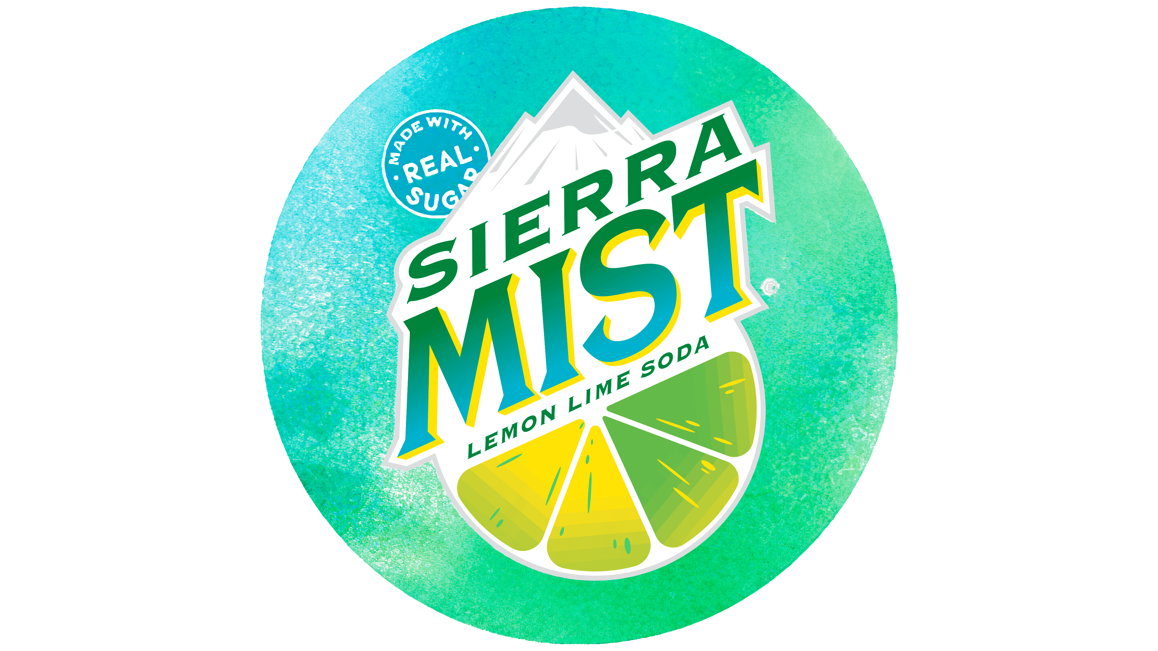
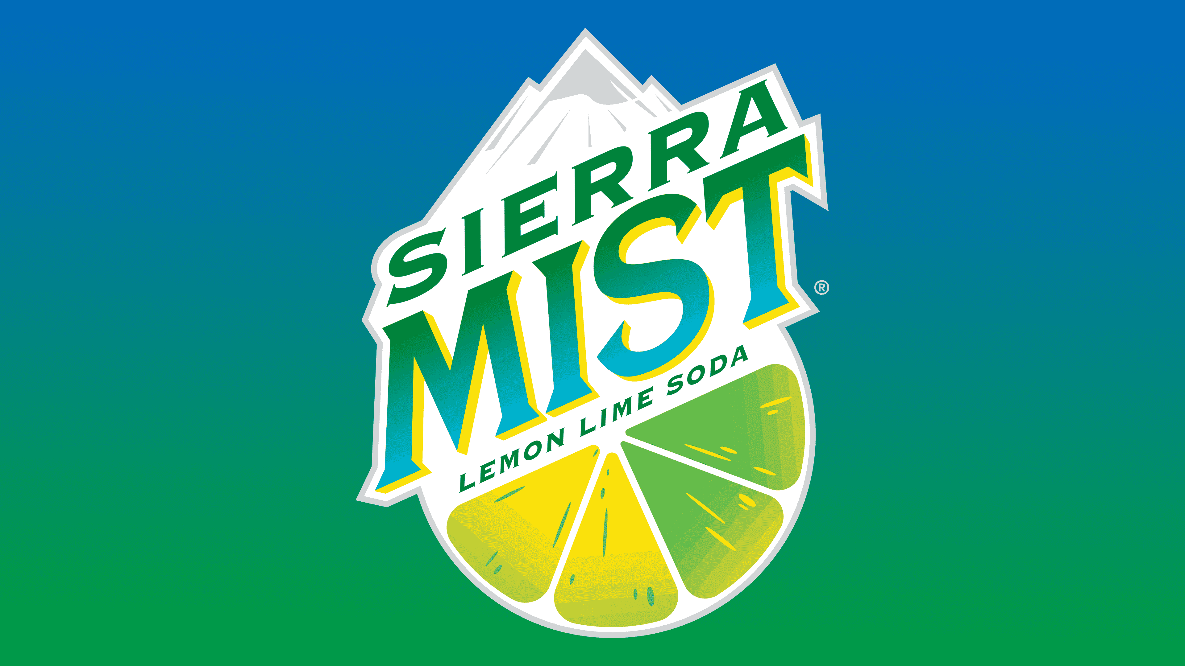
2018 – today
![]()
The current logo is based on the old name that PepsiCo brought back to its brand. The image once again features mountain peaks and a slice of lemon-lime. They indicate that the drink is refreshing and has citrus fruit juice. The name takes center stage and is slanted diagonally. Miniature sharp serifs complement the letters.
Font and Colors
The evolution of the Sierra Mist logo is a continuous search for personal identity. That’s why its style changed from classic to teenage. The emblem reflects the drink’s composition, particularly its main components, lime and lemon. They changed their appearance over time and were used either whole or sliced. Their theme is also conveyed in the basic shades.
The word “Mist” has always been custom. It is a custom typeface, rather than drawn or typed, following a standard pattern. The word “Sierra” in the current logo is in a font reminiscent of Copperplate Gothic. The lettering also echoes the Porkshop Italic style.
The signature palette is connected to the lime-and-lemon theme: it is predominantly green and yellow. It is periodically complemented by blue, white, and black. Now the logo uses a gradient from green to azure.