


![]() Sierra Tequila Logo PNG
Sierra Tequila Logo PNG
Cirrus agave leaves, manual production, and a distinctive aftertaste are all evident in the visual sign of tequila. The Sierra Tequila logo conveys dignity and respect for the local culture. The taste of alcohol contains the flavor of Mexico.
Meaning and History
It all started in the post-war years in Germany when the country was devastated by the war. In 1948, members of the Matthiesen family bought the trading house Borm & Co., which was engaged in the sale of alcohol. After the purchase, it was immediately renamed Borco. A few years later, in 1972, it was renamed again to Borco-Marken-Import Matthiesen GmbH & Co. Nowadays, the third generation of founders runs it.
In the 1980s, there was a tequila boom in Europe, and then the management of the German company decided to take over the tequila distillery. After careful study, it was learned that the alcohol is made from blue agave, which grows in Mexico, and that the best fruit is grown in the Jalisco region. Then the entrepreneurs bought a small industrial site near Guadalajara and began importing tequila into Europe. The first batch appeared in Germany in 1982.
What is Sierra Tequila?
Sierra Tequila is a brand of Mexican tequila produced by the German company Borco-Marken-Import Matthiesen GmbH & Co. The brand’s management is based in Hamburg. The production sites are located near Guadalajara. The brand’s owner is the Matthiesen dynasty.
Unlike other types of this alcoholic beverage, Sierra Tequila is distilled not from roasted agave cones but from raw, unprocessed cones. This decision was made after a trial batch offered by the Germans. The alcohol turned out very original, but strong and interesting. The main thing in technology is to harvest ripe fruit at the peak of juice extraction from the pulp.
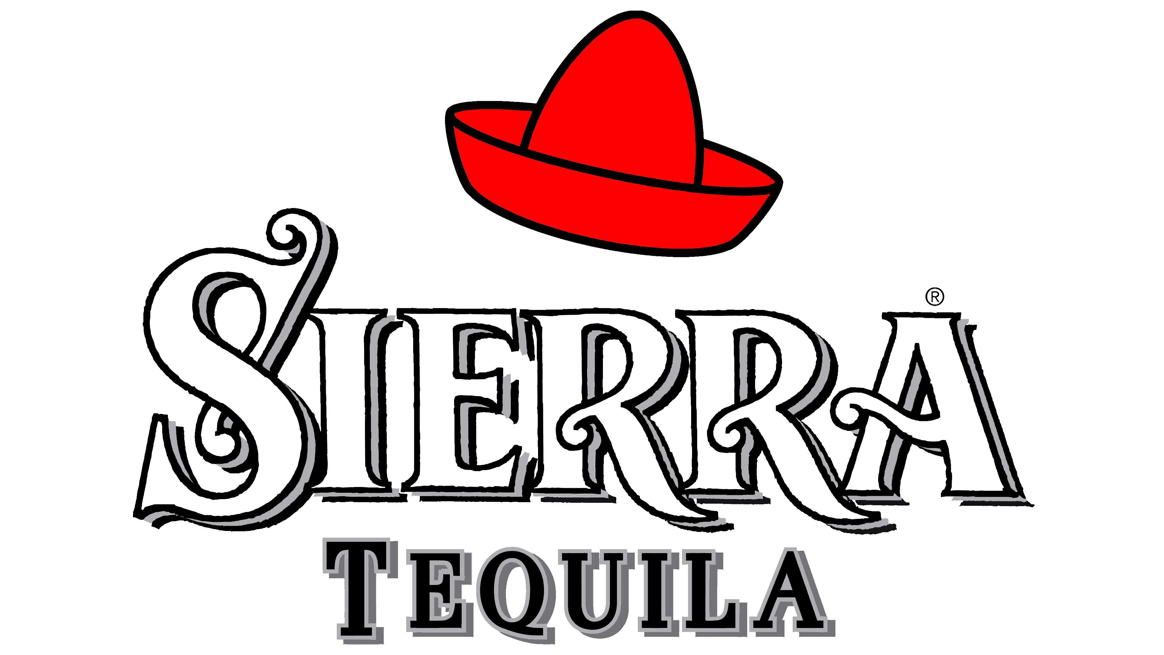
And the name of the brand names the place where the raw material for tequila grows: the blue agave grows at a height of 1,5 km above sea level on the fertile volcanic soil of the Sierra Madre highlands. And the distillery itself is called Destilerias Sierra Unidas. Bottles of the signature tequila are distinguishable from the rest by their unique sombrero-shaped caps, which are part of the authentic culture.
On some labels, a Mexican wide-brimmed hat emphasizes the alcohol’s true origin. It’s a calling card for the German brand, reflected in the brand identity. But not only that: the sombrero also has a practical value. The high edges form a groove deep enough to pour salt into it and dip the edges of the inverted glass before filling it with tequila. After all, that’s how it’s traditionally drunk. At any rate, one version of the logo features a red wide-brimmed hat tilted slightly.
The main logo uses the liquor brand’s name in an Old English style. The letters in the word “Sierra” are large, bold, decorated with figurative elements and miniature sharp serifs. They are reminiscent of the thorns of the blue agave, the plant from whose fruit tequila is distilled. The second part of the brand name is typed in a classic font without any typographical embellishment. All signs in it are flat, smooth, with similar spike-like serifs as in the first word.
The upper inscription is also in antiqua but in small characters. Between “Jalisco” and “Mexico” is a small icon featuring a monochrome agave. The plant is in a vertical oval with a double border, resembling a medallion. There are shadow strokes to the right and bottom of each sign in the center word, giving it a 3D look.
Font and Colors
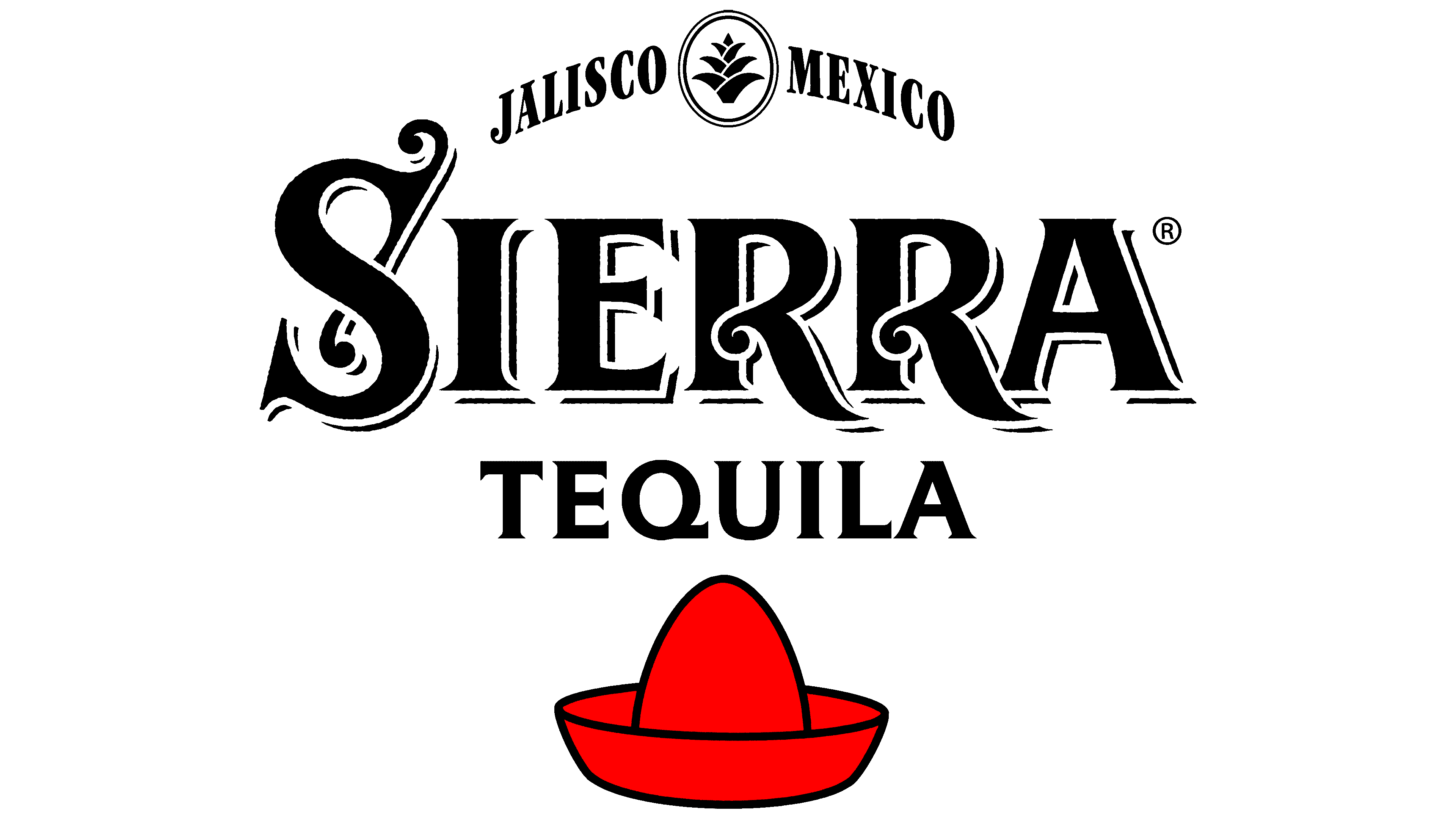
For the text in the Sierra Tequila emblem, the designers chose antiqua, a smooth font with miniature thorns on the ends of the stems. They resemble the thorns that run along the edges of the blue agave’s leaves, which are distilled into alcohol and then aged in oak barrels.
The logo’s palette is understated: there are no flashy elements, just black-and-white monochrome. The exception is the red sombrero used on some tequila labels.