


![]() Sky Logo PNG
Sky Logo PNG
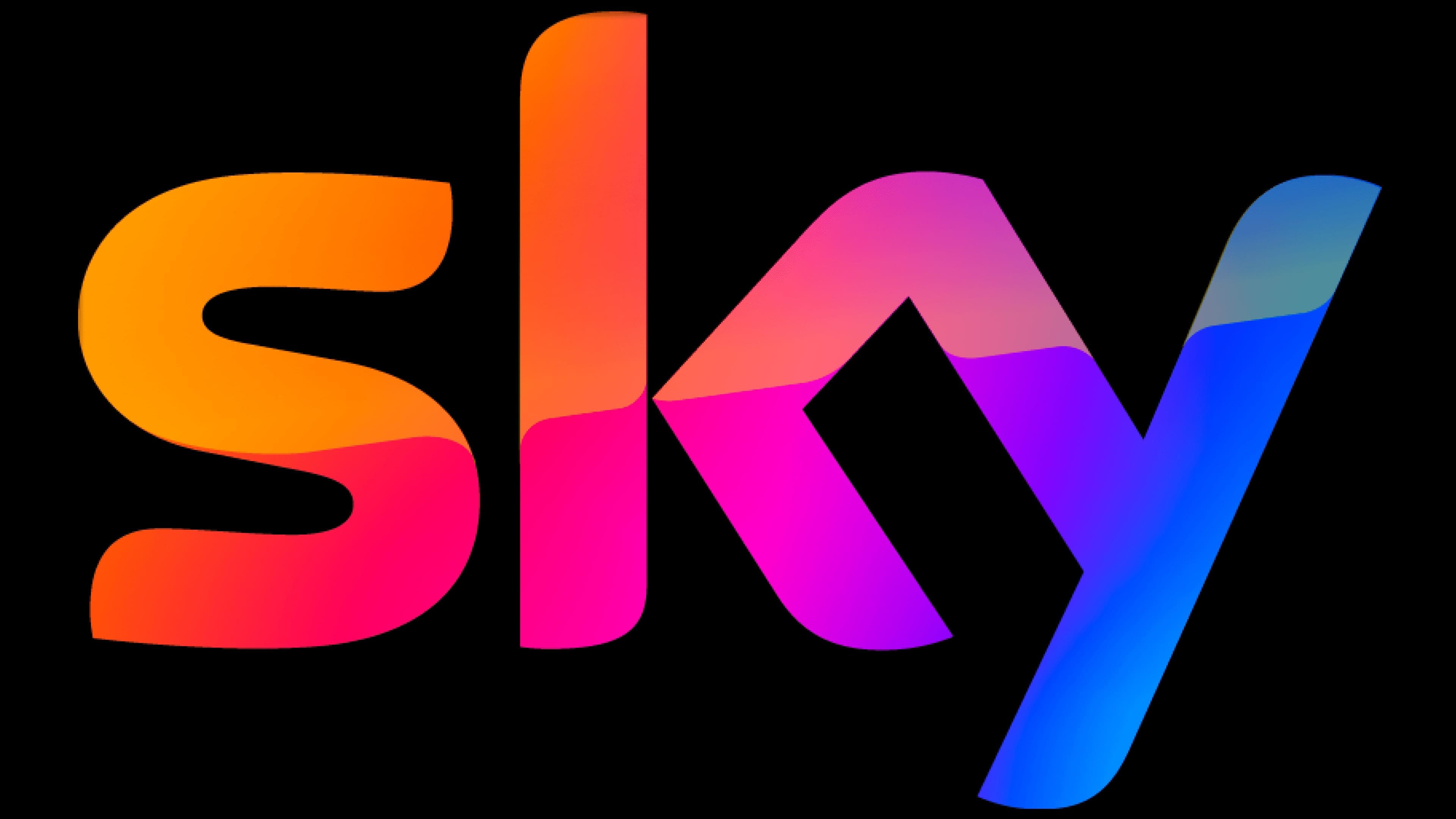
The Sky logo is a merger and unification, with bright, unforgettable emotions. The emblem exemplifies versatility and teamwork in reaching new heights. The sign shows a mix of programs in different directions, where every viewer can find something attractive and interesting.
Sky’s history began in 1982 with Satellite Television UK, one of Europe’s first satellite channels. In 1983, Rupert Murdoch’s News International bought control of the company, which it renamed Sky Channel in 1984.
After losing a UK satellite license to British Satellite Broadcasting in 1986, Murdoch used Astra, a Luxembourg-based satellite outside British jurisdiction. On June 8, 1988, he announced the launch of Sky Television Network, aimed at the UK market. Sky began broadcasting on February 5, 1989, with Sky One, Sky Movies, Sky News, and Eurosport. Sky News became the UK’s first 24-hour news channel. The launch cost £122 million, and first-year losses reached £95 million.
To grow faster, Sky began giving away dishes and receivers in May 1989. BSB launched only on April 29, 1990, using the Marco Polo satellite, D-MAC technology, and square “squarial” antennas. Both companies lost money in the race. In 1990, Sky’s losses reached about £2 million a week. In November 1990, Sky and BSB merged to form British Sky Broadcasting (BSkyB).
By March 1992, BSkyB reached an operating profit. Its breakthrough came through Premier League football rights. In 1991, BSkyB and the BBC entered into a five-year deal. The BBC kept highlights, while BSkyB paid £304 million for exclusive live matches from 1992. In 1994, BSkyB floated 20% of its shares on the London and New York stock exchanges, valuing the company at £4 billion. Sky Digital launched in 1998, and analog broadcasting ended in 2001.
In 2016, 21st Century Fox attempted to acquire Sky in full. In 2018, Comcast entered the contest and completed the acquisition in October, including Fox’s stake.
Meaning and History
![]()
The telecom company’s logos reflect its name: one short word in a simple sans-serif typeface. It was this minimalism that made the media conglomerate memorable and helped it stand out from its competitors.
What is Sky?
Sky is a multiplayer art-house game created by the American developer Thatgamecompany. Its full name is Sky: Children of the Light. It is available on PlayStation 4 and Nintendo Switch, as well as on Android and iOS. The first version was released in 2019. In this video game, users can travel through different worlds, solve puzzles, collect useful items, and interact with each other.
1984 – 1989
![]()
In 1984, two significant events took place in the world of television broadcasting. First, the Satellite Television channel became Sky Television. Secondly, its owners decided to change the work’s name, concept, and branding. An unexpected rebranding touched the logo: in January 1984, viewers first saw the black inscription “SKY” on their screens. The first letter connected to the second, and the second to the third, so the word looked like one indivisible figure.
1989 – 1993
![]()
Sky Television was forced to merge with British Satellite Broadcasting to solve several financial problems. In this union, she took a dominant position, so the new structure continued to be called Sky (officially British Sky Broadcasting). Its logo has barely changed. Designer Harry Marks and Pacific Data Images kept the old font but elongated the letters and set the lettering within a wide black ring.
1993 – 1995
![]()
In 1993, Novocom developed a new visual style for BSkyB TV channels. The main emblem was also redesigned: the ring became white with black stripes around the edges, and the word “SKY” went beyond the central circle. In this case, the bottom of the letter “Y” no longer touches the “K” because of the alignment.
1995 – 1997
![]()
Two years after the redesign, the Novocom studio again changed the TV company’s identity and channels. The logo lettering has been tilted to the left and raised on the right side. The ring disappeared the conglomerate’s name moved to a white oval inside a black rectangle.
1997 – 1998
![]()
Against the background of continuous development and the conclusion of a profitable partnership, BSkyB again changed its logo. This time the word was white and the background black. The lettering was slightly outside the oval, making it look like an egg on the screen due to the superimposed 3D effects. The rectangle has disappeared, simplifying the image’s perception and expanding its use across different channels.
1998 – 1999
![]()
Before launching digital services under the Sky Digital brand, the company asked Pittard Sullivan to redesign the logo. The designer chose a new font for the inscription (Universe Black), removed the slant, and set all letters to lowercase. Also, he removed the oval borders, leaving a black curved line as a reminder, the so-called “satellite edge.”
1999 – 2001
![]()
At the turn of the century, there was another redesign that only touched the lettering. The letters have become smoother and more streamlined. Because of this, the “s” is slightly separated from the interconnected “k” and “y.” In addition, the company began using a new color scheme: white, yellow, and blue.
2001 – 2009
![]()
In 2001, Sky stopped providing analog television services. Around the same period, she changed the emblem, removing the black arched line. The shape of the letters with rounded corners remains the same.
2009 – today
![]()
British Sky Broadcasting decided not to dwell on the old concept and refined its image again. The style has become friendlier because the designers have softened the sharp lines and rounded the letter edges even more.
Font and Colors
Sky Group Limited received its current name only in 2018, but this did not affect its logo in any way. The fact is that she has always used the keyword “Sky” as the centerpiece of her identity, so she did not have to change anything after the rebranding.
The inscription is made in an individual font, representing Universe Black’s modification with rounded corners and aligned letter lines. In the main version of the logo, the word is black and on a white background.