


![]() Smart Logo PNG
Smart Logo PNG
A Smart logo is perfect for a car company. The emblem symbolizes technology, movement, progress, and constant development towards convenience and comfort. In the darkness of the unknown, the firm is the first to pave the way for the future.
Smart began outside the car industry, in the world of Swiss watches. In the late 1980s, Nicolas Hayek, the Lebanese-born entrepreneur behind Swatch Group, wanted to apply the Swatch formula to urban mobility: a small, affordable car with interchangeable plastic body panels. In 1991, Hayek proposed the “Swatchmobile” to Volkswagen, but Ferdinand Piëch rejected the project. BMW, Fiat, General Motors, and Renault also passed. Daimler-Benz finally agreed to talk.
At the 1993 Frankfurt Motor Show, Hayek met Mercedes-Benz CEO Helmut Werner. On March 4, 1994, they announced the formation of Micro Compact Car AG (MCC), with Daimler-Benz holding 51% and SMH, the Swatch holding company, 49%. Smart stood for “Swatch Mercedes ART.” The partnership soon showed tension. Hayek wanted a hybrid or electric car, while Mercedes-Benz preferred a gasoline engine. In 1994, the partners approved a new factory in Hambach-Sarreguemines, France, later known as Smartville.
The first Smart City Coupé was launched in nine European markets in October 1998. Daimler-Benz then bought out SMH’s stake, taking full control of the brand. The car was only 2.5 meters long and used the Tridion safety cell with plastic outer panels. Between 2003 and 2006, Smart cost DaimlerChrysler about €3.9 billion in losses. The City Coupé later became the Fortwo, while the Mitsubishi-based Forfour failed to meet sales expectations.
Smart entered the US and Canadian markets in 2008. Electric testing began in London earlier, and by 2009, Smart had become a major European automaker with a series-produced EV. In 2019, Daimler AG and Geely formed Smart Automobile Co., Ltd. in Ningbo. Mercedes-Benz handled design, Geely took engineering and production. The 2021 Concept #1 marked Smart’s shift from microcars to compact electric crossovers.
Meaning and History
![]()
The concept of manufacturing unusual compact cars originated in the 1970s and 1980s. The CEO of SMH, the manufacturer of the smartwatch Swatch, suggested it. He believed the new project would popularize his products and increase demand, so he released a miniature machine with electronic personalization features. Nicolas Hayek was confident it would adequately represent the small, compact, and stylish city car niche. Soon, his idea turned into the Swatchmobile project. Hayek Engineering AG took over the technical and design issues.
However, at the drafting stage, the author understood that Swatchmobile posed a threat to large car manufacturers. Therefore, he went not through competition but cooperation, offering it to several transport manufacturers. The startup initiator contacted several major market representatives but was refused.
However, in the summer of 1991, he was lucky: Volkswagen became interested in the project. Their joint work did not last long: the corporation’s new head terminated the agreement. Then the innovative company entered into a contract with Daimler-Benz AG, the manufacturer of Mercedes-Benz cars. This was announced in Stuttgart in the spring of 1994.
Then, management finally seriously considered the new structure’s identity. The name Smart, the basis for the logo, initially caused considerable controversy among directors. Nicolas Hayek insisted on “Swatchmobile” or “Swatch Car” options, but Daimler-Benz management wanted a neutral option.
Therefore, Smart appeared to be an acronym of the phrase “Swatch Mercedes ART.” Its abbreviation was once a working name and was used internally by MCC. The word “Smart” is taken from S (watch), M (ercedes), and Art. For the logo, the manufacturer chose lower-case lettering, highlighting the letter “c,” which means “cute” and “compact.” The brand currently has only two emblems.
What is Smart?
Smart is a Chinese car brand owned by Smart Automobile Co., Ltd. The parent company is Mercedes-Benz. The brand was created in 1994, but its first car appeared only four years later. Thanks to its low weight and small size, it was very maneuverable. Later, other models were introduced: Cabrio, Roadster, and Forfour. The manufacturer focused on compact electric vehicles designed for urban conditions.
1998 – 2002
![]()
The debut logo appeared after the trademark was established: it was used only for conceptually new cars. The mark consists of the company name in lowercase, ideally supporting small and compact cars. The word “smart” is written in rounded symbols with no sharp corners, reminiscent of semicircular motorways. The letter “r” looks like a curved stroke, the “t” has the left half of the crossbar cut off, and “a” is supplemented with a triangular arrow that points to the right and expresses movement.
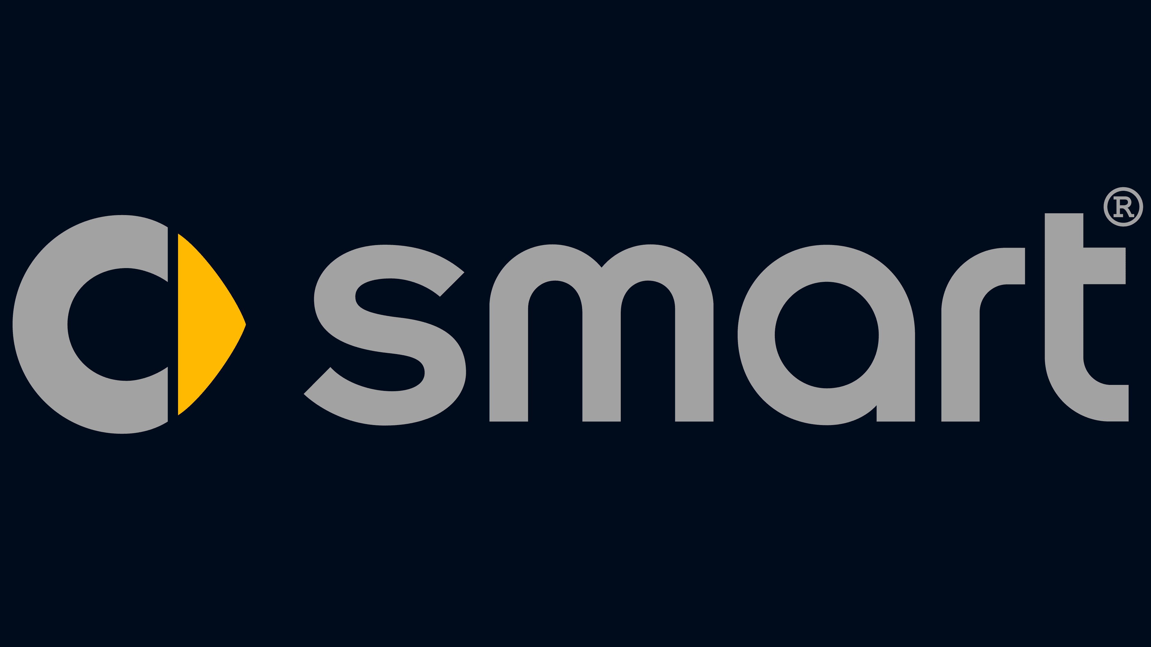
2002 – 2022
![]()
The Smart logo reflects the brand’s minimalist, technology-driven approach at its core. The emblem combines a graphic element with text, creating a visually balanced and streamlined design.
On the right side, the brand “smart” is light gray with a two-dimensional, flat graphic style. This font and color emphasize the vehicles’ simplicity, functionality, and modernity, highlighting their compact size and innovative solutions for urban mobility. The flat design of the text reinforces the sense of technological advancement and lightness.
On the left is a prominent graphic element, the letter “C,” rendered in three-dimensional graphics with gradient highlights that create a volumetric effect. This element represents the brand’s focus on creating compact yet spacious cars. The silver-graphite color of the “C” underscores the quality, reliability, and innovation associated with the Smart brand. A unique feature of the logo is the yellow triangular pointer inside the letter “C.” This element resembles a start button or an arrow, symbolizing the vehicles’ dynamism and energy while highlighting their appeal to a young and active audience.
2022 – today
![]()
The Smart logo has become a symbol of current design trends, embracing simplification and minimalism. Notably, stripped of unnecessary details, it has become flatter and more streamlined, much like many modern visual identities of major brands. This streamlined design allows for easy adaptation across various media, whether on smartphone screens or billboards, an essential feature in the digital age. However, when displayed on a vehicle, the logo may take on a more dimensional and detailed appearance to align with the aesthetics and demands of automotive design.
The black color in the logo symbolizes elegance and sophistication, lending the overall design a serious, contemporary feel. This color choice is part of a broader trend towards simplicity, where companies are moving away from complex gradients and multi-layered effects in favor of more straightforward, easily recognizable solutions.
The emblem consists of two main components: a circle and a triangle. The circular part, resembling the letter “C,” represents compactness and completeness, key characteristics of Smart cars, which have always stood out for their small size and smart functionality. The triangular element, pointing forward, symbolizes progress and reflects the brand’s philosophy of being at the forefront of innovation and offering consumers modern, eco-friendly solutions.
The logo’s font is simple and unadorned, reinforcing the brand’s focus on minimalism and practicality. It perfectly embodies the company’s strategy at a time when the automotive industry is increasingly concentrating on efficiency and sustainability.
Font and Colors
The company opted for lowercase characters to beat the size of small cars. Only the letter used in a separate icon is capitalized. This is “C,” which the management has endowed with two functions: dynamics and information. A yellow triangular pointer expresses the first, the second by the letter itself, denoting the concepts “compact” and “cute.”
You can see that the typeface used in the logo is very similar to HoratioDMed with the changed “s.” This is a special SmartCourier font, custom-designed by Dalton Maag, Ltd.

The color palette consists mainly of shades of gray, including gradient tones of graphite, ash, and silver. Golden ocher is also used.