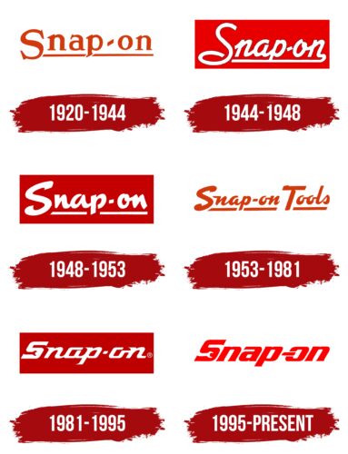
The Snap-on logo shows the connection of the brand with the technical field. And the “engineering” symbols included in it make it clear that the company produces a variety of tools and equipment. The logo is austere and serious but dynamic. It is the epitome of high speed.
Snap-on: Brand overview
| Founded: | 1920 |
| Founder: | Joseph Johnson, Bill Seidemann |
| Headquarters: | Kenosha, Wisconsin, U.S. |
| Website: | snapon.com |
This company is a direct competitor to such technical giants as Ko-Ken Tools, Cornwell Tools, Mac Tools, and Matco. Its structure includes several factories located in different states: Alabama (Elkmont), North Carolina (Murphy), Tennessee (Elizabethton), Arkansas (Conway), Iowa (Algona), and Wisconsin (Milwaukee). The company’s main products are professional tools and equipment for the railway, aviation, marine, and automotive industries. She sells and develops them, so Snap-on puts the logo on each of her products. The time of the appearance of the trademark is 1920. Its creators are Joseph Johnson and William Seidemann. The headquarters is located in Kenosha, Wisconsin.
The venture was first called Snap-on Wrench. It was located in Wisconsin, Milwaukee, and ten years later moved to Kenosha (in 1930). Joseph Johnson and William Seidemann conceived a hand tool with interchangeable tips that “snap” onto the handles. As it turned out later, there are other innovations in their activities: the company is still focused on developing innovative equipment and introducing advanced technologies.
Meaning and History
The manufacturer attaches no less importance to advertising and marketing because its products find buyers through dealer networks and do not go to stores. Such a strategy requires powerful visual support – catchy, understandable, well-recognizable, and constant. At one time, this approach lived up to expectations. The company began to expand actively, increasing the area of activity. She has a lot of industrial sites in the United States and abroad. In addition, she sponsors races, which also contributes to the promotion of the identity. For 2022, Snap-on has six emblems.
What is Snap-on?
Snap-on is a well-known American manufacturer of professional tools and diagnostic equipment for testing various types of vehicles. It also manufactures technical equipment for most industries and has factories in the US and abroad. The company develops all its products itself. The time of the appearance of the trademark is 1920. Its founders are mechanic businessmen Joseph Johnson and William Seidemann. The head office is located in Kenosha, Wisconsin.
1920 – 1944
Debut Snap-on text logo. It contains only the title, located on a white background. The inscription itself is dark red (wine hue), lowercase, with an underline. But the strip is not continuous: it is interrupted at the foot of the letter “p.” The serifs are small and angular; they are placed not directly but at an angle. The only capital character is “S.” It goes below the level of neighboring signs and protrudes beyond the horizontal line.
1944 – 1948
The next option consists of italic text. The inscription imitates handwriting, so all characters are smooth, rounded, and calligraphic. Designers have made an innovation: the logo has a dark red rectangle on which the brand name is placed. It is made in white. The bottom line is now a continuation of the last letter in the word “Snap-on” and runs under the entire inscription. The exception is the “S”: this is a large symbol, and it is located apart from the rest.
1948 – 1953
The developers have changed the font by keeping the same horizontal red rectangle. As a result, the style of the inscription turned out to be more technical – steep, straight, angular, and even sharp. The “S” is now slanted backward, and the underscore is again interrupted by the “p” stem, as in the debut version. In this case, the strip is separated from the text. The letters are bold.
1953 – 1981
After the word “Tools” appeared in the company’s name, the logo developers did a redesign. Firstly, they changed the colors, coloring the text red; secondly, they removed the rectangle; and thirdly, they used a different font. The letters “T” and “S” are uppercase, and the rest are lowercase. The style of the inscription is an imitation of handwriting but without a clear slope (it is present but not as noticeable as before). Since there are two words, there are now two underlining lines.
1981 – 1995
The Snap-on logo once again has a burgundy background rectangle. The letters became white, geometric, with sharp serifs. But this time, they are not diagonal but even and horizontal, except for the “S,” which has vertical serifs. In addition, she has a wrench drawn at the bottom. Most symbols are square in shape. “a” and “o” have an open outline.
1995 – today
The modern logo contains only the company’s name on a white background – it does not have a rectangle. The color of the letters has been changed to bright red. The glyphs are made in technical design: massive, bold, and square. They are slightly tilted to the right. The hyphen between “Snap” and “on” is connected to “o,” so it’s part of the letter. Serifs are present but truncated, which is why they have become invisible. The designers kept the wrench in the negative space at the bottom of the “S.”
Font and Colors
The Snap-on logo in earlier versions was text only. An underline and a background rectangle performed the role of the drawn elements. In 1981, a wrench appeared, clearly visible in negative space. It visually demonstrates the production tasks of the enterprise and its main range – of hand tools necessary for the repair of vehicles and technical devices.
Snap-on used different types of typefaces in their logos. In two of them, an imitation of handwriting can be traced. In two more emblems, the “S” is complemented by a wrench. Antiqua was used in three cases. The visual identity brand colors consist of a combination of red (burgundy) and white. The latest version has a rich red tint.
Snap-on color codes
| Sand | Hex color: | #ff0000 |
|---|---|---|
| RGB: | 255 0 0 | |
| CMYK: | 0 100 100 0 | |
| Pantone: | PMS 1655 C |
