


![]() Spaten Logo PNG
Spaten Logo PNG
According to the emblem, the brand’s beer was brewed centuries ago, when all production processes were carried out by hand. The Spaten logo shows how the brewery has grown since ancient times and how its beer varieties have evolved into elite offerings.
Meaning and History
The long history of the famous German symbol began with a small factory opened by the brewer Hans Welser at the very end of the 14th century. He located it in the center of Munich, which has long been associated with brewing, as it is in the legendary region of Bavaria.
Before becoming the country’s largest enterprise, the brewery changed hands several times. However, it always used ancient recipes and modern technologies of each subsequent century. This has enabled it to produce a range of beers, including Helles, Premium Lager, Dunkel, Optimator Double Bock, and Oktoberfest. Despite the variety, all Spaten products are produced in accordance with the Beer Purity Law (Reinheitsgebot), approved in 1516.
What is Spaten?
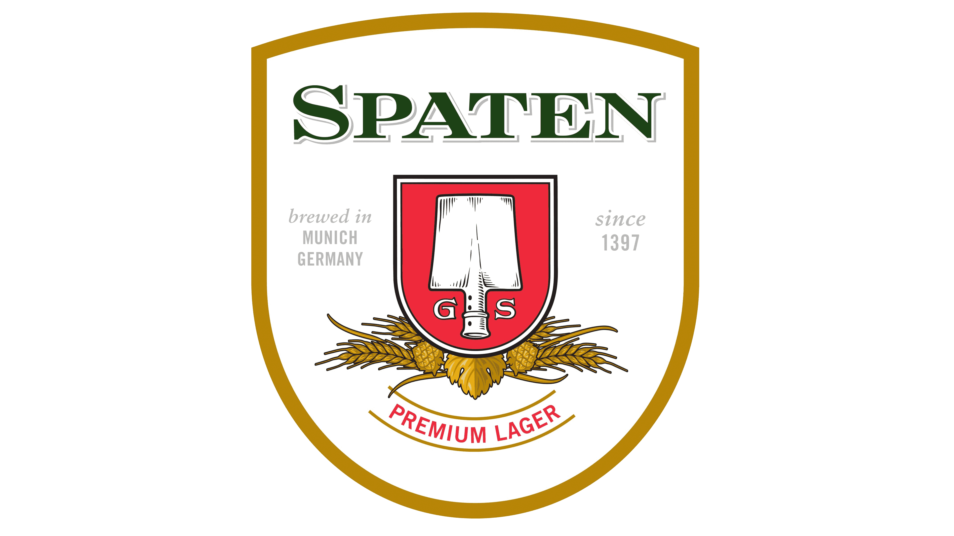
Spaten is a German beer brand that produces several Bavarian beers of moderate strength. Its roots go back to 1379 when entrepreneur Hans Welser opened a brewery in Munich. For a long time, the company has been owned by several owners. Now, this trademark is owned by Anheuser-Busch InBev Corporation.
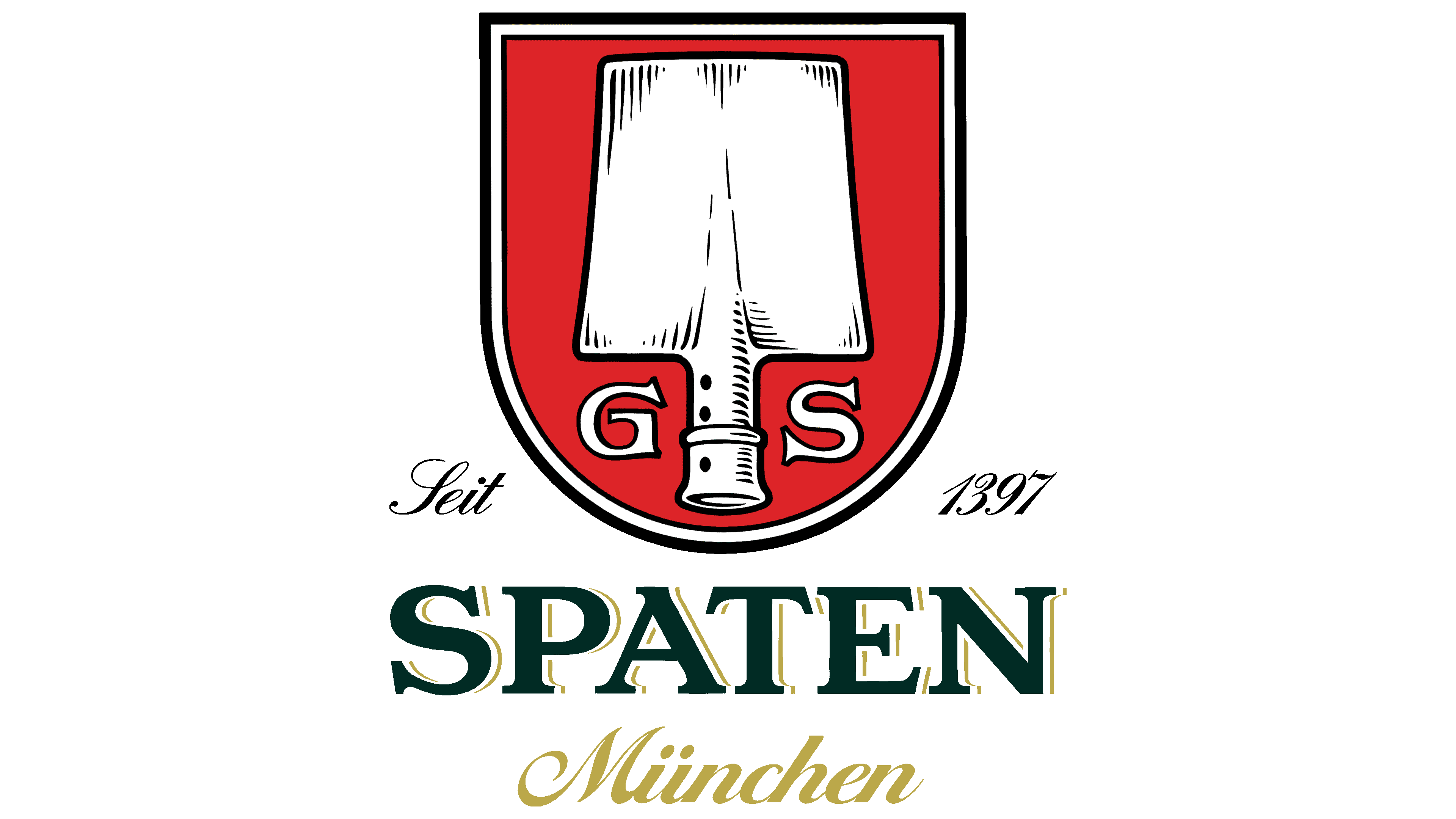
In 1622, the Munich brewery was acquired by the Spatt family and renamed Spaten, meaning “shovel” in German. She mixed the malt to produce an alcoholic beverage. It was hard work, immortalized in the emblem that pays tribute to the ancient brewers. Since then, the logo of the famous brand has never changed or been corrected.
The Spatt dynasty ran the company until 1704. Then, in 1807, Gabriel Sedlmayr, the chief brewer at the Bavarian royal court, bought it. He developed it, making it the largest plant in Munich by 1867. It brewed a bottom-fermented drink and Pilsen-type beer for the first time in the history of the German state. It also passed the first tests of a steam engine (in 1821) and a refrigeration unit designed by the engineer Carl Linde.
At the beginning of the 20th century, the company began supplying products outside Germany. In particular, most of the beer was exported to North America, and now it is found in all countries. In 1922, Spaten formed a commercial alliance with other beer producers (Franziskaner and Lowenbrau). The joint stock company was named Spaten-Franziskaner-Bräu GmbH. In 1977, the brand celebrated its 600th anniversary. Since 2004, it has been a subsidiary of the international corporation Anheuser-Busch InBev.
Heraldic art expert and renowned graphic artist Otto Hupp created the logo for the iconic beer brand. He was an outstanding master of the 20th century and a member of a creative dynasty because his father was a metal engraver. The author coped with the order so talentedly that he made a genuine coat of arms from an ordinary emblem. As a basis, he took the name of the Spaten company, which the former owners, the Spatt family, gave. The logo was officially approved only in 1884.
The key element of the brand name is a shovel. You can see it on every bottle. In ancient times, brewers mixed malt in deep vats, where the wort fermented. This work was time-consuming and difficult, so the artist encoded a double meaning in the logo: the name of the beer brand owners and the main labor tool. A shovel with a short handle appears on all versions of the labels, which feature different designs depending on the beer type and composition. Above the coat of arms is the brand’s German advertising motto: “Lass Dir raten, trinke Spaten!”
The malt shovel is at the center of the red coat of arms, with a rounded base and a black-and-white triple border. At the bottom are several inscriptions in different styles: Old English handwritten and classical printed. To the right and left of the handle are the capital letters “G” and “S.” They are an abbreviation of the name and surname of Gabriel Sedlmayr, a leading brewer at the Bavarian Royal Court. Previously, he also owned this enterprise, which he bought in 1807 and raised to a high status.
Font and Colors
The name of the alcoholic brand Spaten is typed in an antique font with distinct serifs. Above it is an inscription in Old English script. The letters in it are decorated with curly spikes and thin curls resembling hop stems and leaves. The beer company’s slogan is cursive, handwritten, and semi-coherent (initial characters are predominantly separated from the rest of the words). The signature palette depends on the type of beer and may be different. Some labels are green, yellow, and white; on others, it is only red and black.